Delivering a successful design
•Descargar como PPT, PDF•
0 recomendaciones•286 vistas

How AFAO came up with an effective briefing for a new website design - Jill Sergeant, AFAO

Recomendados
Recomendados
Más contenido relacionado
La actualidad más candente
La actualidad más candente (20)
Destacado
Destacado (20)
Similar a Delivering a successful design
Similar a Delivering a successful design (20)
Más de Australian Federation of AIDS Organisations
Más de Australian Federation of AIDS Organisations (20)
Último
Último (20)
Delivering a successful design
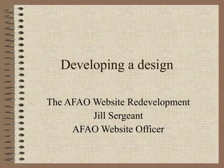
- 1. Developing a design The AFAO Website Redevelopment Jill Sergeant AFAO Website Officer
- 2. About AFAO
- 9. Things we like ….
Notas del editor
- The Australian Federation of AIDS Organisations (AFAO) is the peak body representing the community response to HIV in Australia, that is, representing communities most affected by HIV – people living with HIV, gay men, IDU, sex workers etc. AFAO does policy and advocacy work, health promotion campaigns and capacity building for the HIV sector. We have 16 staff and represent 12 member organisations. The image in the middle of this montage shows our President, Graham Brown, at a human rights march at the recent international AIDS conference in Vienna. I think it captures our commitment, as an organisation, to social justice. As a national community organisation we have a profound commitment to consultation with our constituents, so when we redevelop our website, it’s been essential to engage our membership and our staff. We also have to pay particular attention to the kinds of imagery we use – the balance between appealing to our primary audience of gay men and yet remaining representative of the diversity of the epidemic. This presentation will look at how we addressed stakeholder engagement, the needs of our target audiences and other issues during the design phase of our website redevelopment – and what we learned from the process.
- This slide shows our current home page, with the design that was done in 2004. It’s well overdue both for a restructure and a revamp. The AFAO website has not been redeveloped since 2004, when a quick and dirty rescue operation salvaged the site from a web company that had gone bust, almost taking our site with it. But that’s a whole other story. I’d like to point out a small example of the kind of sensitivities we have to negotiate when thinking about design. Some people have been offended by the rainbow strip just underneath the logo – blink and you’ll miss it – because in their minds it identifies the site as “gay” and of course not all people with HIV, or at risk of contracting the virus, are gay. Well it’s true that was the intention of the designer, to subtly reference our gay community base, and we liked it, we felt it gave the page a bit of a lift, so we let it through.And with around 80% of the epidemic in Australia still occurring among gay men, it’s not completely inappropriate. Well, you can’t please everyone. Our website redevelopment started when we put the job out to tender in June 2009. Like many such projects, it took a while to get moving but by early 2010 we had an information architecture we were basically happy with and it was time to start on the design.
- Developing the IA had been a collaborative project that I coordinated, and at one stage or another involved nearly all the staff and also several stakeholders. But for the design phase I decided that we needed a working group to oversee the whole process. I invited staff and representatives of our member organisations to be on the working group, sending out a ‘job description’ so that people had some idea what they were in for, and targeting particular people within the membership who I thought would have an interest or benefit from being involved. The group ended up being entirely composed of staff - reflecting the time pressures on our membership I guess, and also the fact that as a national organisation it is difficult to get people from interstate involved. However as I’ll explain in a moment, I made sure there were opportunities for members to have input into the design process. There were five people in the working group: one of the Managers, myself, the Communications Officer, and staff from the education and admin teams who had expressed interest. (The CO and I are both from the Policy team). Although members hadn’t wanted to get involved, there was actually a bit of competition among staff to get onto the group – but I didn’t want to have it too large so a few people missed out. We met regularly for about 4 – 6 weeks to research, discuss and refine the design brief. An important factor in our process, and one that might not occur in other organisations, was that our Executive Director was happy to delegate the decision-making to the working group – even the final decision about what design we would go with. I think that’s indicative of our organisational culture, which is fairly easy-going, open and respectful. Also, I’ve been working in the sector a long time so I guess he trusted me with the process and the decisions.
- It had been a long time since we had prepared a design brief for the main AFAO website and we weren’t really sure how to go about it. Previously we’d more or less left it up to the designer to come up with something just based on our conversations with them – we hadn’t been directive about fonts or colours. So in our tender document for the new site, this is all we said about the design. It summed up what we wanted and we thought it wouldn’t really make sense to go into too much detail, because we could judge for ourselves, from the tendering companies’ design portfolios, whether they could deliver a good design. We also thought that we could go into further details in consultation with the successful tenderer, and this was indeed the case. Fortunately, the developer provided a “design considerations” document that gave comprehensive suggestions and guidance for developing a briefing. We found this invaluable.
- I convened the first meeting of the working group and used the Design Considerations document as a way of structuring the process of coming up with the design brief. This slide lists a few of the things we needed to consider. I spent a lot of time working with the Communications Officer so we could make recommendations to the working group and they could focus on the more important decisions. I won’t talk here about every design decision we made – I’ll just outline some of the key parts of the process.
- One of the first things the working group did was to brainstorm adjectives that we felt described our organisation, and that we wanted the site to reflect.
- We also brainstormed what we didn’t want to site to be.
- We spent a lot of time looking at other websites and identifying features we liked and disliked. The sites ranged from those in the developers’ design portfolio to other key HIV sites in Australia, to sites for banks, airlines, community arts, and other health conditions. We largely did this research as individuals and then came together to discuss our favourites and develop a short list. This process helped us to decided on a few key features for the design brief, such as the preferred font, the centring of content. This slide shows some of the features we liked, and which we included in our design brief as examples. I also had additional meetings and brainstorms with the Communications Officer. It was great to have someone to work more closely with when preparing for the working group meetings, and someone to whom I could delegate tasks occasionally. We had several long afternoons together when we looked through websites for ideas and inspiration – it was lots of fun. Thinking about design is possibly the most enjoyable part of web development for many people – certainly our working group all had fun researching and discussing possibilities. Having the working group was also useful because it provided a bigger pool of inspiration and ideas and favourite sites to draw upon.
- At the meeting where we discussed our shortlist of sites, we decided to delegate colour choices to a sub-committee of the working group – myself, the CO and the Education Team member, who has a particular interest in colour. Our brief was to come up with 2 or 3 colour scheme proposals, based on the likes and dislikes we’d come up with after researching sites. We were lucky in that we weren’t tied to using a particular colour scheme. Although on our letterhead and business cards the AFAO logo is teal, we’ve never used that colour on the website – and as it’s a colour I don’t really like, I wasn’t about to start using it now. Also there had been rumblings about rebranding AFAO, so the safest option seemed to be to continue using it either in black and white, or reversed out on whatever colour scheme we chose. This gave us freedom to consider just about anything. We started by taking a closer look at some of the colour schemes we’d particularly liked on other websites, and to aid us in deciding on a colour scheme, we used this website. It was very helpful because you could just type in a colour and the site would generate a list of colours to go with it. We weren’t trying to pin down exact matches but it was a helpful tool. Once we’d done this, I prepared a slideshow that we emailed around to staff and stakeholders, inviting their feedback. It combined colour swatches with examples of websites we liked that used similar colour schemes. We weren’t formally surveying stakeholders – it wasn’t put to a vote – but we wanted to get a sense of what people liked. A number of people did email us their comments.
- We started out with this one, because we’d seen a number of sites that combined a light, bright blue with bright oranges, greens and yellows, and even though we were trying to get away from blue, we were very taken with them.
- This is another page from that presentation. This palette was inspired by the Uniken cover at top right. The Communications Officer and I discovered this image when browsing sites and we liked it so much that we couldn’t resist including a colour palette in our proposal to staff and members. But very rightly, most people felt that it was too “environmental” and not appropriate for our organisation. The other problem was that the brighter version of this palette, with the lighter greens and orange, was already being used by one of our member organisations, NAPWA.
- In business it’s important not to look too much like your competitors. In the community sector, it’s important not to look too much like your partners. The HIV sector is complex enough without confusing people more. So we reluctantly abandoned this colour scheme.
- As we discovered with the Olive/chocolate colour palette, inspiration can come unexpectedly, and so it was with our 3 rd proposal. I’d been feeling not entirely satisfied with what we’d come up with – I had a hunch that the olive/chocolate wasn’t going to work out, and I was reluctant to go with blue, having had a blue site for six years. I felt we needed another option but couldn’t figure out what. And then Finn called me over to have a look at the proposed cover image for our next edition of our quarterly magazine, HIV Australia .… I loved it …. so at the very last minute, we rustled up a new option to include in our proposal.
- We provided 4 different palettes to staff and members and about 10 people responded to our request for feedback – which is not very many, considering how large our membership is. But it was still useful, because it indicated which colours were definitely out of the game, and of the remaining, people were about evenly split, so we felt that whatever we chose, we’d be on the money. People also appreciated the chance to have input, albeit in a small way.
- After adjusting our proposal in line with the feedback, the next step was for us to meet with the designer and project manager to talk through our ideas, and how they fitted with the functional specs and IA we’d developed earlier in the year. As I mentioned earlier, there were several items – such as font - that the working group had a fairly clear agreement on, and Finn and I conveyed this to the designer. However we were still a bit uncertain of whether we would go for the charcoal or the blues palette – the designer agreed to do design mockups for both. The other design issue we weren’t quite sure of was how adventurous we wanted the design to be. We knew we didn’t want the site to be too ‘out there’, or look like a youth or music/arts site – after all, some of our key adjectives were words like “mature” “authoritative” – but we also didn’t want the site to look too conservative or modular, like we’d got it out of a box. Once more, the designer gave us a choice. We agreed that they would give us a couple of different options, based on the colours we’d discussed.
- We loved the colour contrast on this one, but it felt a bit too chunky and conservative in the layout. Also we felt the impact of the design lay in the gorgeous green shirt and brown skin tones contrasting with the darker background – but this was not actually an image we’d be using on our home page – it was one of a number we’d provided to Squiz, but it didn’t represent our core business – just one smallish area of our policy work with CALD communities.
- We had mixed feelings about this one – we liked the layout – it was arresting and clear - but we had mixed feelings about the colours and nearly everyone who looked at it had a bad reaction to the background image. I’ve been working in the HIV sector for nearly 20 years and I’m also old enough to remember the infamous grim reaper AIDS campaign of the 1980s. In this sector, you have to be very careful what images you use to represent HIV. To me personally, this design said “ghosts”, although I’m sure that was far from the designers mind. People with less negative reactions to it still felt it was not appropriate because it, made the site feel like a youth or music site.
- We’d asked Squiz to provide the mock-ups in time for our May Members’ General Meeting, which is attended by around 50 people from around the country. We set up laptops in a meeting room and invited people to come and look at the site and complete a short survey indicating their likes and dislikes. Although we didn’t get feedback from all 50 people. once again, there was more or less an even split between designs – plus the almost unanimous dislike of the background on the blue design. Having the designs on display also gave us an opportunity to chat to people and generated some interesting discussions.
- So what next? It was very hard to decide. So perhaps predictably, we ended up going back to Squiz and asking for a new design that incorporated the best of both. We wanted to see how the charcoal palette would work with the more adventurous design, and we wanted a version of that design without the people in the background. So we had a bit of back & forth for a while, tweaking, discussing, tweaking. We didn’t want to have a site that was ‘designed by a committee’ and we also wanted to respect the integrity of the designer, so we tried not to fiddle with it too much. The final decision was made by the working group, after much discussion and angst on my part. It’s always hard to choose when all the options look good!
- And this is what we finally agreed on. What we liked about it – the charcoal background would set off the wide range of colours used in our publications and resources, which would provide much of the content The high visibility of the links and their interesting arrangement. We felt this design really put into practice an IA that was designed to provide multiple pathways to popular content. Many people with HIV are now ageing and so the large fonts and headings improved visibility for people with vision problems related to HIV or simply to ageing. We liked the use of splashes of colour throughout the home and inside page. We showed it off at a staff meeting but haven’t yet showed our members – we are going to do a proper show and tell at our AGM in November.
- Here’s an inside page. We liked the use of banner images on inside pages, it gives the site a human touch. However we’ve never used a lot of images on the site so we’ve had a to spend a lot of time discussing what we felt was appropriate. Again, that’s been a lot of fun, looking through images we had on file from campaigns and publications, and also organising a photo-shoot, as we didn’t want to become too reliant on photo libraries and also we didn’t want to keep seeing ‘our’ images on other websites. We also liked the colour in the menus, the headings and the option to have more colour in the featured publications and banner sections at right. In fact the inside page design was a strong selling point for us when reviewing Squiz’s original designs – after all, they are the pages that people will see the most of, and also the pages on which many visitors will arrive at the site.
- I asked staff and stakeholders to feedback on how they felt about their involvement in the design process. Here are some of their responses.