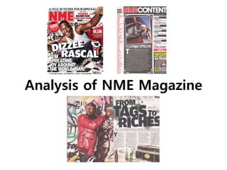
2. Front Cover
The target audience of NME are aged 21-30 and are mostly
male. This is suggested by the magazine showing bands and solo
artists that aren’t new, but haven’t been around for a long time,
who are mostly male. The social class of the target audience
would be BC1, and they would’ve most likely gone to College and
then got an apprenticeship. This would be suggested through the
use of little text on the cover, meaning that the audience don’t
necessarily enjoy sitting down and reading long articles, but
prefer to go out and do things they enjoy, suggesting that they
would have a more active job, where they get to travel and move
around a lot. They are extremely passionate about music and are
constantly going to concerts and festivals with friends, as they
enjoy travelling to new places and experiencing new things. The
target audience are single, as they are young and their life of
travelling to different festivals doesn’t suit a partner, who might
not want to travel around a lot. When they’re not out listening to
live music they enjoy playing different sports and finding new
places to visit with their friends.
Whilst this issue of NME features the rap artist Dizzee Rascal, the
magazine doesn’t have a specific music genre. This is shown by
the names of other music artists on the cover of the magazine,
who aren’t of the hip-hop genre, but of rock and indie.
Task 2a
The masthead of NME is placed in the top left hand corner of the cover, since this will be the first thing that the
audience will see, as when it is displayed on the shelf in a shop, conventionally, only the top part of the magazine is
shown. It is also where the audiences’ eyes will be drawn to first because in the English language we read starting
from the top left. In addition, the masthead of NME doesn’t change with each edition meaning that readers will be
able to identify the magazine with ease. Furthermore, as the font that the masthead is written in denotes red, with
a white and black stroke, and it is large and bold it stands out and draws the audiences’ eye straight away.
3. Front Cover
There is a clear colour scheme within the magazine, as only
black, white, and red appear on the cover. Black and white are
contrasting colours that are bold and striking, meaning that the
text will stand out and the cover will grab the attention of the
reader. Red is a stimulant colour meaning that it would make the
audience make quick decisions, like the decision to buy the
magazine. These colours are also very commonly used on many
different types of music magazines, meaning that it relates to
different genres of music. The colour scheme is used thoughtfully
and isn’t too garish, to ensure that, before even reading a cover
line, the reader isn’t put off by the clashing colours, but attracted
by the strategic placement of the three colours.
The main image on the magazine is a full shot of Dizzee Rascal.
Dizzee is looking at the camera and therefore making eye contact
with the reader, which would denote direct address. The
placement of Dizzee’s eyes is also following the rule of thirds, as
they are in line with a hotspot point on the magazine cover,
meaning that the audiences’ eyes are immediately drawn to the
eye contact. By directly addressing the audience, NME is making
them intrigued and feel as though they need to buy the
magazine because it’s addressing them personally. The magazine
also appears friendly and welcoming to the reader as Dizzee is
crouched down with open arms and a wide, open smile. This also
links to the quote from Dizzee in the main cover line, saying that
he is ‘spreading joy around the world’. The mise-en-scène is quite
minimal within the main image. The image is bright and well lit,
which would reiterate the friendly and welcoming feel of the
magazine. There isn’t any dramatic make-up, use of lots of
different props, but there is a graffitied wall in the background,
which would connote the hip-hop genre.
Task 2a
The barcode is placed in the bottom right
hand corner of the cover, as this is the last
place that the readers’ eyes will be drawn to.
This means that the barcode won’t interfere or
distract from the important information on the
cover.
4. Front Cover
The main cover line anchored to the image appears just below
the middle of the cover. ‘Dizzee Rascal’ is at a slight slant over the
main image, and the rest cover line isn't slanted and is to the
bottom left of Dizzee. The fact that the main cover line is slanted,
would have connotations of rebellion, which would link to hip-
hop music, which reiterates the genre of music that Dizzee Rascal
produces. Also the slanted text could appeal to the audience, due
to it seeming friendlier. If everything on the cover was ordered
and in straight lines, then it may appear too formal and put the
audience off buying it, but by making the main cover line slightly
slanted it makes the magazine more approachable.
There are also other cover lines and straplines on the cover that
appear on the right side of the cover and next to the masthead,
so that they don’t distract from the main image and cover line.
Across the top of the cover there is a strapline for the ‘Autumn
Tour Special’. As it’s along the top, NME clearly thinks that the
special will appeal to the audience, and that it will intrigue
readers, as it will be visible to the audience when the magazine is
displayed in a shop. The strapline also contains names of music
artists, which would attract fans of them to purchase the
magazine. The list of artist featured in the magazine are continues
along the bottom of the magazine, to widen the audience. On the
right of the cover there is a cover line, which is in a small, white
font. The use of a white font, means that it stands out against the
red background, but the fact that it’s small means that it doesn’t
over power the main cover line.
Task 2a
The mode of address within the cover is quite
informal, like the use of ‘man’ in the main
cover line, which would continue the friendly
and welcoming feel of the magazine. There are
two exclamation marks featured on the cover,
making the magazine sound more exciting,
which in turn makes the audience more excited
to read it.
5. Contents Page
The masthead of the contents page is placed in the top right
hand corner of the page, as this is on the opposite side to the
masthead on the cover, meaning that they won’t look the same,
but the masthead is still where the readers eyes are drawn to
first, as it is at the top. The NME logo is next to ‘Contents’
because this continues the branding and links the contents page
to the cover. Furthermore, as the font that the masthead is
written in denotes white against black, and it is large and bold it
stands out and draws the audiences’ eye straight away.
The main image on the contents page is a medium shot of a girl
outside an tour bus. The girl is making eye contact with the
reader, which would denote direct address. By using direct
address above the editor’s note it make the reader feel as though
they are being addressed personally within the note. The use of
the tour bus anchors the image to the title ‘Touring Special’,
meaning that the image is related to something on the page and
not there for no reason. There is also a white border around the
image and it is on the page at a slant. This makes the image
appear to be a photograph that’s been stuck onto the page,
making the magazine appear more fun and friendly.
Task 2b
6. Contents Page
The layout of the contents page consists of three columns that
follow the rule of thirds. By putting the information into different
columns, it organises it so that it is easy for the audience to
navigate. It also makes the page look neater and more appealing.
The majority of the text is written in sans serif font, meaning that
the information is the main focus to the audience, as sans serif
fonts are very plain and simple. However, the editor’s note is
written in a serif font, meaning that the text will appear more
welcoming than the rest of the page, as sans serif fonts can
appear quite harsh. The editor’s note needs to appear more
welcoming because it is almost like an introduction for the
magazine and it will appeal to the reader if it is more friendly.
The article titles and page numbers are set out on either side of
the page. On the right hand side there is a list of the main
articles within the magazine, as this will indicate to the reader the
highlights and features of the issue. These articles have been split
up into sections with headings, which will help the reader to find
the type of article they are looking to read. On the left hand side
there is a list of bands in alphabetical order with the page
numbers that they feature on. This makes it easier for readers to
find certain bands within the magazine, as opposed to the
numbers being in order, which would make finding these bands
harder.
Task 2b
7. Double Page Spread
The double page spread on Dizzee Rascal has used one
page for the main image of Dizzee, and the other page
for the title and the other text. The page number is
located in the bottom left hand corner of the page, so
that the audience can flick through the corners to
easily find the page. The image and text are integrated
by the use of props connecting the second page to the
first. Also the graffiti theme is carried across both
pages.
The main image on the page is a medium long shot of
Dizzee Rascal. Dizzee isn’t looking at the camera,
meaning that direct address isn’t direct address isn’t
present within the image. This is so that the readers’
eyes are more drawn to the title of the article, as the
article itself is the most important part of the double
page spread.
Task 2c
Within the image Dizzee seems to be looking out for someone, as he is in the act of graffiting. This anchors the
image to the title of the article ‘From Tags to Riches’, as someone graffiting would connote deprived areas, linking
to the original phrase ‘from rags to riches’. Unfortunately, the fact that Dizzee is graffiting and looking quite
suspicious, would imply the negative and harmful stereotype that black men, in particular, are criminals. However,
the graffiti would also link to the hip-hop genre of music, so would connect to Dizzee in terms of the music that he
produces, as opposed to just the colour of his skin. The mise-en-scène is used to emphasise the genre of Dizzee’s
music and to link it to the cover and contents page. The red jacket, that he wasn’t wearing on the cover, is used to
connect the double page spread to the colour scheme used on the cover and the contents page, so that the brand
of the magazine isn’t lost throughout it. The props of the empty beer bottles and the radio would connote having
fun and partying, which is the type of artist that Dizzee Rascal is. They also make the double page spread look more
interesting and appealing, as they fill empty space below the text.
8. Double Page Spread
The mode of address within the double page
spread is quite informal, shown by the use of a pun
in the title and the props of the empty beer bottles.
It also doesn’t use direct address, as the article is
about Dizzee’s life and music, not about personally
addressing the readers.
The title of the article is written is a large, sans serif
font that takes up half of the second page. It
denotes black against a white background, so that
it stand out and catches the readers’ eye, and
appears slightly slanted with spray paint drips
behind it, which would link to the graffiti within the
main image.
Task 2c
The subtitle is significantly smaller than the title and is written in a serif font, as serif fonts are considered
to be easier to read when smaller and in large sections of text. The text in the article is also written in a
serif font for the same reason.
The text in the article is smaller than the subtitle, so that the subtitle stands out more to the reader. It also
starts off with a drop cap, which is an effective way of grabbing the audiences’ attention and add visual
strength to the page. In addition, the article is divided up into four columns, so that the text doesn’t
interfere with the image by going too far down the page.
9. Elements that Connect the
Different Parts of the Magazine
It is important that different parts of a magazine are
connected, because otherwise the brand identity will be lost
throughout it.
Within NME there are many elements that connect the cover,
the contents page, and the double page spread to each
other. One element would be the colour scheme of black,
white, and red. The use of a colour scheme is very important
because, before any text is read, the audience will see the
colours and general layout of a magazine.
Another element that connects the three parts of NME would
be the fonts. NME uses mainly sans serif fonts, with the
exceptions of paragraphs of text and on the straplines on the
cover. The use of the same or similar fonts means that the
magazine doesn’t look mismatched and unorganised. It also
means that the audience isn’t overwhelmed with lots of
different styles of fonts.
In addition the use of music artists, in this issue Dizzee
Rascal, on the cover and double page spread, means that the
cover relates to the articles within the magazine. This is so
the audience knows what to expect from the magazine just
by looking at the cover and isn’t mislead by a cover that has
nothing to do with the content of the magazine.
Task 2d