![[object Object],[object Object],[object Object],[object Object],[object Object],[object Object],[object Object],[object Object],[object Object],[object Object]](data:image/gif;base64,R0lGODlhAQABAIAAAAAAAP///yH5BAEAAAAALAAAAAABAAEAAAIBRAA7)
Recomendados
Más contenido relacionado
La actualidad más candente
La actualidad más candente (19)
Destacado
Destacado (14)
Similar a Displaying data
Similar a Displaying data (20)
Más de AbhishekDas15
Último
Último (20)
Displaying data
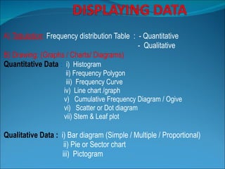
- 1. A) Tabulation : Frequency distribution Table : - Quantitative - Qualitative B) Drawing: (Graphs / Charts/ Diagrams) Quantitative Data : i) Histogram ii) Frequency Polygon iii) Frequency Curve iv) Line chart /graph v) Cumulative Frequency Diagram / Ogive vi) Scatter or Dot diagram vii) Stem & Leaf plot Qualitative Data : i) Bar diagram (Simple / Multiple / Proportional) ii) Pie or Sector chart iii) Pictogram
- 3. TABLE-1 Population by sex in Kolkata urban area in 2001 Source: Health on the March 2004-05, Govt. of West Bengal Characteristics Population (in million) % Male Female 7.07 6.14 53.52 46.48 Total 13.21 100.00
- 4. Frequency distribution table for qualitative data Characteristics Population (in million) % Male 7.07 53.52 Female 6.14 46.48 Total 13.21 100.00
- 5. Frequency distribution table for quantitative data Pulse rate/minute No of medical students Percentage 51-60 2 1.33 61-70 22 14.67 71-80 56 37.33 81-90 55 36.67 91-100 14 9.33 101-110 1 0.67 Total 150 100.00
- 7. Rating of length measurement Table 2 2 5 1 2 6 3 3 4 2 4 0 5 7 7 5 6 6 8 10 7 2 2 10 5 8 2 5 4 2 6 2 6 1 7 2 7 2 3 8 1 5 2 5 2 14 2 2 6 3 1 7
- 8. Frequency Table of rating of length Table 2-3 0 - 2 20 3 - 5 14 6 - 8 15 9 - 11 2 12 - 14 1 rating Frequency
- 22. Relative Frequency Table relative frequency = class frequency sum of all frequencies
- 23. Relative Frequency Table 20/52 = 38.5% 14/52 = 26.9% etc. Table 2-5 Total frequency = 52 0 - 2 20 3 - 5 14 6 - 8 15 9 - 11 2 12 - 14 1 Rating Frequency 0 - 2 38.5% 3 - 5 26.9% 6 - 8 28.8% 9 - 11 3.8% 12 - 14 1.9% Rating Relative Frequency
- 24. Cumulative Frequency Table Cumulative Frequencies Table 2-6 0 - 2 20 3 - 5 14 6 - 8 15 9 - 11 2 12 - 14 1 Rating Frequency Less than 3 20 Less than 6 34 Less than 9 49 Less than 12 51 Less than 15 52 Rating Cumulative Frequency
- 25. Frequency Tables 0 - 2 20 3 - 5 14 6 - 8 15 9 - 11 2 12 - 14 1 Rating Frequency 0 - 2 38.5% 3 - 5 26.9% 6 - 8 28.8% 9 - 11 3.8% 12 - 14 1.9% Rating Relative Frequency Less than 3 20 Less than 6 34 Less than 9 49 Less than 12 51 Less than 15 52 Rating Cumulative Frequency Table 2-6 Table 2-5 Table 2-3
- 29. Multiple / Compound Bar diagram show the comparison of two or more sets of related statistical data .
- 35. Refer to page 336 for the line graph.
- 40. Stem-and Leaf Plot Raw Data (Test Grades) 67 72 85 75 89 89 88 90 99 100 Stem Leaves 6 7 8 9 10 7 2 5 5 8 9 9 0 9 0
Notas del editor
- page 35 of text
- Discussion of what these rating values represent is found on page 33 (the Chapter Problem for Chapter 2).
- Final result of a frequency table on the Qwerty data given in previous slide. Next few slides will develop definitions and steps for developing the frequency table.
- The concept is usually difficult for some students. Emphasize that boundaries are often used in graphical representations of data. See Section 2-3.
- Students will question where the -0.5 and the 14.5 came from. After establishing the boundaries between the existing classes, explain that one should find the boundary below the first class and above the last class, again referencing the use of boundaries in the development of some histograms (Section 2-3).
- Being able to identify the midpoints of each class will be important when determining the mean and standard deviation of a frequency table.
- Class widths ideally should be the same between each class. However, open-ended first or last classes (e.g., 65 years or older) are sometimes necessary to keep from have a large number of classes with a frequency of 0.
- page 38 of text Emphasis on the relative frequency table will assist in development the concept of probability distributions - the use of percentages with classes will relate to the use of probabilities with random variables.
- Some students will need a detailed explanation of how the classes “Less than 3”, “Less than 6”, etc. are identified and the frequency for each of the classes are determined.
- A comparison of all three types of frequency tables developed from the same QWERTY data.
- page 45 of text Data that has at least two digits better exemplifies the value of a stem-leaf plot. Cover up the actual data and ask students to read the data from the stem-leaf plot. Data should be put in increasing order. A stem-leaf plot builds ‘side-ways’ histogram. The most common mistake students make when developing stem-leaf plots is leaving out a ‘stem’ if there is no data in that class. The other mistake is, if there is no data in a class, putting a ‘0’ next to the stem - which, of course, would indicate a data value with a right digit of ‘0’. Students confuse the use of ‘0’ indicating a frequency in a frequency table with a ‘0’ in a stem-leaf plot indicating an actual data value. (See example on page 47 middle of page.)
- A plot of paired (x,y) data with the horizontal x-axis and the vertical y-axis. Chapter 9 will discuss scatter plots again with the topic of correlation. Point out the relationship that exists between the nicotine and tar - as the nicotine value increases, so does the value of tar. page 47 of text