How to Create Killer CTA Buttons for Effective Content Marketing

http://bit.ly/cta-buttons-infographic CTA buttons – or buttons on your website that push the visitor to take action (i.e., a “Call to Action“) are tricky little things. They seem so simple. So straightforward. But a year or two ago, I had my eyes opened to the crazy power of a really, really good call-to-action button. Back then, I ran this series of experiments – it was a bunch of button tests done in July and August. The reason I decided to focus nearly a dozen split tests on buttons alone was not just because buttons are insanely easy to test. (After all, you can’t convert online without clicking a button. So measuring a button’s success or failure is pretty direct – total straight-line.) I focused on CTA buttons because they’re so overlooked as to be mocked. People joke about button color tests like they’re stupid. They act like CTA split testing is pointless. But it’s not. Because although the color of a button is unlikely to persuade a prospect to take action (hence, the term often used for buttons on websites – or “calls to action”)… your call to action is a core part of UX and UI design – it directly impacts conversion. The copy you put on your CTA button can amplify or destroy its click-worthiness. And how visible or invisible your button is on the page will – without question – affect whether or not it gets clicked. 3 important facts all digital design and online marketing experts should already know: 1- You cannot convert online without clicking a button. 2- Which makes buttons the SITE of conversion. 3- Which makes buttons worthy of not just a little of our effort but a lot of it. I’ve devoted entire conference presentations to the power of buttons. Buttons are a big deal. You need to make yours better. How to Design a Better CTA Button In 9 Easy Steps CTA buttons can make or break the effectiveness of ANY page on your website. They can make or break your conversion rates. And if those two points are true, then by default – they can make or break your business. So give every CTA button you create the attention it deserves. Here’s how… http://bit.ly/cta-buttons-infographic

Recomendados
Recomendados
Más contenido relacionado
Más de unfunnel
Más de unfunnel (20)
Último
Último (20)
How to Create Killer CTA Buttons for Effective Content Marketing
- 1. Buttons are a big deal. You need to make yours better. made with
- 2. Joey is a passionate, forward-thinking, and inventive web strategist and inbound marketing expert. Also well-known as an SEO, author and entrepreneur, his interests involve creating world-class digital experiences ... with game changing results. Expertise In addition to startups and small businesses across North America, clients include FedEx, St. Jude Research Hospital, AutoZone, Harrah's Casino, ServiceMaster, World Series of Poker, Lowe’s and many more! About The Author Voted by LinkedIn as one of 15 "Millenials on the Move" Joey Barker, CEO @ Unfunnel
- 3. 9 Best Practices For Creating A Killer CTA Button [INFOGRAPHIC]
- 4. CTA buttons - or buttons on your website that push the visitor to take action (i.e., a "Call to Action") are tricky little things. They seem so simple. So straightforward. But a year or two ago, I had my eyes opened to the crazy power of a really, really good call-to-action button. Back then, I ran this series of experiments - it was a bunch of button tests done in July and August. The reason I decided to focus nearly a dozensplit tests on buttons alone was not just because buttons are insanely easy to test. (After all, you can't convert online without clicking a button. So measuring a button's success or failure is pretty direct - total straight- line.) I focused on CTA buttons because they're so overlooked as to be mocked. People joke about button color tests like they're stupid. They act like CTA split testing is pointless. But it's not. Because although the color of a button is unlikely topersuade a prospect to take action (hence, the term often used for buttons on websites - or "calls to action")... your call to action is a core part of UX and UI design - it directly impacts conversion. The copy you put on your CTA button can amplify or destroy its click- worthiness. And how visible or invisible your button is on the page will - without question - affect whether or not it gets clicked.
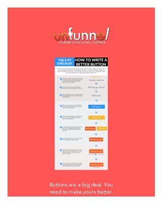
- 5. 3 important facts all digital design and online marketing experts should already know: 1. You cannot convert online without clicking a button. 2. Which makes buttons the SITE of conversion. 3. Which makes buttons worthy of not just a little of our effort but a lot of it. I've devoted entire conference presentations to the power of buttons. (Perhaps most notably on the stage of Digital Citizen University.) Buttons are a big deal. You need to make yours better. How to Design an Effective Call-To-Action Button In 9 Easy Steps CTA buttons can make or break the effectiveness ofANY page on your website. They can make or break your conversion rates. And if those two points are true, then by default - they can make or break your business. So give every CTA button you create the attention it deserves. Here's how...
- 6. Step 1 - Think Call To Value It's not about what your prospect needs to do - it's about what they are going to get when they click the button. For instance, a 10-day free trial if they click the button below... Try It For Free! Step 2 - Use Power Words Is your first word a power word? Does it visually catch attention and create a desire to perform an action? Make it happen. FREE! Start Your Trial Now Step 3 - Reduce Friction When creating a CTA button, you absolutely MUST reduce any and all perceptions of work! Replace words that suggest effort with words that feel like life will be made easier. Get the Free PDF Roadmap » Step 4 - Clickability You should always make sure your CTA button looks clickable. Avoid grey or similar color backgrounds, which can make your CTA button look disabled. Swipe The 7 Pre-Launch "Must-Haves" Ebook »
- 7. Step 5 - Color Choose a contrasting action color. Your action color shouldn't be a color in your original brand guidelines (even if your brand manager has a fit). Step 6 - Distinction If other CTA buttons are placed nearby on a Home Page or Pricing Page - make sure the CTA button you're optimizing is distinct from the others (i.e., use a different action color than its counterpart). Step 7 - Iconography Still not getting clicks on your CTA button? Try adding an icon or a symbol to catch the visitor's eye. Try UF Growth Labs For Only $1! Step 8 - Be Specific With CTAs You may know what's on the other side of your CTA button - but your prospects don't. Wherever and whenever possible, try to use supporting copy to neutralize a visitor's anxieties about the next step. Swipe The 7 Pre-Launch "Must-Haves" Ebook » Step 9 - Keep It Simple Be careful not to "over-optimize" your CTA button - for example, avoid adding extra messages or icons that could introduce some type of anxiety to your prospects.
- 8. NEXT: Download The Free Infographic! Grab The FREE Infographic »
- 9. Ready to Join Us? Like we mentioned before, your 7-day $1 trial of Unfunnel Growth Labs has no hidden costs or upsells, nothing. If you stick around after the trial is over, membership will cost you just $35/month, and you can cancel ANYTIME with just two clicks. No hassle, no questions asked. Start your $1 trial Now » made with