
Recomendados
Más contenido relacionado
Similar a POLITEKNIK MALAYSIA
Similar a POLITEKNIK MALAYSIA (20)
Más de Aiman Hud
Más de Aiman Hud (20)
Último
Último (20)
POLITEKNIK MALAYSIA
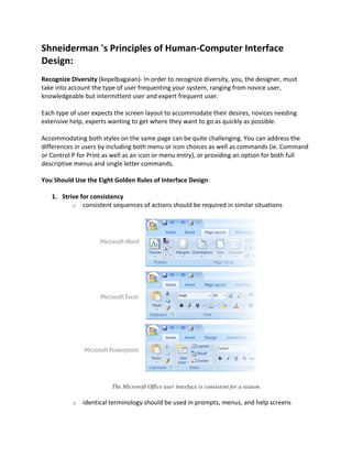
- 1. Shneiderman 's Principles of Human-Computer Interface Design: Recognize Diversity (kepelbagaian)- In order to recognize diversity, you, the designer, must take into account the type of user frequenting your system, ranging from novice user, knowledgeable but intermittent user and expert frequent user. Each type of user expects the screen layout to accommodate their desires, novices needing extensive help, experts wanting to get where they want to go as quickly as possible. Accommodating both styles on the same page can be quite challenging. You can address the differences in users by including both menu or icon choices as well as commands (ie. Command or Control P for Print as well as an icon or menu entry), or providing an option for both full descriptive menus and single letter commands. You Should Use the Eight Golden Rules of Interface Design: 1. Strive for consistency o consistent sequences of actions should be required in similar situations The Microsoft Office user interface is consistent for a reason. o identical terminology should be used in prompts, menus, and help screens
- 2. o consistent color, layout, capitalization, fonts, and so on should be employed throughout. 2. Enable frequent users to use shortcuts o to increase the pace (kelajuan) of interaction use abbreviations, special keys, hidden commands 3. Offer informative feedback o for every user action, the system should respond in some way (in web design, this can be accomplished by DHTML - for example, a button will make a clicking sound or change color when clicked to show the user something has happened) Windows system key combinations F1: Help CTRL+ESC: Open Start menu ALT+TAB: Switch between open programs ALT+F4: Quit program SHIFT+DELETE: Delete item permanently Windows Logo+L: Lock the computer (without using CTRL+ALT+DELETE)
- 3. 4. Design dialogs to yield closure o Sequences of actions should be organized into groups with a beginning, middle, and end. The informative feedback at the completion of a group of actions shows the user their activity has completed successfully o A good example of this is sending an email, you begin by deciding who it will be sent to, you then compose the email and finally, you send the email. Sending is confirmed by an on screen message and the email appearing in your ‘sent’ folder. 5. Offer error prevention and simple error handling o design the form so that users cannot make a serious error; for example, prefer menu selection to form fill-in and do not allow alphabetic characters in numeric entry fields o if users make an error, instructions should be written to detect the error and offer simple, constructive, and specific instructions for recovery o segment long forms and send sections separately so that the user is not penalized by having to fill the form in again - but make sure you inform the user that multiple sections are coming up
- 4. 6. Permit easy reversal of actions 7. Support internal locus of control (put user in control) o Experienced users want to be in charge. Surprising system actions, tedious sequences of data entries, inability or difficulty in obtaining necessary information, and inability to produce the action desired all build anxiety and dissatisfaction o We should ensure that systems do not become ‘sluggish’ or ‘clunky’ due to the more sophisticated media that devices are now expected to handle. Efficient and careful use of resources is key to this. 8. Reduce short-term memory load o A famous study suggests that humans can store only 7 (plus or minus 2) pieces of information in their short term memory. You can reduce short term memory load by designing screens where options are clearly visible, or using pull-down menus and icons o Don’t force users to remember complex sequences of actions or difficult codes in order to complete tasks. Shneiderman's guidelines for error messages include: – Avoid using term like FATAL, INVALID, BAD – Audio warnings – Avoid UPPERCASE and long code numbers – Messages should be precise rather than vague (samar2) – Context -sensitive help ● Google: did you mean committee
- 5. ‘Drag and Drop’ being used to uninstall applications Prevent Errors - The third principle is to prevent errors whenever possible. Steps can be taken to design so that errors are less likely to occur, using methods such as organizing screens and menus functionally, designing screens to be distinctive and making it difficult for users to commit irreversible actions. Expect users to make errors, try to anticipate (menjangka) where they will go wrong and design with those actions in mind. Discussion 1 How can we relate the recommendations from human-computer interface design research directly to web design? 1. Recognize Diversity o make your main navigation area fast loading for repeat users o provide a detailed explanation of your topics, symbols, and navigation options for new users o provide a text index for quick access to all pages of the site o ensure your pages are readable in many formats, to accommodate users who are blind or deaf, users with old versions of browsers, users on slow modems or those with graphics turned off 2. Strive for consistency in: o menus o help screens o color o layout o capitalization o fonts
- 6. o sequences of actions 3. Offer informative feedback - rollover buttons, sounds when clicked 4. Build in error prevention in online forms 5. Give users control as much as possible 6. Reduce short term memory load by providing menus, buttons or icons. If you use icons, make sure you have a section which explains what they mean. Make things obvious by using constraints - grayed out items in menus for options not available in that page 7. Make use of web conventions such as underlined links, color change in links for visited pages, common terminology. 8. Provide a conceptual model of your site using a site map or an index Discussion 2 Understanding the QPM User Interface All the pages in the web-based QPM user interface have a consistent look and feel. Figure 1-1 Example of a QPM Page Table 1-1 describes the common elements in each page. Table 1-1 Common GUI Elements in a QPM Page Number Area Description 1 TOC Provides up to two additional levels of navigation, if required:
- 7. • A submenu for the selected option. • In a wizard context, this area displays the wizard steps. 2 Path bar Provides a context for the displayed page. Indicates from which tab and option the current page is derived. 3 Content area Displays the page in which you perform application tasks. 4 QPM tabs Contains tabs that provide access to QPM functionality. Click a tab to access its options: • Dashboard—The Dashboard is the QPM homepage and provides a launch point to the commonly used QoS management operations. • Devices—Contains options for managing devices and device groups in the QPM inventory. • Provision—Contains options for defining policy groups and policies, configuring QoS for IP telephony, and working with global library policy components. This tab also contains options for deploying QoS policies and for previewing the CLI configuration on the devices. You can view and restore previously deployed jobs through this tab. • Monitor—Contains options for monitoring traffic on devices with QoS policies attached to them. You can perform Real-time, Historical, and Threshold analysis of the traffic. • Administration—Contains additional administration options. 5 Option bar Displays the options available for the selected tab. Discussion 3 Designing software that people intuitively know how to use is hard. Getting your product to a point that requires a very small learning curve takes a great design and a simple interface. Check out this example of a simple, effective screen layout.
- 8. A: Clean menu, easy to navigate B: Simple use of icons to enhance understanding C: Uncluttered page title D: Useful sidebar, relative to current content E: Subtle secondary menu for uncommon tasks EXERCISE I Can you spot the difference? Very consistent, but a recipe for disaster. In this example, details like selecting the receiver, selecting products and amounts etc. should behave the same - that's consistency. Appearance should be significantly different. Clue Consistent behavior means: Things that look the same should behave the same. Adequate appearance means: the look helps the user predict the functionality.
- 9. EXERCISE II Differentiate between two web search engines below in interface design. Figure 1: Google Interface
- 10. Figure 2: Yahoo Interface Tips 1 Enterprise interface programs such as corporate website have three primary aims: coherence, symbolism, and positioning. Coherence A coherent interface presents the enterprise clearly and comprehensively, conveying an understandable picture of the organization’s structure and functioning, products and services to clients, internal communications and management policy, and overall mission and goals. Building a legible, easily navigable corporate web structure is more than just a graphic user interface issue. A well-structured site rich with useful content directly represents the depth and breadth of an enterprise more comprehensively than any previous medium. Symbolism As networked work environments become the norm and various forms of telecommuting and remote access become routine, web-based work environments will become the dominant force in creating and maintaining the corporate ethos, attitudes, and values. For most employees the organizational web presence has become the most visible and functional evidence of social cohesion and common purpose across the enterprise. Positioning A clear and recognizable identity program helps distinguish an enterprise from peers and competitors. This is especially critical on the Internet, where everyone has a web site and all web sites appear in the same limited venue (a browser window on the
- 11. user’s screen). A user may visit a dozen organizational sites in a browsing session and be exposed to many graphic themes. Web users’ expectations of the Internet as a communications medium are determined mainly by what they have seen in other sites, and what they’ve seen is mostly like confetti: weightless, colorful, and chaotic. Will users remember your pages if your site looks like nothing else they’ve seen in your larger enterprise? Further Reference 1. http://www.ssw.com.au/ssw/Standards/Rules/RulesToBetterInterfacesEdit.aspx 2. http://www.usabilitypost.com/2009/04/15/8-characteristics-of-successful-user-interfaces/