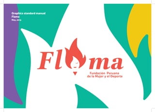
3. welcome to Flama’s brand guide
Our brand lives in the mind of our team, volunteers, partners, investors and
community. Everything we say and even more importantly everything we do
creates a mental image of our brand that shapes their impression of us.
Building a strong brand requires clarity and focus, so it’s important that we are
always consistent in how we act, and communicate visually and verbally day to
day. Every little behaviour and detail counts.
Professional, distinctive, clear and consistent interactions and communications
is the way for us to stand out.
Our brand guidelines are here to help. Read them and use them every day.
4. Index 1. The Logo
1.1 Logo introduction
1.2 Logo exclusion zones
1.3 Incorrect uses
2.1 Brand colours
2.2 Using our palette on Greys and white
2.3 Using our palette
3.1 Typefaces
1
2
3, 4
5, 6
7, 8
9, 10
11, 12
2. Colour
what colour to use and how to use them
3. Typography
The following pages of the Flama Graphics
Standards Manual, listed in sequential order,
are officially in effect as of May 9, 2019
5. 4.1 Intro to marks
5.1 Stationary
5.2 Merch
4. Iconography and marks
5. Application
2019
13, 14
15 - 18
18 - 29
6. The FLAMA Logotype
Our logo is where it all begins, It’s
the seed of our visual identity. It
provides our typographic style and
it’s blunt
The Logotype should be coloured using the brand pallette
only
All elements within the icon have to be present at all times.
(Eye, mouth, hair, body)
The Icon
1.1 The Logo
The Logo type
1
7. Our logo is important... so don’t cramp it’s style,
let it have the space it needs and deserves
Our logo is important, it should be given space, allowed to
be noticed. The best way to do this is to use the following
guide to ensure that nothing encroached too close to the
logo.
This simple system is totally scalable, and is based upon
measurments from the logo itself, so wether you are placing
the logo at the footer of a newspaper or acrosvs the side of
a bus, you can ensure it has the space it deserves.
1.2 Exclusion Zones
2
8. 1.3 Incorrect uses
1
4 5 6
2 3
1.The logo should never be only one element. Exception: Eye and mouth
together
2.The logo should never be displayed without the body
3.The logo should never be shown as outlines letterforms
4.The logo should never be used with colours that are not in a our pallete
5.The logo should never be deformed
6.The logo should never be used diagonally
3
11. 2.1 Our Brand Colours
C61 M74 Y0 K0
C26 M20 Y20 K0
C6 M18 Y99 K0 C0 M83 Y74 K0 C75 M0 Y51 K0
R125 G92 B223
R200 G198 B199
R241 G202 B25 R240 G83 B73 R19 G184 B155
Pantone 2597 U
Pantone 13-4104 TCX
Pantone 7405 CP Pantone 3556 U Pantone Mint Leaf 15-5728 TPG
These colours are never to be used as tints or shades. Only use
the colours shown in the exact mixes. (Pantone, CYMK or RGB)
depending on your medium.
We have adopted a strict colour palette
which is restricted to the colours below. This
gives the brand a very unique and energetic
look to be distinguished instantly.
6
14. 2.3 Using our pallete
Our colour palette can be used in many colour combinations. As a general rule, at least two of
the brighter colours should be used with one or more of the darker colours.
Try to avoid using too many dark colours together as the brand needs to be bright and fun.
9
17. Park Lane Bold
Park Lane Bold
Park Lane light
Dagny Pro Black
Dagny ProPark Lane
Dagny Pro Black
Dagny Pro Black
Dagny Pro Bold
We use only two typefacs to create all the
Flama collateral, be sure to use and only use
these typefaces
Dagny Pro Bold Italic
AaBbCcDdEeFfGg
HhIiJjKkLlMmNnOoP-
pQqRrSsTtUuVvWwXxYyZz
0123456789(%$&*:;-)
AaBbCcDdEeFfGg
HhIiJjKkLlMmNnOoPpQqRrSsTtUu-
VvWwXxYyZz
0123456789(%$&*:;-)
Serif Type, strong and provides movement to the logo Sans Serif Type, strong and bold
3.1 Typefaces
12
19. Spontaneous fresh marks give Flama’s identity some fun, energy and movement.
These shall be used and applied in specific merchandising and presentations.
14
20. 4. Application 4.1 Stationary
A4 Letter
Flama headquarter letterhead and envelope
Flama letterhead and envelopes are standard sizes.
Letterhead: A4, envelope: 162 x 229 mm
15