SlideShare una empresa de Scribd logo
1 de 20
Descargar para leer sin conexión
Tone and Colour


     Ashleigh Benn
Tone/colour in context
• Context changes tonal
  value, as we can see in
  this piece the areas
  where a shadow would
  be, the colour and tone is
  dark, making the areas
  recede. The principle of
  line depicted is a
  gestured line done in an
  organic manner.
                        Ashleigh Benn
                                    http://gratitude28.blogspot.com/
Warm colours
• Here one can see how the
   warmer colours
 move forward (the
oranges and yellows)
and how the cooler
colours (black and
grey) recede.The principle of
line used here is slightly curved
and the tone is what defines the
line.

                              Ashleigh Benn
.                                        http://fineartamerica.com/featured/narration--tonal-value-ii-jacek-
                                                jung.html
Warm colour and Cold colour
• In this image it is evident
  that in the
  squares/geometric lines
  the colours that are
  warmer come forward
  and the cooler colours
  move back and create
  depth.
                                 http://www.dreamhomesgroup.com/home-design/decorating-the-language-of-
                                 color-i/

                          Ashleigh Benn
Warm and cool primary colours
• In this piece the primary colours
  are evident, but if one looks closely
  slight alterations in the colour can
  create warmer and cooler effects,
  for example the yellow horse’s hair
  has areas that seem cooler then
  others, the paints used have been
  mixed ever so slightly to create
  depth and tonal variance by
  ‘cooling’ and ‘heating’ (through
  mixing) the primary colours. The
  quality of line here is curvilinear
  and organic..                           http://www.freespiritart.com/primary-colors-glazier.php


                                  Ashleigh Benn
Tertiary Colours
• By adding together all
  three primary colours
  one creates tertiary
  colours, these can vary
  by adding more of the
  separate primary
  colours.


                                   http://www.willymaurer.ch/bio_en.htm

                        Ashleigh Benn
Tertiary Colours
• In this piece one can see
  how the primary colours
  have been mixed ever so
  slightly to create these
  tertiary colour tones
  with organic lines.


                                http://mharmston.blogspot.com/2010/10/watercolor_20.html


                        Ashleigh Benn
Dirty colours - Neutrals
• The neutral colours seen
  here move towards the
  background while the
  red and yellow seem to
  pop forward.


                                    http://www.dailypainters.com/paintings/175470/Neutrals-by-Nancy-Eckels-
                       Ashleigh Benn
                                abstract-contemporary-modern-art-painting/
Tint and Shade
• A tint, is mixture of
  certain colours with
  white. Shade, is when a
  colour is darkened
  through black. In this
  piece the horizontal and
  vertical lines are
  reinforced through the
  tonal changes with tint
  and shade.                   http://bobotaro.wordpress.com/2007/04/07/office-building-new-abstract-
                               line-pattern-ctyscape-painting-6128-2007-kazuya-akimoto-art-museum/


                       Ashleigh Benn
Burnt colour
• Burnt orange or burnt
  umber is a medium
  brown colour.In this
  piece there are invisible
  horizontal lines which
  flows with the burnt
  orange.

                                   http://www.etsy.com/listing/33540986/returning-4x6-inch-
                                   original-fine-art


                         Ashleigh Benn
Raw Colour
• Cooler colours create a
  relaxed and peaceful
  mood.The cooler colours
  in the piece are calming
  amongst the turmoil of
  the geometric and
  curvilinear line.

                               http://www.artscapesbysteve.com/galleries/gallery7.html


                       Ashleigh Benn
Saturation
• The strength of a colour is
  created through the lack of
  black and white - this is
  known as saturated
  colour.In this image the
  intensity of the colours is so
  vivid that there is very little
  black and white used and
  only seen in areas used for
  tone.
                                        http://www.artscapesbysteve.com/galleries/gallery7.html


                               Ashleigh Benn
Purple next to other colours
• I cropped this image to
  show how purple almost
  changes when placed
  next to another colour,
  see how the purple looks
  darker when only seen
  with the green apple and
  how it gradually
  becomes lighter when
  seen with the neutral.
                       Ashleigh Benn
                                http://aberkeleydaily.blogspot.com/
Hue
• Colour without tint or
  shade. It’s the true
  colour of something. Its
  not mixed or altered.


                                http://fineartamerica.com/featured/landscape-indian-r-aggarwal.html


                        Ashleigh Benn
Translucent
• Here one can see the
  background of the piece
  through the usage of
  watered down white
  paint. The organic shape
  and line is emphasized
  through changes in tone
  by thickening and
  thinning the paint.          http://fineartamerica.com/featured/translucent-zully-m.html


                       Ashleigh Benn
Opaque
• This painting is done
  using opaque colours,
  the paint is thick and the
  tone is defined through
  the geometric lines.


                                 http://www.jyotsnaprakashan.com/docs/portfolio.htm


                         Ashleigh Benn
Bright Colours
• I chose this piece because
  of it’s colour intensity.
  The colours pop in
  between the horizontal
  lines.


                                http://isaackirshbom.com/gallery/surrealistic_interpretations/


                        Ashleigh Benn
Turned to grayscale
• Here, I changed the
  previous image to
  grayscale, notice how
  the emotion is taken out
  of the piece and the tone
  is more noticeable.


                                http://isaackirshbom.com/gallery/surrealistic_interpretations/


                        Ashleigh Benn
Emotion in colour
• I thought this piece was
  beautiful, there is an
  anxiety that is felt
  through the horizontal
  lines mixed with the
  intensity from the reds
  and oranges.

                                 http://www.paintingsilove.com/image/show/202332/action-abstract-
                                 painting-the-wild-currents-of-emotions-


                        Ashleigh Benn
Thank you


  Ashleigh Benn

Más contenido relacionado

Destacado

Presentation grade-6-tonal-value-images
Presentation grade-6-tonal-value-imagesPresentation grade-6-tonal-value-images
Presentation grade-6-tonal-value-imagesPaula Street
 
Monochromatic Painting Steps
Monochromatic Painting StepsMonochromatic Painting Steps
Monochromatic Painting StepsTommyOmani
 
Color monochromatic and layered color schemes
Color monochromatic and layered color schemesColor monochromatic and layered color schemes
Color monochromatic and layered color schemesglennhirsch
 
Monochromatic Pop Art Celebrity Portraits
Monochromatic Pop Art Celebrity PortraitsMonochromatic Pop Art Celebrity Portraits
Monochromatic Pop Art Celebrity Portraitsrachelt816
 
Paint Intermediate Strategies to Stage Light
Paint Intermediate Strategies to Stage LightPaint Intermediate Strategies to Stage Light
Paint Intermediate Strategies to Stage Lightglennhirsch
 
Value painting assignments- posterized or monochromatic
Value painting assignments- posterized or monochromatic Value painting assignments- posterized or monochromatic
Value painting assignments- posterized or monochromatic Joe Turek
 
Color Mixing Strategies: Contrasting Layers, Monochromatic Mood, Impasto Text...
Color Mixing Strategies: Contrasting Layers, Monochromatic Mood, Impasto Text...Color Mixing Strategies: Contrasting Layers, Monochromatic Mood, Impasto Text...
Color Mixing Strategies: Contrasting Layers, Monochromatic Mood, Impasto Text...glennhirsch
 
Painting Using a Monochromatic Color Scheme
Painting Using a Monochromatic Color SchemePainting Using a Monochromatic Color Scheme
Painting Using a Monochromatic Color Schemeglennhirsch
 

Destacado (10)

Presentation grade-6-tonal-value-images
Presentation grade-6-tonal-value-imagesPresentation grade-6-tonal-value-images
Presentation grade-6-tonal-value-images
 
Who am I
Who am IWho am I
Who am I
 
Monochromatic Painting Steps
Monochromatic Painting StepsMonochromatic Painting Steps
Monochromatic Painting Steps
 
Color monochromatic and layered color schemes
Color monochromatic and layered color schemesColor monochromatic and layered color schemes
Color monochromatic and layered color schemes
 
Monochromatic Pop Art Celebrity Portraits
Monochromatic Pop Art Celebrity PortraitsMonochromatic Pop Art Celebrity Portraits
Monochromatic Pop Art Celebrity Portraits
 
Paint Intermediate Strategies to Stage Light
Paint Intermediate Strategies to Stage LightPaint Intermediate Strategies to Stage Light
Paint Intermediate Strategies to Stage Light
 
Value painting assignments- posterized or monochromatic
Value painting assignments- posterized or monochromatic Value painting assignments- posterized or monochromatic
Value painting assignments- posterized or monochromatic
 
Color Mixing Strategies: Contrasting Layers, Monochromatic Mood, Impasto Text...
Color Mixing Strategies: Contrasting Layers, Monochromatic Mood, Impasto Text...Color Mixing Strategies: Contrasting Layers, Monochromatic Mood, Impasto Text...
Color Mixing Strategies: Contrasting Layers, Monochromatic Mood, Impasto Text...
 
Painting Using a Monochromatic Color Scheme
Painting Using a Monochromatic Color SchemePainting Using a Monochromatic Color Scheme
Painting Using a Monochromatic Color Scheme
 
Tone & Texture
Tone & TextureTone & Texture
Tone & Texture
 

Similar a Colour and Tone

Similar a Colour and Tone (9)

Johannes Itten
Johannes IttenJohannes Itten
Johannes Itten
 
Exploring lines
Exploring linesExploring lines
Exploring lines
 
Types of colors
Types of colors Types of colors
Types of colors
 
Colortheory2
Colortheory2Colortheory2
Colortheory2
 
3886225.ppt
3886225.ppt3886225.ppt
3886225.ppt
 
Color Schemes & Wheel
Color Schemes & WheelColor Schemes & Wheel
Color Schemes & Wheel
 
Color theory2
Color theory2Color theory2
Color theory2
 
Tone & Colour in Design
Tone & Colour in DesignTone & Colour in Design
Tone & Colour in Design
 
Colour theory
Colour theoryColour theory
Colour theory
 

Colour and Tone

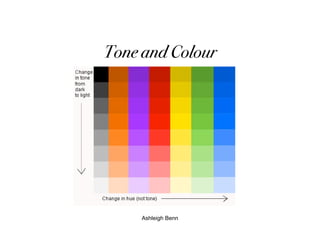
  • 1. Tone and Colour Ashleigh Benn
  • 2. Tone/colour in context • Context changes tonal value, as we can see in this piece the areas where a shadow would be, the colour and tone is dark, making the areas recede. The principle of line depicted is a gestured line done in an organic manner. Ashleigh Benn http://gratitude28.blogspot.com/
  • 3. Warm colours • Here one can see how the warmer colours move forward (the oranges and yellows) and how the cooler colours (black and grey) recede.The principle of line used here is slightly curved and the tone is what defines the line. Ashleigh Benn . http://fineartamerica.com/featured/narration--tonal-value-ii-jacek- jung.html
  • 4. Warm colour and Cold colour • In this image it is evident that in the squares/geometric lines the colours that are warmer come forward and the cooler colours move back and create depth. http://www.dreamhomesgroup.com/home-design/decorating-the-language-of- color-i/ Ashleigh Benn
  • 5. Warm and cool primary colours • In this piece the primary colours are evident, but if one looks closely slight alterations in the colour can create warmer and cooler effects, for example the yellow horse’s hair has areas that seem cooler then others, the paints used have been mixed ever so slightly to create depth and tonal variance by ‘cooling’ and ‘heating’ (through mixing) the primary colours. The quality of line here is curvilinear and organic.. http://www.freespiritart.com/primary-colors-glazier.php Ashleigh Benn
  • 6. Tertiary Colours • By adding together all three primary colours one creates tertiary colours, these can vary by adding more of the separate primary colours. http://www.willymaurer.ch/bio_en.htm Ashleigh Benn
  • 7. Tertiary Colours • In this piece one can see how the primary colours have been mixed ever so slightly to create these tertiary colour tones with organic lines. http://mharmston.blogspot.com/2010/10/watercolor_20.html Ashleigh Benn
  • 8. Dirty colours - Neutrals • The neutral colours seen here move towards the background while the red and yellow seem to pop forward. http://www.dailypainters.com/paintings/175470/Neutrals-by-Nancy-Eckels- Ashleigh Benn abstract-contemporary-modern-art-painting/
  • 9. Tint and Shade • A tint, is mixture of certain colours with white. Shade, is when a colour is darkened through black. In this piece the horizontal and vertical lines are reinforced through the tonal changes with tint and shade. http://bobotaro.wordpress.com/2007/04/07/office-building-new-abstract- line-pattern-ctyscape-painting-6128-2007-kazuya-akimoto-art-museum/ Ashleigh Benn
  • 10. Burnt colour • Burnt orange or burnt umber is a medium brown colour.In this piece there are invisible horizontal lines which flows with the burnt orange. http://www.etsy.com/listing/33540986/returning-4x6-inch- original-fine-art Ashleigh Benn
  • 11. Raw Colour • Cooler colours create a relaxed and peaceful mood.The cooler colours in the piece are calming amongst the turmoil of the geometric and curvilinear line. http://www.artscapesbysteve.com/galleries/gallery7.html Ashleigh Benn
  • 12. Saturation • The strength of a colour is created through the lack of black and white - this is known as saturated colour.In this image the intensity of the colours is so vivid that there is very little black and white used and only seen in areas used for tone. http://www.artscapesbysteve.com/galleries/gallery7.html Ashleigh Benn
  • 13. Purple next to other colours • I cropped this image to show how purple almost changes when placed next to another colour, see how the purple looks darker when only seen with the green apple and how it gradually becomes lighter when seen with the neutral. Ashleigh Benn http://aberkeleydaily.blogspot.com/
  • 14. Hue • Colour without tint or shade. It’s the true colour of something. Its not mixed or altered. http://fineartamerica.com/featured/landscape-indian-r-aggarwal.html Ashleigh Benn
  • 15. Translucent • Here one can see the background of the piece through the usage of watered down white paint. The organic shape and line is emphasized through changes in tone by thickening and thinning the paint. http://fineartamerica.com/featured/translucent-zully-m.html Ashleigh Benn
  • 16. Opaque • This painting is done using opaque colours, the paint is thick and the tone is defined through the geometric lines. http://www.jyotsnaprakashan.com/docs/portfolio.htm Ashleigh Benn
  • 17. Bright Colours • I chose this piece because of it’s colour intensity. The colours pop in between the horizontal lines. http://isaackirshbom.com/gallery/surrealistic_interpretations/ Ashleigh Benn
  • 18. Turned to grayscale • Here, I changed the previous image to grayscale, notice how the emotion is taken out of the piece and the tone is more noticeable. http://isaackirshbom.com/gallery/surrealistic_interpretations/ Ashleigh Benn
  • 19. Emotion in colour • I thought this piece was beautiful, there is an anxiety that is felt through the horizontal lines mixed with the intensity from the reds and oranges. http://www.paintingsilove.com/image/show/202332/action-abstract- painting-the-wild-currents-of-emotions- Ashleigh Benn
  • 20. Thank you Ashleigh Benn