
Recomendados
Más contenido relacionado
La actualidad más candente
La actualidad más candente (20)
Similar a Digipak analysis ½
Similar a Digipak analysis ½ (20)
Más de BradleyBarnes16
Más de BradleyBarnes16 (20)
Último
Último (20)
Digipak analysis ½
- 1. Digipak Analysis ½ James Bay – Chaos and the Calm By Bradley Barnes
- 2. Key Digipak Shots Throughout, James Bay’s digipak there seems to be lots of key digipak shots. I have taken pictures of all key elements and have uploaded them above. I will now analyse each digipak element in turn as I feel that it is important to understand how/why each shot is effective and why it has been produced. This will therefore enable me to produce my own digipak to a high standard by researching existing digipaks in order to find out what pictures/shots fits into a indie genre.
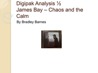
- 3. Digipak cover Font –The font of his name is in white and capital letters in order for it to stand out. The white contrasts to the rest of the dark low key lighting on the album cover because he is he star being the new album being released. Furthermore, his name is more eye-catching than the name of the album due to the white as it connotes his innocence and freedom which he tries to portray through the lyrics of his songs. The font style is also quite old fashioned and simple to mirror his style of music. Therefore, it connotes he is genuine and classic compared to other indie artists. Lighting – The borders of the album are dark and mysterious, whereas the middle of the album where he is situated is brightly lit (high key lighting) in order to represent him as the main focus. Due to him being caught in the moment/ natural position it represents that he does what he does for the love of music nothing else. His face is also bright against his dark clothing to ensure the audience see him and then will recognise that he is a new upcoming artist. The distressed and run down look of the location connotes his authenticity and vintage image. Expression – His expression is very natural and as if he is looking at the camera as though he is making eye contact with the audience in order to entice them to buy his product more as a result. Styling – The fact he is wearing a hat and has long hair, connotes his genre of music as indie pop alternative/old fashioned. By his outfit being dark and similar to everyday wear it resembles the fact that he is down to earth and sees himself just like a normal person, thus he isn’t caught up in the lime light.
- 4. CD Insert background The CD insert background is very unique and personalised towards James Bay as an artist, the iconic hat image will immediately connote that particular symbol to him as he’s the only well known artist to have long hair and to wear a hat whilst performing in modern day society. The black background also represents his indie rock style as black is normally associated with ‘rock’ artists. Due to the fact that his face is formed by white lines/shapes this therefore corresponds well with the dark black background and therefore adds to his audience interpretation that the dark colours presented are presented in order to portray his indie rock genre, hence why the black is for the rock element and the white (uplifting colour) is for the indie side of things.
- 5. Back cover of album - The back of the album presents what looks to be an old fashioned armchair, this therefore connotes that perhaps this digipak picture was taken in his living room as perhaps it is sentimental to him as a person. Due to it looking quite old fashioned we can therefore start to interpret that perhaps it was somebody's else in his family’s first that has been handed down to him, by the armchair appearing to be ripped and wearing away this would reinforce the fact that it has been handed down and that it has been in his family for several generations. The armchair can also represent that he may do most of his thinking time (for new songs) whilst sitting on this particular armchair, as a result we may add to the fact that the armchair is wearing away due to the fact that he’d be sitting there hours on end until he’d come up with an imaginative idea for a new single. - By the hat being placed on the armchair this represents him as an artist as we connote the black hat to him and his style of music. Therefore, as a result if a fan of his work only saw the back of the digipak they’d still know that its his new album purely due to the indie hat on the armchair. - The white writing over the armchair of the tracks that will be on his album contrasts well with the brown leather and the dark hat. By there being windows in the background this again reinforces the fact that this digipak shot may have been taken at home, the purpose of setting the windows in the shot means that more natural light will be able to come in and that the digipak shot itself wouldn’t need as much editing as a result of this. Therefore, the white writing connotes the freedom in which he wants to express throughout his music. - By the same image of his face (the same as on the CD insert) being on the back cover in the corner can again reinforce that the album is his as they will also straight away
- 6. CD The black CD again reinforces his indie rock genre. The black background is a common convention used throughout by James Bay, this will therefore make his audience resemble him with any black backgrounds they see as a result. On the CD his artist name and the album name is portrayed at the bottom of the CD, this is the same colour as to what is on the from of the album. This is useful in order for anybody picking up the CD (when it isn’t in a case) to know what it is and who the CD is by. There are copyright information on the CD in small print, this is the same size as ‘2015 Republic Records’ which is one of the labels he is signed to. The two bits of information are essential in digipak as they as the copyright issue will protect him and his music from others misusing it in order to benefit themselves. By having one of his record label companies on the CD it will enable his audience to therefore research the label if they want to know anything extra about how he works with the label/ or what other artists they also represent who may be of a similar genre to his.
- 7. Analysis of all Lyric pages By the pages in his album booklet having variation from black to white in every other double page it gives of an old fashioned feel to his album as a result. This may resemble the fact that he has researched into older artists in order to get some inspiration behind his music and possible ideas/colours to use within his digipak. Personally, I feel as if the white and black throughout offers a vintage feel to his digipak as a whole. This will therefore enable his audience to see both the indie and rock aspects of his music just by looking at his digipak. The three different poses of him also represent him to be natural which will portray him in a ‘good light’ as he is never seen to be sad, in public or throughout his digipak, which is why he is resembled as a young upcoming successful musician as a result.
- 8. Credits to his team Credits are often used in albums to indentify the people ‘behind the scenes’ , not all artists will however acknowledge their team within their albums. So by James Bay acknowledging his team it again portrays him in a good light and he is therefore seen as a team player as a result. Again on this page in the digipak we are presented with the common black and white colour theme. Again, as James is wearing dark clothing we are given a few light elements (the lighting behind him) in order for us to see his natural facial expressions and his hat which we stereotypically expect to find him wearing.
- 9. Back cover of Insert booklet Finally, the back cover of his insert booklet, has an image of him on it. By him laying down this may represent that he is taking time out to relax after a busy production period. An effect has been placed over this image and although the background is still dark, the sheets are white which means that he can easily be seen in the picture. Again, he is wearing dark clothing, this time in a form of a black jacket, whilst at the same time wearing a white top which may be done in order to reflect his innocence and brand. Overall, I feel that his digipak is very successful and one that we could take inspiration from when coming to create our own digipak. The constant colour theme used throughout is something which I will keep in mind when coming to produce my own digipak, although I will use predominately light colours in order to display my band’s members innocence and lust for one and other.