
Recomendados
Recomendados
Más contenido relacionado
Similar a Flinders St Station: Usability Test in a Mock Up station
Similar a Flinders St Station: Usability Test in a Mock Up station (20)
Último
Último (20)
Flinders St Station: Usability Test in a Mock Up station
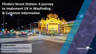
- 1. Flinders Street Station: A journey to implement UX in Wayfinding & Customer Information Carolina Gaitan Senior User Experience Planner Network Planning
- 2. The Brief and The Problem
- 3. We know the problem…
- 5. The Problem Outdated signage system – 10+ years Mixed messaging
- 6. The Problem Space Constraints Elizabeth St. Subway 8 Heritage constraints
- 7. Complex Environment Multiple Platforms Multiple Entry points Multimodal connections Multiple Places of Interest
- 8. Meet you ‘under the clocks’! Multiple Directions
- 9. All Types of Users Tourists & Visitors Daily Commuter / Frequent Users Infrequent Users Accessibility Community
- 10. Opportunities beyond Flinders Street Station New Stations Melbourne Metro Tunnel Level Crossing Removals
- 11. We know the problem… and we have the solution!
- 12. Let’s use the colour map London and many other cities around the world have used for a while… … But what does it mean for Melbourne?
- 13. First idea… Test the concepts in a Live Environment
- 14. So let’s create a mock up station
- 15. A fictitious new station within the current network
- 16. Touchpoints Isolation of visual elements 18
- 17. The approach 19 3 days of testing 90 members of the public A range of wayfinding tasks
- 18. 5 Tasks Starting the Journey Getting off the station Interchange Multi-modal & Train to Train Disruptions Finding Facilities Ticketing Lifts Toilets
- 19. Iterations 21 Colour Coding Strategy: Colour Map Directional signage Identification signage Real Time Information
- 20. We filmed participants from a central CCTV system
- 21. We filmed individual participants
- 22. Participants 24 Emphasis on people that require ‘visual’ signage.
- 23. 25
- 24. We recreated a station with a concourse
- 25. Multiple Platforms… two functional and a ‘subway’ for interchanges
- 26. Multiple entrances, connection to other modes and places of interest
- 28. Internal research team… first hand experience!
- 30. The Design Team talking about the process
- 32. The Findings
- 33. Some Results
- 34. What about the behaviour of different types of users?
- 40. The core insight into action ‘Purpose first’ vs. ‘type of asset first’
- 41. The core insight into action A service information point for unfamiliar users at a convenient ‘dwell point’ Fixed and Tailored Real Time Information Snapshot of service status for familiar users on the move. Same asset but different purpose = different content design
- 42. The design team putting the core insight into action
- 44. The future
- 45. 49 The evolution of Unfamiliar Passenger Information Displays
- 46. 50 The evolution of Familiar Passenger Information Displays
- 47. 51 Non- visual elements for vision impaired users Frameworks and guidelines to influence Environmental Design Application of the core insight in Online Support – Journey Planning Service Design to customer facing channels More touchpoints to work on Detail design of visual elements Applying the core insight in an Integrated Transport environment at TFV
- 48. 52
- 49. Any questions? Thank you Carolina Gaitan @carogaitang
Notas del editor
- Project: Customer Experience Strategic Plan for Flinders Street Station Workstream: Wayfinding & Information WHY – HOW – WHAT GOT FROM IT – WHAY IT’S BEEN A GREAT SUCCESS AND CASE STUDY FOR US AT PTV AND NOW TFV Why we set up a mock up station The results – what we learnt How that has change the way PTV and TFV approach design challenges
- Can some one tell me how this information of departures has been arranged? Maybe you’re not from Melbourne… some one from Melbourne? Come on… It’s pretty obvious that it’s arranged by ‘operational lines’ - these are the way the people from operations look at the metropolitan lines… pretty obvious right? Ok we could do better for tourist and visitors… Oh but ‘daily commuters’ would find it really easy!... Well they proved themselves wrong!
- Before the usability test with users we took the project team – people across PTV, MPV and Metro – and gave them some tasks (same principle of usability test) – we thought that it was going to be easy for them (most of them know the network upside down)… But they ended up like this poor guy looking at it for a long time to find the information they needed to perform the task and many of them were offered help from strangers (they didn’t have anything that identified themselves as PTV, Metro, etc)… This was eye opening for them.
- The starting point We know the problem – A broken system follow best practices around the world with colour map Problem to solution mindset
- The starting point We know the problem – A broken system Asset oriented follow best practices around the world with colour map Problem to solution mindset The LinkedIn post about heritage New stations – the signs are an afterthought in the process Complexity: XX stations – operations constrains The target market: from picking your most important customers to you have to design for everybody
- Stations with: Multiple lines going through – Multiple platforms Multiple entry points Multimodal connections Connection to multiple places of interest
- Plus multiple types of users
- The starting point We know the problem – A broken system follow best practices around the world with colour map Problem to solution mindset
- We created a new station within the network First day we tested the current system Days 2 & 3 new colour system and iterations from learnings
- Filmed everything with CCTV – control room
- Filmed some users with go pros
- Concourse Unpaid and paid area
- Ticketing booth – no details tested Information points
- Multiple platforms / 2 functional
- Multiple points of entry
- Internal group of facilitators including the design team and the product development team
- Debriefing sessions after each session