
Recomendados
Más contenido relacionado
La actualidad más candente
La actualidad más candente (20)
Destacado
Destacado (20)
Similar a Ancillary product poster - analysis task
Similar a Ancillary product poster - analysis task (20)
Más de Chris238
Último
Último (20)
Ancillary product poster - analysis task
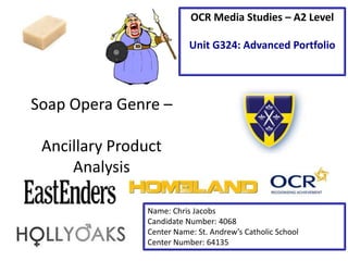
- 1. Soap Opera Genre – Ancillary Product Analysis OCR Media Studies – A2 Level Unit G324: Advanced Portfolio Name: Chris Jacobs Candidate Number: 4068 Center Name: St. Andrew’s Catholic School Center Number: 64135
- 2. Image – This image has been edited in a few ways, one of these is the red tint that has been mainly on the characters face. This connotes the danger that this character could be in and with red being related to death as well as it could be a bad sign for this individual. By making the edge dark it allows the main image which is the storyline to stand out from the rest of the screen. Tagline The tagline used for this advert can easily grab the attention of the reader with the effects the words give off. ‘Walford will change .Forever.’ That something is going to happen that will change the whole show that no one has ever seen before in EastEnders. Synergy with social media: The soap could be looking to attract and open up to a new target market. The hashtag bringing in Twitter allows viewers to comment on the show and allows to see other opinions on the episode from viewers. Institution Logo: This can create a sense of brand recognition for the channel by telling the audience what channel the show is on. By putting the logo in a small font it can connote that the channel don’t need as much attention because they are already a big company.
- 3. Analysis of the EastEnders Poster • I would ‘repeat’ (Steve Neale – 1980): • Having the model not to look at the camera because it gives an effect that the character is in trouble or guilty of something that she doesn’t want people to know. • The use of darkening the image around the edge so that the main part of the picture needs to viewed can stand out more from the picture. • The size of the logo because it doesn’t take any attention away from the story.
- 4. Image - The manipulation that is eluded to in this image is a fiery and burning effect. The denotations of this is that there could be a fire that is going to occur in the show. The connotations of this is that characters from the poster maybe main protagonists in orchestrating or victim to the fire. None of the characters are looking straight at the camera could be a sign that they all have apart to play in the fire or may have seen something that could link to what has gone on. Tagline – The tagline’s denotations are that Hollyoaks will change forever. This could connote that the actual actor wants to leave the show so they are going to kill them off in traditional soap style. The dates connote that you will have to watch every episode in that time frame to understand the whole story. Institution Logo - This is key for brand recognition for the channel to attract a new market from the viewers. It allows the viewers to know when the show is on and what channel it’s going to be on. By expressing the channel name in a big font it connotes that the channel is looking for viewers to watch the channel and so they can show off the shows they have on. Date – The date displayed on the poster is key to knowing when the show is actually on. This suggests that viewers can make sure they watch the show so they can take in this big storyline.
- 5. Analysis of Hollyoaks Poster • I would ‘repeat’ (Steve Neale – 1980): • I would repeat the manipulation of the main image because it will draw in the attention of the viewer because of the unusual effect it has. • The use of the big brand logo because it will give the channel good brand recognition. This is because they will know what channel the show will be on and market the channel as well. • The use of the date can be a key convention because it will be able to say when my new soap actually starts, so it is a good bit of marketing.
- 6. Main Image: The use of only one image on this page because this is just about ‘Homeland’. What draws the attention of the reader is the use of the effect on the image , a fade away effect giving connotations of the two sides of the character in this show. This poster is an inspiration but isn’t a soap opera Logo: This is key for brand recognition and allows the audience to get the information of when and where the show is on. The use of print text could connote the sense of professionalism in the show. Colour: The use of the colour yellow connotes that there is two sides to the main protagonist and that the other character in this picture is the only one who can see his other side. Masthead: The use of the backward E in the masthead can elude to the two sides of the character. Also this connotes that this can express the dealing of treason in the US with the flag being turned upside down and so the AE is the wrong way round so tells us he went against his country.
- 7. Analysis of Homeland Poster • I would ‘repeat’ (Steve Neale – 1980) • The fading of the image because of the effect it gives on the type of personality the main protagonist is in the show. • The use of the masthead having one letter reversed is good because it gives a connotations of the characters in the show once again, there two sided nature.
- 8. Student Exemplar Work – Textual Analysis Image – There has been a use of manipulation on this image to give it a desired effect. This connotes this in this image with the use of the wedding dress in the poster that main story revolves around the marriage of two people. The use of only putting colour on the children's toys connote that a child will be a key part of this soap opera. By the ma looking at ground it can connote he is guilty and can’t look at the woman in the eye connoting that he has betrayed someone most likely his wife. Synergy with Social media: The soap opera can looking to widen there target demographic . This is connotes a use of the hashtag so viewers can interact with one another, on the past episode and what they think of the concept of this new soap opera. Date: The date is displayed on this poster and is key to letting the audience know when the show is on. This connotes that the viewers need to make sure they are free at this time to watch the show and engage with the storyline eluded to into the poster.
- 9. Analysis of Student Exemplar Poster • I would ‘repeat’ (Steve Neale – 1980): • The use of a range of colours that express the connotations of the storyline. • The use of the big brand logo. It make sure that all the viewers know what and when the show is on and which specific channel. • The use of a main image connoting many storylines. This gives the viewer more interest into the various storylines that are used in the show.