
Recomendados
Más contenido relacionado
La actualidad más candente
La actualidad más candente (15)
Similar a Assignment 2 task 1b website analysis 1
Similar a Assignment 2 task 1b website analysis 1 (20)
Más de Chris_m3c2
Más de Chris_m3c2 (20)
Assignment 2 task 1b website analysis 1
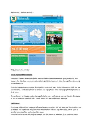
- 1. Assignment 2 Website analysis 1 http://www3.yha.com.au/ Visual styles and Colour Pallet The colour scheme reflects an upbeat atmosphere the kind expected from going on holiday. The colours also stand out from one another clashing slightly, however it stops the page from becoming dull and identical. The tabs have an interesting style. The headings of each tab are a similar colour to the body and are separated by a white band, this is to contrast and highlight the titles and telegraph their presence a little more. The uniformity of the page makes the page feel a lot more professional and user friendly. The layout is also an aid to the Presentation. It comes across as a very professional webpage. Typography The typography and font are easily definable between headings, link and body text. The headings are quite bold and capitalised; they also share the same font with the top of the page, which again is another example of the uniformity of the page. The body text is smaller and easy on the eyes and not as bold as the titles, so no confusion there.
- 2. The Links are surrounded by a coloured box and share the same font with the title and headings, but are not capitalised. Sounds None. Animations The only noticeable animation is on the right hand side of the page and it is a very simple transition between user submitted pictures. The animation is a slow fade and each image is a link to another part of the site. Interactivity The interactivity is limited but it is still a nice touch. The headings on the navigation bar deploy a drop down menu when the mouse hovers over it and the map, used for easy booking, changes colour when the mouse is moved over the states.