4. Dan Petty
Brian Lovin
Massimo Vignelli
Olly Moss
Jason Santa Maria
Fiona Staples
Jessica Harllee
Alex Griendling
Ryan Putnam
Andrew Kramer
Angela Oster
Jake Knapp
Bryn Jackson
Greg Coomer
François Truffaut
Jenny Johannesson
5. “If you can design one thing, you can design everything”
Massimo Vignelli
19. My 10 Year Roadmap
3
5
10
Get hired
Personal Website
T-shirt design
Impactful design
projects
Portfolio/ advertising
Improve JavaScript Skills< >
Learn
Level Up
Tee sales
Popular shots
Good JavaScript Skills< >
Mentoring and advice
Opportunities
Run races, <19min 5K, Drive, Passport
Snowboarding!
Travel
Published
Share knowledge
Learn
Build applications
Notas del editor
How do I design?
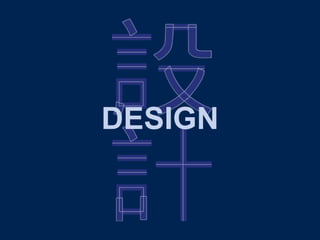
Before I move on to a case study, I’d like to talk more broadly about design to better explore my process. Where better to start than with simplicity; through its use of structure & geometry, spacing, colour and subtle clarifying design details the Kanji in the background exemplifies good design. Getting the basic theory right is the framework of good design.
Design means more to me than a job, it’s a passion. I aim to love what I do & keep doing what I love - make great design.
The theory is essential but in order to actually design we still need a toolbox. These are some of the most common tools I use. Pencil, paper, Illustrator I made the graphics in this slide with, Sketch…the list goes on. > These tools give me the flexibility to offer quality design work in branding, illustration, advertising, and even motion graphics.
I’ve worked mostly as a lone designer or in teams too small to offer the benefits of sharing and learning agencies offer. This is where the internet and networking and self guided learning come in. Jason Santa Maria at Vox Media taught me a lot about type, Bryn Jackson at Facebook taught me a lot about grids, Ex-googler Alex Griendling: illustration, Dan Petty: networking… design legend Massimo Vignelli…
Who is a big inspiration and very quotable, my favourite:
“If you can design one thing, you can design everything” applies to myself and how I am striving to diversify the design work I do and not limit the work I produce.
I’ve started expanding my portfolio including some of the work behind me, with class displays for The Ruth Gorse Academy, logos, corporate stationary, and even a table cover for events. My output has begun to diversify to meet organisation needs and to offer more value and quality. Not Quite Everything but getting there.
I created graphics and design work for The GORSE Academies Trust’s academies websites. Fantastic photography of the children and good typography does a lot of the design work. The websites are in line with visitors expectations of modern websites, and surpass them.
Morley Newlands' website had the most striking transformation with the before and after behind me. The website is a digital landmark the academy and everyone attached to it can be proud of.
The Ruth Gorse Academy needed house badges. Behind me you can see how once a design idea has moved beyond the sketch phase and been digitised it’s very fast to iterate and improve the design to a level of refinement and quality that I aspire to.
Research was a major part of this project evident in the badges themselves but also in the School Houses page I made for the website. This was the surprising extra element I take great pleasure in providing as it exceeds expectations.
Overall the academy is very pleased with the result which engaged the children.
I thought it appropriate to book the case study we’re about to see with a trendy graphic intermission…
…as i’m going to talk about a logo I designed for The National Grid for Reading, which is an exciting initiative in engaging youngsters with reading and discussions. The logo produced is behind me and this is what I’d like to explore today.
Here you can see the very first thing I did on the project which was to grid and a4 sheet of paper and begin exploring ideas associated with the brand. I do more of this sketching & explore promising ideas at a larger scale before I digitise them in Illustrator.
Tracing the inspiration is a good way to get an idea of how the design evolved. The logo ideas I generated took 2 distinct directions. In this instance an art teacher at The Ruth Gorse Academy had taken a crack at it, the logo needed digitising. The logo was artistic and had lots of her personal style in it and didn’t focus on the organisations goals and clear communication. Initial versions I created kept the essence of the logo. However I had an early sketch with GB colours but I wasn’t satisfied with either but I knew the importance in of having that be central due to my work with LEARN.ORG.UK LIMITED who were very conscious about representing both Britain and the EU as it aligned with their organisation goals. It was by chance that I came across The UK SPACE AGENCY logo as I follow them on Twitter which gave me a clear idea for what the logo should be. Promoting British Values is also important in education so it made absolute sense.
These are rejected ideas, the black and gold ones are trying to retain an essence of Jenny’s original.
However it was with the TNGR book grid logo there that I broke out into the direction of Britain being at the fore of the design. I wasn’t happy with these however and that’s when I saw the UK SPACE AGENCY Logo as a clear indication of what the logo should look like but also of how that idea could be used to greater effect to promote The National Grid for Reading.
But as you can see initial designs performed pretty poorly in testing, I used the feedback to improve the design. Upon analysing why it didn’t resemble a book I realised that unlike books going back thousands of years, it’s pages originated from the outer edge and not the spine.
The logo can be split up in to four key concepts which are integral to the projects aims and identity. Firstly, reading - as the project is aimed at encouraging it and I’m sure kids will find the way the book is incorporated into the logo fun. Secondly, Britain, promoting British values, and improving young Britains reading skills, thirdly, Grid based design - it couldn’t be any other way and it’s in the name. Note the logo breaks from the grid in the top right corner. which brings me onto finally. Upward trending to reinforce the idea of improving reading skills and discussions.
That’s the end of the case study and almost the presentation but I do have one slide I couldn’t bring myself to cut.
That’s it and I’d now be happy to answer any questions you have.
And that’s my roadmap which shows a version of how I see myself progressing personally and professionally. I’m currently 3-4 years into this. I’ve managed to build a personal website, using the latest techniques I’m proud of from a technical standpoint. Learning to drive and getting a passport I’m working on finishing as soon as possible and I’m currently enjoying looking in to dribbble, an invite only network for designers to share work, however i’m going to the Leeds meet up and want to get an invite from someone before the end of the year. If i keep on working hard it won’t be hard to see how opportunities will open up for me by year 10 and I’m excited for the future.