SlideShare una empresa de Scribd logo
1 de 3
Colour:  the colour of this double page spread sticks to a certain colour scheme, the use of 3 colours creates a decorative feeling without confusing the reader or making them confused with the many colours to look at. The black text upon the white background stands out so the reader can easily read the information, black is usually the colour that the audience will read in day to day life therefore they are used to it. The colour blue on the back of their headline shows an important point, blue is also used on the pug and enlarged text so the reader takes notice. The colour blue is also a cool colour with teenagers (mirroring the headline) Although it could be said that blue has a stereo type of a colour for boys, this colour may offend the audience in somewhat to elate the double page to boys only. Image:  the image on this double page spread is clear and relevant to the headline. By the 3 boys lying slouched on the bed, it relates to the headline ‘teenager’ especially when teenagers are know for being lazy. The long shot shows the boys outfits which may interest the reader to read more about them as they look similar to their taste. The room that the boys are in is an average room which may be similar to those of the audiences. The reader then may feel they are connected to the band and read the double page spread. The image also covers a whole page , with the headline connecting the pages together, the image interests the reader, The smaller image on the page breaks up the text in the so the page so it isn't boring and full of text. Audience : the audience for this double page spread would be teenagers, aged 13+ who have a interest in new music. It would interest both male and females but in particular boys by the use of colour on the page. Other:  On this page NME uses a pug by the heading ‘NME loves’ this makes the audience read on, if their favourite magazine thinks the band is good initially so will they. On the right hand side of the page the double page also shows other bands with smaller information on, this enables the audience to still get some information of the page if they aren't too keen on the main headline, NME could of made the text bigger in the main headline however they filled the page with other bands so the audience isn't bored however sticking to the same colour scheme.
Colour:  the colour on this magazine is very simple. the text on the page stands out by the strong contrast of black and white The colour red also contrasts with the other colours on the page. This contrast makes the text stand out and gives a bold effect on the double page spread. The background colour is dark and miserable although its easy for the reader to read the text this colour may bore the reader and give a dismal feel upon the magazine. The stripes that are used on the left hand corner of the magazine mirror the stripes on ‘examples’ jumper. This connection connects the pages together making a double page spread. The dark colour background allows the image to stand out more particularly ‘examples’ face. Audience:  the audience for this double page spread would be male and female aged 13+ and have a interest in r&b music. It may also interest older readers by the detailed and informative text included on the page. Image:  the imaged used on this magazine is a medium close up of a well known r and b singer (‘example’). The image shows ‘example’ as a cool character which may inspire the audience to be like him. The image also advertises the adidas logo and jumper, this will also attract the audience to look at what their favourite singer wears and copy them as a role model. the image fills a whole page, by doing this the audience may rip the picture out for future reference if they want to. The use of a full page image breaks up the amount of text on the double page spread so the audience doesn’t get bored or unwilling to read on. When the audience turns over the previous page to this double page spread, they instantly know what the information is about by the large image on the left. Other:  a negative feature on this magazine is the lack of connection between the two pages, the image is one page and the text is another, the colour scheme is the same in both the pages but they aren't linked so a reader could confuse it for two separate pieces of information. The text is also in huge clumps, it could bore the reader
Other:  the headline for this double page is effective by the use of words, the film that most people know is called ‘lady of the tramp’ however this double page has played with words and heading ‘lady is a champ’ This connects the audience with magazine making them read on because its interesting. The writing on this double page is all clumped together in a large block. This may bore the reader and theirs less chance they will read the information. Although this technique does make the magazine more unique, usually we see on double page spreads, either one page of text or spread over the two. The more the magazine stands out from its competitors the more chance the audience will pick it up. Colour : the colour used on this double page is quite dark and dull, on the other hand it uses a contrasting colour on the heading and text, white contrasts with black enabling the audience to read the text better. the colour white of the text also mirrors ‘lady gagas’ hair which is near enough white. The use of this colour scheme doesn’t make the page too busy or bright, although it could be questioned that it makes it boring. Black is usually known as a sophisticated colour, this is similar to ‘lady gagas’ pose which is sexy yet sophisticated. Audience:  he audience for this magazine will be teenagers aged 13+ and have a interest in lady gaga( the person who is headlining the page) they will be both make and female however more female by the artist whose filling the page. Image:  the image used on this magazine is very dramatic, the long shot shows ‘lady gaga’ in a show which connects with the headline and text underneath. The dancers are faded out and lady gaga is highlighted, as if the light is shining on her, this light may represent the spotlight and her fans will looking up to her, it makes the reader see lady gaga as a role model particularly how a low angle shot is used. Interestingly the image covers the whole page interestingling the reader by there is no blank space present.

Más contenido relacionado

Más de Danielle_Chaddock (20)

Evaluation
EvaluationEvaluation
Evaluation
 
Presentation1ghgf
Presentation1ghgfPresentation1ghgf
Presentation1ghgf
 
Presentation1
Presentation1Presentation1
Presentation1
 
Presentation1
Presentation1Presentation1
Presentation1
 
Layout for contents
Layout for contentsLayout for contents
Layout for contents
 
Layout for contents
Layout for contentsLayout for contents
Layout for contents
 
Layout slides
Layout slidesLayout slides
Layout slides
 
Presentation1fdf
Presentation1fdfPresentation1fdf
Presentation1fdf
 
Presentation1
Presentation1Presentation1
Presentation1
 
Presentation1
Presentation1Presentation1
Presentation1
 
Presentation1
Presentation1Presentation1
Presentation1
 
Presentation1
Presentation1Presentation1
Presentation1
 
Presentation1
Presentation1Presentation1
Presentation1
 
Review of front pages
Review of front pagesReview of front pages
Review of front pages
 
Review of front pages
Review of front pagesReview of front pages
Review of front pages
 
Review of front pages
Review of front pagesReview of front pages
Review of front pages
 
Presentation18
Presentation18Presentation18
Presentation18
 
Presentation1hhh
Presentation1hhhPresentation1hhh
Presentation1hhh
 
Presentation1hhh
Presentation1hhhPresentation1hhh
Presentation1hhh
 
Presentation18
Presentation18Presentation18
Presentation18
 

Último

Finding Java's Hidden Performance Traps @ DevoxxUK 2024
Finding Java's Hidden Performance Traps @ DevoxxUK 2024Finding Java's Hidden Performance Traps @ DevoxxUK 2024
Finding Java's Hidden Performance Traps @ DevoxxUK 2024
Victor Rentea
 
Architecting Cloud Native Applications
Architecting Cloud Native ApplicationsArchitecting Cloud Native Applications
Architecting Cloud Native Applications
WSO2
 

Último (20)

How to Troubleshoot Apps for the Modern Connected Worker
How to Troubleshoot Apps for the Modern Connected WorkerHow to Troubleshoot Apps for the Modern Connected Worker
How to Troubleshoot Apps for the Modern Connected Worker
 
Polkadot JAM Slides - Token2049 - By Dr. Gavin Wood
Polkadot JAM Slides - Token2049 - By Dr. Gavin WoodPolkadot JAM Slides - Token2049 - By Dr. Gavin Wood
Polkadot JAM Slides - Token2049 - By Dr. Gavin Wood
 
Finding Java's Hidden Performance Traps @ DevoxxUK 2024
Finding Java's Hidden Performance Traps @ DevoxxUK 2024Finding Java's Hidden Performance Traps @ DevoxxUK 2024
Finding Java's Hidden Performance Traps @ DevoxxUK 2024
 
Apidays New York 2024 - The Good, the Bad and the Governed by David O'Neill, ...
Apidays New York 2024 - The Good, the Bad and the Governed by David O'Neill, ...Apidays New York 2024 - The Good, the Bad and the Governed by David O'Neill, ...
Apidays New York 2024 - The Good, the Bad and the Governed by David O'Neill, ...
 
presentation ICT roal in 21st century education
presentation ICT roal in 21st century educationpresentation ICT roal in 21st century education
presentation ICT roal in 21st century education
 
Artificial Intelligence Chap.5 : Uncertainty
Artificial Intelligence Chap.5 : UncertaintyArtificial Intelligence Chap.5 : Uncertainty
Artificial Intelligence Chap.5 : Uncertainty
 
Repurposing LNG terminals for Hydrogen Ammonia: Feasibility and Cost Saving
Repurposing LNG terminals for Hydrogen Ammonia: Feasibility and Cost SavingRepurposing LNG terminals for Hydrogen Ammonia: Feasibility and Cost Saving
Repurposing LNG terminals for Hydrogen Ammonia: Feasibility and Cost Saving
 
AI in Action: Real World Use Cases by Anitaraj
AI in Action: Real World Use Cases by AnitarajAI in Action: Real World Use Cases by Anitaraj
AI in Action: Real World Use Cases by Anitaraj
 
Apidays New York 2024 - Scaling API-first by Ian Reasor and Radu Cotescu, Adobe
Apidays New York 2024 - Scaling API-first by Ian Reasor and Radu Cotescu, AdobeApidays New York 2024 - Scaling API-first by Ian Reasor and Radu Cotescu, Adobe
Apidays New York 2024 - Scaling API-first by Ian Reasor and Radu Cotescu, Adobe
 
Vector Search -An Introduction in Oracle Database 23ai.pptx
Vector Search -An Introduction in Oracle Database 23ai.pptxVector Search -An Introduction in Oracle Database 23ai.pptx
Vector Search -An Introduction in Oracle Database 23ai.pptx
 
Connector Corner: Accelerate revenue generation using UiPath API-centric busi...
Connector Corner: Accelerate revenue generation using UiPath API-centric busi...Connector Corner: Accelerate revenue generation using UiPath API-centric busi...
Connector Corner: Accelerate revenue generation using UiPath API-centric busi...
 
Introduction to use of FHIR Documents in ABDM
Introduction to use of FHIR Documents in ABDMIntroduction to use of FHIR Documents in ABDM
Introduction to use of FHIR Documents in ABDM
 
DBX First Quarter 2024 Investor Presentation
DBX First Quarter 2024 Investor PresentationDBX First Quarter 2024 Investor Presentation
DBX First Quarter 2024 Investor Presentation
 
Corporate and higher education May webinar.pptx
Corporate and higher education May webinar.pptxCorporate and higher education May webinar.pptx
Corporate and higher education May webinar.pptx
 
Apidays New York 2024 - Accelerating FinTech Innovation by Vasa Krishnan, Fin...
Apidays New York 2024 - Accelerating FinTech Innovation by Vasa Krishnan, Fin...Apidays New York 2024 - Accelerating FinTech Innovation by Vasa Krishnan, Fin...
Apidays New York 2024 - Accelerating FinTech Innovation by Vasa Krishnan, Fin...
 
Strategize a Smooth Tenant-to-tenant Migration and Copilot Takeoff
Strategize a Smooth Tenant-to-tenant Migration and Copilot TakeoffStrategize a Smooth Tenant-to-tenant Migration and Copilot Takeoff
Strategize a Smooth Tenant-to-tenant Migration and Copilot Takeoff
 
Navigating the Deluge_ Dubai Floods and the Resilience of Dubai International...
Navigating the Deluge_ Dubai Floods and the Resilience of Dubai International...Navigating the Deluge_ Dubai Floods and the Resilience of Dubai International...
Navigating the Deluge_ Dubai Floods and the Resilience of Dubai International...
 
Architecting Cloud Native Applications
Architecting Cloud Native ApplicationsArchitecting Cloud Native Applications
Architecting Cloud Native Applications
 
Web Form Automation for Bonterra Impact Management (fka Social Solutions Apri...
Web Form Automation for Bonterra Impact Management (fka Social Solutions Apri...Web Form Automation for Bonterra Impact Management (fka Social Solutions Apri...
Web Form Automation for Bonterra Impact Management (fka Social Solutions Apri...
 
[BuildWithAI] Introduction to Gemini.pdf
[BuildWithAI] Introduction to Gemini.pdf[BuildWithAI] Introduction to Gemini.pdf
[BuildWithAI] Introduction to Gemini.pdf
 

Media double page

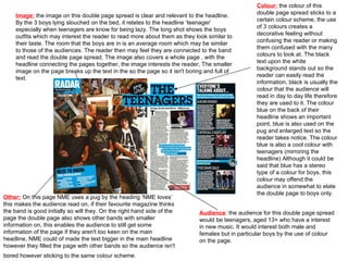
  • 1. Colour: the colour of this double page spread sticks to a certain colour scheme, the use of 3 colours creates a decorative feeling without confusing the reader or making them confused with the many colours to look at. The black text upon the white background stands out so the reader can easily read the information, black is usually the colour that the audience will read in day to day life therefore they are used to it. The colour blue on the back of their headline shows an important point, blue is also used on the pug and enlarged text so the reader takes notice. The colour blue is also a cool colour with teenagers (mirroring the headline) Although it could be said that blue has a stereo type of a colour for boys, this colour may offend the audience in somewhat to elate the double page to boys only. Image: the image on this double page spread is clear and relevant to the headline. By the 3 boys lying slouched on the bed, it relates to the headline ‘teenager’ especially when teenagers are know for being lazy. The long shot shows the boys outfits which may interest the reader to read more about them as they look similar to their taste. The room that the boys are in is an average room which may be similar to those of the audiences. The reader then may feel they are connected to the band and read the double page spread. The image also covers a whole page , with the headline connecting the pages together, the image interests the reader, The smaller image on the page breaks up the text in the so the page so it isn't boring and full of text. Audience : the audience for this double page spread would be teenagers, aged 13+ who have a interest in new music. It would interest both male and females but in particular boys by the use of colour on the page. Other: On this page NME uses a pug by the heading ‘NME loves’ this makes the audience read on, if their favourite magazine thinks the band is good initially so will they. On the right hand side of the page the double page also shows other bands with smaller information on, this enables the audience to still get some information of the page if they aren't too keen on the main headline, NME could of made the text bigger in the main headline however they filled the page with other bands so the audience isn't bored however sticking to the same colour scheme.
  • 2. Colour: the colour on this magazine is very simple. the text on the page stands out by the strong contrast of black and white The colour red also contrasts with the other colours on the page. This contrast makes the text stand out and gives a bold effect on the double page spread. The background colour is dark and miserable although its easy for the reader to read the text this colour may bore the reader and give a dismal feel upon the magazine. The stripes that are used on the left hand corner of the magazine mirror the stripes on ‘examples’ jumper. This connection connects the pages together making a double page spread. The dark colour background allows the image to stand out more particularly ‘examples’ face. Audience: the audience for this double page spread would be male and female aged 13+ and have a interest in r&b music. It may also interest older readers by the detailed and informative text included on the page. Image: the imaged used on this magazine is a medium close up of a well known r and b singer (‘example’). The image shows ‘example’ as a cool character which may inspire the audience to be like him. The image also advertises the adidas logo and jumper, this will also attract the audience to look at what their favourite singer wears and copy them as a role model. the image fills a whole page, by doing this the audience may rip the picture out for future reference if they want to. The use of a full page image breaks up the amount of text on the double page spread so the audience doesn’t get bored or unwilling to read on. When the audience turns over the previous page to this double page spread, they instantly know what the information is about by the large image on the left. Other: a negative feature on this magazine is the lack of connection between the two pages, the image is one page and the text is another, the colour scheme is the same in both the pages but they aren't linked so a reader could confuse it for two separate pieces of information. The text is also in huge clumps, it could bore the reader
  • 3. Other: the headline for this double page is effective by the use of words, the film that most people know is called ‘lady of the tramp’ however this double page has played with words and heading ‘lady is a champ’ This connects the audience with magazine making them read on because its interesting. The writing on this double page is all clumped together in a large block. This may bore the reader and theirs less chance they will read the information. Although this technique does make the magazine more unique, usually we see on double page spreads, either one page of text or spread over the two. The more the magazine stands out from its competitors the more chance the audience will pick it up. Colour : the colour used on this double page is quite dark and dull, on the other hand it uses a contrasting colour on the heading and text, white contrasts with black enabling the audience to read the text better. the colour white of the text also mirrors ‘lady gagas’ hair which is near enough white. The use of this colour scheme doesn’t make the page too busy or bright, although it could be questioned that it makes it boring. Black is usually known as a sophisticated colour, this is similar to ‘lady gagas’ pose which is sexy yet sophisticated. Audience: he audience for this magazine will be teenagers aged 13+ and have a interest in lady gaga( the person who is headlining the page) they will be both make and female however more female by the artist whose filling the page. Image: the image used on this magazine is very dramatic, the long shot shows ‘lady gaga’ in a show which connects with the headline and text underneath. The dancers are faded out and lady gaga is highlighted, as if the light is shining on her, this light may represent the spotlight and her fans will looking up to her, it makes the reader see lady gaga as a role model particularly how a low angle shot is used. Interestingly the image covers the whole page interestingling the reader by there is no blank space present.