
Recomendados
Más contenido relacionado
La actualidad más candente
La actualidad más candente (20)
Destacado
Similar a Conventions of a social realism poster
Similar a Conventions of a social realism poster (20)
Último
Último (20)
Conventions of a social realism poster
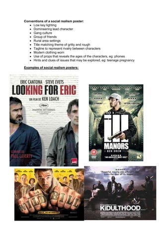
- 1. Conventions of a social realism poster: Low key lighting Domineering lead character Gang culture Group of friends Rural area settings Title matching theme of gritty and rough Tagline to represent rivalry between characters Modern clothing worn Use of props that reveals the ages of the characters, eg: phones Hints and clues of issues that may be explored, eg: teenage pregnancy Examples of social realism posters:
- 3. Final Poster: On my poster, the font used is to represent rough and a broken effect in relation to the short film being called ‘Broken Trust’. This is used so the theme of appealing to a younger audience would be recognised. By having the two main characters on my poster hugging each other whilst one is looking at their phone shows that there must be a slight indication of mistrust between the two characters. This is important because it uses the conventions of rivalry between two people as shown on the poster. Also, by having Jodie (one of the characters) face looking away from the image of the hugging with a very upsetting and distraught facial expression demonstrates that the Jodie is feeling isolated and betrayed by her friend. I decided to use the background as a brick wall because from researching other social realism films, I realised that it was commonly used especially in outside locations in rural areas. I believe this helped to set the setting of the characters background in more detail. The brick wall does not suggest that the film will be filmed in a nice glamorous area. By other social realism film poster such as, Adulthood using brick walls on their posters then audiences can relate to this film as another one of the social realism films. The credit block on poster is situated on the bottom of my poster in red font. This is because this colour was used as a theme throughout my poster because I wanted to demonstrate a dull and serious element to my poster. The credit blocks of the casts’ names were in colour order so that it could create more enigmas on why two of the characters are in the same colour. The audience may begin to wonder if there is a sort of relationship between the two characters. However, I did not use a tagline on my poster because I did not want to make my poster overcrowded with too much writing. This worked perfectly as I could make my poster into a teaser poster. The diverse of colours on images are often used on social realism films; however this is illustrated by the effectiveness of lighting. This is because
- 4. social realism films will use low key lighting on inferior characters. On my poster I did not use this because I thought adding a different effect such as black and white would be more effective. This is because Jodie will be seen as vulnerable and defenceless against her friend. Using the picture of me and Jodie hugging in high definition colour with exposed contrast will draw the audiences’ attention quickly. This is because they would be drawn into the competition and jealousy between both characters.