
Recomendados
Más contenido relacionado
Más de EmmaWinter
Nme front cover analysis
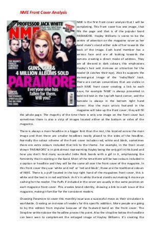
- 1. NME Front Cover Analysis NME is the first front cover analysis that I will be completing. This front cover has one image, that fills the page and that is of the popular band PARAMORE. Hayley Williams is scene to be the centre of attention on the magazine cover as her band mate’s stand either side of her towards the back of the image. Each band member has a serious face and are all looking towards the camera creating a direct mode of address. They are all dressed in dark colours, this emphasises Hayley’s hair and increase an attraction for the reader (it catches their eye). Also its supports the stereotypical image of the ‘Indie/Rock’ look. There are certain conventions that are visible in each NME front cover creating a link to each issue, for example ‘NME’ is always presented in bold red text in the top left hand corner, and the barcode is always in the bottom right hand corner. Also the main artists featured in the magazine will take up the front cover; they will fill the whole page. The majority of the time there is only one image on the front cover but sometimes there is also a strip of images located either at the bottom or sides of the magazine. There is always a main headline in a bigger font than the rest, this located across the main image and then there are smaller headlines neatly placed to the sides of the headline. Normally the colour scheme of the front cover includes red, white and black, sometimes there are extra colours included that link to the theme. For example, in the front cover shown ‘PARAMORE’ is in pink almost representing Hayley being the only girl in this band and how you don’t find many successful Indie Rock bands with a girl in it, emphasising the femininity that is existing in the band. Most of the time there will be two colours included in a caption or headline and they will be the same all over the front cover of the magazine. In this front cover they use ‘white and red’ or ‘red and black’; these are the traditional colours of NME. There is a puff located in the top right hand of the magazines front cover, this is white and the text is in red and black. As it’s in white the text stands out making it more eye caching for the reader. The Puffs if included in the cover are usually in the same position on each magazine front cover. This creates brand identity, showing a link to each issue of the magazine, making it familiar for the consistent readers. Choosing Paramore to cover this monthly issue was a successful move as their circulation is worldwide. Creating an increase of readers for this specific addition. More people are going to by this edition from impulse because of the featured band on the front cover. The Strapline written above the headline proves this point. Also the strapline below the headline can been seen to complement the enlarged image of Hayley Williams. It’s creating the
- 2. NME Front Cover Analysis representation of the image showing her glowing beauty, making it easy for someone to fall for her; ‘Everyone else has fallen . . . ’. The images, chosen straplines and the featured bands/ artists on this front cover all have something to do with success, becoming bigger and better. ‘The Manics finally conquer America’ this just proves to the audience that if targets are set and you work hard enough, they will be achieved. This builds hope and confidence for smaller known artists in the audience of the readers. This particular NME front cover doesn’t show it is an ‘Indie/Rock’ magazine. The layout is neat and quite plain reversing the original image of what we think of when it comes to this genre; messy, busy, grabs others attention and stands out.