
Recomendados
Más contenido relacionado
La actualidad más candente
La actualidad más candente (20)
Similar a PPT PowerPoint Guideline
Similar a PPT PowerPoint Guideline (20)
Más de Evelyn Loh
Último
Último (20)
PPT PowerPoint Guideline
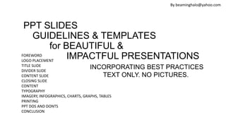
- 1. FOREWORD LOGO PLACEMENT TITLE SLIDE DIVIDER SLIDE CONTENT SLIDE CLOSING SLIDE CONTENT TYPOGRAPHY IMAGERY, INFOGRAPHICS, CHARTS, GRAPHS, TABLES PRINTING PPT DOS AND DONTS CONCLUSION PPT SLIDES GUIDELINES & TEMPLATES for BEAUTIFUL & IMPACTFUL PRESENTATIONS INCORPORATING BEST PRACTICES TEXT ONLY. NO PICTURES. By beaminghalo@yahoo.com
- 2. Foreword It is important to provide a Consistent visual first impression with external audiences. By utilizing a PowerPoint template with Both internal and external audiences, The brand is reinforced and our work will be more cohesive FOR MESSAGE RETENTION! 2 main types of presentations: • Oral. Screen projection and visual walkthrough, led by presenter • Written. Meant to be printed. ie. executive summary. Better than word docx. Include slide/page number. By beaminghalo@yahoo.com
- 3. MAKE YOUR AUDIENCE FEEL IMPORTANT. CONSIDERATIONS. • DIRECT & FOCUSED. TO THE POINT. IMPACTFUL. • PROFESSIONAL • CONSISTENT • THERE MAY BE COLOUR BLIND AUDIENCES. • ELDERLY MAY NOT BE ABLE TO SEE SMALL FONTS FROM A DISTANCE. •HAVE A GOAL FOR THE AUDIENCE. By beaminghalo@yahoo.com
- 4. PLANNING THE SLIDES • CALL TO ACTION ON FIRST SLIDE. DESIGN FOR IMPACFUL PURPOSE. • GOOD STORY FIRST. CONTENT IS KING. • CONTENT FLOW EVEN MORE IMPORTANT • INCLUDE A SURPRISE ELEMENT. AWE INSPIRING. • WHY SHOULD AUDIENCE CARE? THEY HAVE TO CARE! • WHY THEY NEED THE SERVICE/ PRODUCT? • MAKE A SALE @ THE END. GET COMMITMENT TO A DATE/ DELIVERABLES. • DON’T LEAVE WITHOUT A RESOUNDING YES! By beaminghalo@yahoo.com
- 5. LET AUDIENCES SPREAD THE WORD • CONTENT SPREADS AS IT INSPIRES A COMMUNITY. • LET YOUR PRESENTATION BE THE TALK OF THE TOWN. • REINFORCE A BELIEF. • REFUTE OPPOSING ARGUMENTS • START PASSIONATE DISCUSSIONS. REACH AUDIENCES! YOUTUBE. LINKEDIN. SLIDESHARE. INSTAGRAM. FACEBOOK. TWITTER. By beaminghalo@yahoo.com
- 6. ONE IDEA PER SLIDE • PLAN CONTENT FIRST • CREATE A HOOK! A SCRIPT/ SHORT STORY. • THINK OF ASSERTION OF SLIDES • REMEMBER…THERE IS A SCRIPT. FOLLOW THE SCRIPT. • GET RID OF CLUTTER • NOT TOO MANY IMAGES. BEWARE OF FANCY FONTS By beaminghalo@yahoo.com
- 7. Use Every Slide as an Advertisement Design from the Audience’s Perspectives Focus on: Core Message/ Story Good Structure/ Outline By beaminghalo@yahoo.com CATCH the Audience’s ATTENTION!
- 8. Think Big, Bold & Beautiful! By beaminghalo@yahoo.com Try Maximum 15 Slides Have a reason for Every Content!!!!!!!
- 9. Reframe Audience’s Mindset Shift the way people think, work & innovate. Introduce incremental change or disruptive thinking. Design for a Purpose/ Agenda. Clutter-Free. Consistent. By beaminghalo@yahoo.com
- 10. Keep Audiences in Mind • What will be interesting? • What they will learn/ takeaway? Ultimate objective? • What will keep them focused? • Ask the audience questions. • Ask hypothetical/ rhetorical questions. •Appeal to Emotions! Create Stimuli! Involve the Audience By beaminghalo@yahoo.com
- 11. Key Takeaways • Ensure readability • Consistent colours and visuals to reinforce message • Aesthetic is secondary • Use phrases • SKIP the bullet points • Slides only enhance presentation. The presenter is the focus. •Know your audience, occasion & speaking environment By beaminghalo@yahoo.com
- 12. Key Takeaways • IT’S NOT ABOUT THE PRODUCT. • ITS ABOUT THE ENERGY. FEEL GOOD ADRENALINE. • RESONATE WITH CUSTOMERS. • DIFFERENT FROM COMPETITORS. • RELEVANT PRODUCT TRUTHS. CATERING FOR DIFFERENT CUSTOMERS. BUSINESS/ EVENTS/ RETAIL….. By beaminghalo@yahoo.com
- 13. ACTION SAFE AREA. KEEP WITHIN 95% OF THE SLIDE. By beaminghalo@yahoo.com 95% 90% ACTION SAFE 85% TITLE SAFE +
- 14. Logo Placement • Logo Placement on every slide and pages of any marketing material. • Logo Visibility – Good resolution image. • Best to include full logo. By beaminghalo@yahoo.com
- 15. Opening Slides/ Title slides EFFECTIVE TITLE captures key takeaway & stirs reader to take action It is important to provide a Consistent visual first impression with external audiences. By utilizing the PowerPoint template with Both internal and external audiences, The brand is reinforced and our work will be more cohesive. By beaminghalo@yahoo.com
- 16. Divider Slides Good presentations parse overarching messages into understandable and sequential sections. A divider slide between sections helps the audience take a momentary "breather." The divider slide can help the presenter change the pace of the presentation after the little pause it provides. Impactful image Gives audience visual breaks Reinforces ideas Make audience think By beaminghalo@yahoo.com
- 17. Navigation Slides By beaminghalo@yahoo.com If you are presenting an approach, Use Navigation Aide to Step through Content. 1. Present Approach upfront followed by description of each phase. 2. Place Navigation Aide at Top of each Subsequent slides Analyse Design Deliver We will follow a 3-phased approach for STRATEGY DEVELOPMENT Plan & Research Capture Attention Call To Action
- 18. Closing Slides May include the brand positioning, the master brand logo signature, or a strong photographic impression. Utilizing an impactful closing slide helps to reinforce awareness of the brand. Create templates that includes various closing slides. 1. Quotes 2. Powerful Image 3. Contacts By beaminghalo@yahoo.com
- 19. Bullet Points • Use bullet points sparingly • Use a maximum of nine bullet points per slide. Ideally 6. • Do not use end punctuation in bullets • Use only one sentence per bullet • Each bullet point less than 6 words long By beaminghalo@yahoo.com
- 20. • For maximum legibility and clarity, we recommend the following typographic styles Capitalize first word only/ first letters of titles. • Type size guidelines should vary for audience size to ensure legibility of projected text • Use San Serif fonts. Limit to 2-3 fonts maximum. • Arial is the standard typeface. Keep size consistent. • BOLD Headlines and try not to use underline— • 24 pt at least. Typography Guidelines By beaminghalo@yahoo.com
- 21. TYPOGRAPHY DOs & DON’Ts DO: use the specified fonts DO: make the size easily readable for your audience DO: use size and weight to create contrast DO: remember that less is more DON’T: use vertical or horizontal scaling DON’T: add a stokes or outline DON’T: add drop shadows DON’T: cram too much in. Less is more By beaminghalo@yahoo.com
- 22. Helvetica Font – The Best Choice By beaminghalo@yahoo.com Contrasting text colours to highlight keywords. Use Bold to stand out. Look Bold & Clean
- 23. • Short and sweet. • Can repeat agenda slides at the start of each section • and highlight the topic to be covered Agenda. [DO NOT use the word Contents] By beaminghalo@yahoo.com Agenda Introduction Selecting the Right Template Agenda Slides & Navigation Write Effective Titles Use of Colours Conclusion Appendices WHO ARE WE? WHAT WE DO? OUR PORTFOLIO OUR CLIENTELE WHAT’S NEXT? Agenda
- 24. Content •NO ORPHAN WORD!!! • 3-5 points each slide. No more than 6 lines of text per slide. • Targeted message. Ask a question and answer it. • Short and sweet. • Pictures speak a thousand words. • Determine purpose and actions to elicit from audiences. • Determine slides used in which location and for which context. • Office settings? Shops? Shopping centres? Conferences? • For students? Business partners? Potential clients? Shop customers? • To buy? To inform? To pique interest? By beaminghalo@yahoo.com
- 25. • Backgrounds should not distract! •Consistent, repeated backgrounds. • Choose either the white or the dark background for text or imagery slides, depending on content or position within the show for good contrast. • Make sure to stay within one color background per section to maintain a consistent flow • Use divider slides for structure and pace • Recommend master template to have white background free from watermarks and distracting colours. • Only use dark backgrounds for oral presentations, not for print. Content Slides Background By beaminghalo@yahoo.com
- 26. • Minimal. Should not distract! •DO NOT use Sounds to get attention. • Use animation, slide transitions, audio and videos sparingly Transitions Effects By beaminghalo@yahoo.com
- 27. Recommended Colours Flat Colours are Beautiful By beaminghalo@yahoo.com Use no more than 5 colours Pastel is Soothing #2B2937 R43 G41 B55 #5FA6A9 R95 G166 B169 #C84D64 R200 G77 B100 #496BAB R73 G107 B171 #EAAE54 R234 G174 B84
- 28. Colour Palette Signature colours Pantone Equivalent CMYK RGB Web-safe Hex 2125U C M Y K 0.438 0.0178 0 0.337 R G B 95 166 169 #5FA6A9 SHIFTED COLOUR VARIANTS #655FA9 TINTED COLOUR VARIANTS #384B6A NATURAL BASE/ PASTEL VARIANT #8FA9DB By beaminghalo@yahoo.com
- 29. Recommended Colours By beaminghalo@yahoo.com Use Basic Colours. Avoid Neon. Use Pastel Colours. Black & White 1 Grey 3-4 Blue 1 Other Colour Use same colour scheme throughout entire presentation
- 30. 1. Make Messages Powerful 2. Photos that enhance Meaning. Simple. Punchy. 3. Catch People’s Attention • Avoid the use of clip art. • USE FREE STOCK PHOTOS THAT ARE NOT CLICHÉ. • Good picture resolution yet small file size • Prepare images at 100% at 96dpi for final placement in a presentation • Inserting large scale images at resolutions greater than 96dpi will increase the overall size (MB) of your final presentation • Use dark background to print out the vibrancy of images. • Have Good & Strong Contrast! • Try 1 image for 1 slide Imagery Guidelines By beaminghalo@yahoo.com
- 31. • Balance whitespace and enhance readability. • Let your slides breathe! Whitespace By beaminghalo@yahoo.com
- 32. Use Infographics By beaminghalo@yahoo.com 1 OUT OF 10 PEOPLE WILL SHARE THIS PRESENTATION 8.23.2 1.4 1.2 Sales 1st Qtr 2nd Qtr 3rd Qtr 4th Qtr NOT Awful Pie Chart
- 33. Charts and Graphs Guidelines • Strive for clean, simple charts and graphs. EFFECTIVE LABELLING! • Avoid 3-dimensional graphs, charts or diagrams • Choose high-contrast colors for optimal legibility • Charts and graphs for online presentations should not use text smaller than 12 pt • Charts and graphs should always support content and not detract from messages • Create charts and graphs within PowerPoint—do not import from another application • The following slides are examples of charts and graphs created within PowerPoint 33 By beaminghalo@yahoo.com
- 34. Charts and Graphs (Examples) By beaminghalo@yahoo.com
- 35. Tables Category • Item one • Item two • Item three • Item four • Item five Category two • Item one • Item two • Item three • Item four • Item five Category three • Item one • Item two • Item three • Item four • Item five Category four • Item one • Item two • Item three • Item four • Item five 35 Category Category 2 Category 3 Category 4 Category 5 • Item one • Item one • Item one • Item one • Item one • Item two • Item two • Item two • Item two • Item two • Item three • Item three • Item three • Item three • Item three • Item four • Item four • Item four • Item four • Item four By beaminghalo@yahoo.com
- 36. Printing the Presentation (Colour) • The typical office printer has a resolution output of 300 dpi • Resolution is the sharpness of an image on paper, computer screen, or other mediums • Low resolution images are ideal for use in electronic documents or printed presentations as they allow for portability via electronic mail and quick printing on a standard office printer; they should not be used for high-quality printing • Photography resolution should be no larger than 96 dpi @ 100% By beaminghalo@yahoo.com
- 37. Printing the Presentation (B&W) • To print in pure black and white • select File | Print and dialogue box will appear • ensure that the ‘Microsoft PowerPoint’ tab is selected • click ‘Pure Black & White’ • click ‘Print’ By beaminghalo@yahoo.com
- 38. The Presentation – Tips for Presenter • DRESS WELL. FIRST IMPRESSION COUNTS. • Know your slides inside out • Speak with confidence. Loud & clear. • Maintain eye contact • Elaborate with memorable examples • Be Animate • POINT TO THE SLIDE FOR EMPHASIS • Have intermission slide if needed • Ask question By beaminghalo@yahoo.com
- 39. Presentation PPT Tips – Shortcut Keys • Turn pointer off – Shift+A/ Ctrl+H • Jump to any slide. Just type slide #number then Enter • Blank the screen – Press . Period key. Or button B • BACKSPACE/ left arrow to go to previous slide • Esc to end show • F5 start slide show By beaminghalo@yahoo.com
- 40. Mistakes to Avoid • Using display fonts as body copy • Lengthy line spillover – Orphan word • Using multiple random images without consistent design structure • Formatting inconsistency • Slapping solid text boxes over busy images. By beaminghalo@yahoo.com
- 41. What Makes Ineffective PPT? • Slide read word for word • Text too small • Full sentences used • NO TAKEAWAY FOR EACH SLIDE By beaminghalo@yahoo.com
- 42. Last Slide • End with Q&A slide • Invite audience to ask questions • Provide visual aid during question period • Avoid ending presentation abruptly By beaminghalo@yahoo.com
- 43. Proofing Slides • Proof slides for spelling errors • Use of of repeated words • Grammatical errors • Make sure presebtation flow is logical Get someone to help you, especially if English is NOT your first language. By beaminghalo@yahoo.com
- 44. PREPARE WELL. • PRACTICE • SAVE YOUR PRESENTATION IN THE CLOUD • MAKE BACKUP COPIES By beaminghalo@yahoo.com
- 45. Summary • Aim for effective communication, with right message structure, simple language and omitting unnecessary words • Capture key messages in the titles • Generously use pictures and diagrams, making sure content is supported. • Keep it Simple • Tell a Story. Have a Roadmap. Be relevant. Logical flow. • Images that Evoke Emotions. • Use quotes sparingly. • Always CLOSE w A Thought Provoking Question • Enhance Communication with the audience. • Less is More!!!! By beaminghalo@yahoo.com
- 46. Conclusion • Effective & Strong Closing • Due to Recency Effect – info near the end followed by info at the beginning are the easiest to recall • Summarise main points • Suggest future avenues of research END WITH A PUNCH LINE. OPPORTUNITY TO PROVIDE…. BENEFITS……… WITH AWESOME MEMORABLE EXPERIENCES TO SHARE THAT WILL ACHIEVE THE GOAL OF……….. FEELING GOOD & SATISFIED By beaminghalo@yahoo.com
- 47. Create your own Templates. DO NOT use Stock Templates. By beaminghalo@yahoo.com
- 48. BLACK/ DARK BACKGROUND • FOR PICTURES/ EMPHASIS • dark backgrounds may work well for conference presentations, • but are not ideal for corporate or printing purposes. By beaminghalo@yahoo.com
- 49. Contact Us Company Name Address Email Telephone Website Facebook Page/ Group LinkedIn Company Page Twitter, Instagram BETTER TO USE ICONS. By beaminghalo@yahoo.com