9 Avant-Garde Color Trends to Expect in 2018
•
1 recomendación•760 vistas

Like many trends, color trends begin with the experts. Folks in fashion or design circles choose their favorite hues, and gradually, they spread to other industries. One day, cool, sleek colors are all the rage. The next, it’s bright purples. Studies on color psychology show that color truly does influence our subconscious emotions. That’s why you need to make smart color choices for your brand. Brands presented consistently are 3-4x more likely to experience brand visibility. So for the sake of consistency, there’s no need to chase every trend. But evolving your visual identity can help you keep up with consumers. If you’re rebranding or designing a logo in the new year, keep in mind these 2018 color trend predictions.

Recomendados
Más contenido relacionado
Similar a 9 Avant-Garde Color Trends to Expect in 2018
Similar a 9 Avant-Garde Color Trends to Expect in 2018 (16)
Más de FreeLogoServices
Más de FreeLogoServices (7)
Último
Último (20)
9 Avant-Garde Color Trends to Expect in 2018
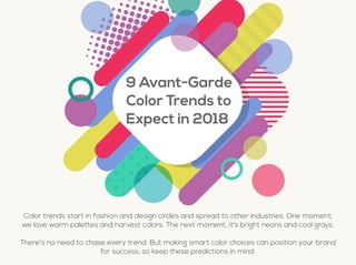
- 1. Color trends start in fashion and design circles and spread to other industries. One moment, we love warm palettes and harvest colors. The next moment, it's bright neons and cool grays. There's no need to chase every trend. But making smart color choices can position your brand for success, so keep these predictions in mind. 9 Avant-Garde Color Trends to Expect in 2018
- 2. Primary colors remixed Bright hues have inspired new and established brands in recent years. So, it's no surprise that the Pantone Color Institute expects a return to primary colors. 11
- 3. Ombre gradients22 Ombre adds impact to almost any design, and in a solid-color logo, ombre shading is the perfect way to add texture to a flat, simple design. Ombre styles blend gradients of one color or multiple hues.
- 4. Folk multiculturalism33 Technology brings people together, sparking a greater appreciation for globalism. As a byproduct, designers are getting inspiration from folk and artisanal traditions around the world. In the Sherwin Williams 2018 Color Forecast, the "Unity" palette celebrates folk and indigenous patterns.
- 5. Low saturation44 Prepare for a gradual move from ultra-bright to low-intensity colors. While many brands use boldness to stand out, others prefer less saturation for a timeless look.
- 6. Colorful overlapping55 Going forward, many color trends are about reinventing solids. Overlapping hues is another way to make sure bright colors aren't fighting for attention. The technique typically alternates two colors in sections of a logomark.
- 7. High-tech hues66 Tech-inspired palettes merge youthful contemporary hues with the colors of digital data and machinery. The Sherwin Williams "Connectivity" palette taps into this upbeat movement, representing ideas, innovation, and social freedom.
- 8. Brilliant duo-tones77 The duo-tone trend blends two colors for a double-exposure or sheen effect. Duo-tones offer a more mature evolution from intensely saturated rainbow colors.
- 9. Retro spring88 Vintage colors of the 60s and 70s are making a comeback in spring palettes. Romantic, carefree pastel shades of peach, rose, lavender, and teal are getting a modern update.
- 10. Black and white99 It probably doesn't have to be said, but black and white is the eternal color scheme. This power duo exudes strength, sophistication and seduction.
- 11. Choose the right color palette Creating a brand image is about telling a story and evoking the right emotions in your audience. So be sure to choose colors that reflect your industry and brand message. Sources џ https://www.pantone.com/fashion-color-trend-report-new-york-spring-2018 џ https://www.sherwin-williams.com/architects-specifiers-designers/inspiration/color- forecast/2018-color-forecast/ џ https://designshack.net/articles/graphics/design-trend-vivid-rainbow-colors/ џ http://inkbotdesign.com/logo-design-trends-2017/ џ https://imjustcreative.com/2017-colour-trends/2017/04/24