
Recomendados
Más contenido relacionado
Más de FudgeBUNNY
Más de FudgeBUNNY (20)
Último
Último (20)
Textual analaysis power point
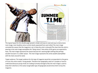
- 1. This typical layout for this double page spread is simple and easy to read and easy to look at (one main image, main headline and an article clearly separated from each other) The main image connoted the season that the magazine is set in (how the artist is dressed) The chain that the artist is wearing in the main image exemplifies the “bling culture” that artists of this genre are expected to have. The main image represents the season because he’s wearing light clothing that perhaps wouldn’t be worn in a colder season. The main image represents the artists wealth (exemplified with the chain around his neck) Target audience: The target audience for this type of magazine would be correspondent to the genre of music this artist creates. Young people. Therefore the typography used isn’t complex or hard to understand because young minds are reading it (mostly teenagers) Also the main image is used to draw their attention or the easily recognisable type of typography would entice them to buy this magazine.
- 2. The text is written in received pronunciation (standard English) This music magazine’s Double page spread style adheres to the typical style used in other music magazines. A single image is used and it represents a teenage girl that seems to be independent. This article draws in its audience by the use of its floating quote, attempting to make the Audience think about the statement, judge it and then read on to find out more. The audience is being directly addressed to by the floating quote. The layout is simple, yet appealing And seems easy enough to read. Finally, the colours used on this double page spread are simple And are known to work well with eachother (red and black on the main image or black and white For the floating text and background)
- 3. This is a typical double page spread because it has a main image on one half, and the main heading and article on the other. The main image connotes the band’s age range, maybe appealing to a slightly older generation such as old school rock. The way they’re dressed also strengthens their genre, and the tattered background can be used to connote the “retro” feel of music. Target Audience: The old western look of the main image suggests that the audience may be quite old fashioned and into rock music (the electric guitars that two of them are holding) The right column’s layout sets itself out almost as a newspaper, perhaps inferring that the majority of the magazine’s readership is mature.