SlideShare una empresa de Scribd logo
1 de 5
The title is not a real word and uses alliteration, it is eye-catching and enjoyable to say The Headline ‘ibiza’ is a popular place as a lot of dance music is played there, so relates well to the magazine and the audience Offers a free dance music CD – appeals to people who listen to music as they are more likely to buy the magazine if it has  CD rather than a book for example. The woman in the main image is wearing a bikini. This is linked to the headline ‘ibiza’ as people are dressed in bikinis most of the time because they are on the beach.  Model wearing sunglasses to show she is in the sun, and could also mean she has been out all night dancing to the music so she does not want us to see her eyes. The image is full of bright colours to resemble the bright lights in nightclubs etc. The articles are about hotels and parties etc. This attracts the attention of the readers as they will probably be into parties and clubbing because of the music they listen to.  Barcode on the bottom right of the page. This is following the conventions of a magazine. This magazine is very bright and bold. This makes it ‘in your face’ which makes it eye catching. The choice of colours and the main image determines the target audience which is young people interested in  dance music and clubbing.  Analysis of front cover
The title is bright and is in a bold colour which is eye catching. The word is quite unusual but simple so will stick in people’s heads.  The top bar is eye catching and is different to other magazines as many magazines do not have this. It gives a little bit more information about the magazine and is useful especially when there is little writing in the front cover.  The main image is just one person with a white background. This makes all the attention go on to the person. He also has words painted on him that are associated with dance music such as ‘Attitude’ and ‘Respect’ This could show that the person and the magazine are trying to illustrate the fact that they know a lot about dance music and want to show you that.  Main headline uses alliteration to catch attention of the audience. Also follows the colour scheme of red and black which adds quality to the magazine Article titles are in bold colours and there are abbreviations. This is eye catching and quick and simple to read, which makes people more likely to look at them. The barcode is located on the bottom left hand corner of the magazine. This is an unusual place for it to be, which could show that the magazine is unlike any magazine so it is worth buying. Analysis of front cover
This celebrity is trying to make it big by getting her music into the American market. You can see this by the big text behind her saying ‘USA’ Sitting on the American flag, adding to the ‘American’ theme. Also shows she wants to be at the top in American charts because the flag is underneath her.  Play of words,  because her song  is called ‘ You  got the love’ not ‘ USA  got the love’ This catches the attention of the  Audience because they notice it is not the real title of the  song so may read on to find out about it. Dressed provocatively- shows she is trying to  fit in with the American  market because that is the stereotypical way American celebrities dress.  Her pose is very confident  which shows she is in control and confident about her look  and her music.  The first letter of the article is larger than the rest And is done using calligraphy. It indicates the start of the article and makes it look quite elegant. This catches the reader’s attention and also follows the conventions of an article.  Introduction is separate from  the other writing  which makes it  stand out more.  Article written in columns which follows the conventions  of how articles are written so the  readers are more likely to read it. Play on words to create article Image takes up 1 whole page  Analysis of Double page spread
Large image taking up about half the page. Shows to people clubbing and enjoying themselves. This adds to the ‘happy’ vibe this magazine seems to be giving off, which makes the reader happy and feel good about themselves, so they should buy it again if they want to feel happy.  Multiple smaller images are also used. This could be because the magazine editor wanted to make the magazine more interesting which makes the reader want to buy the magazine again. Stereotypically, people who enjoy dance music and clubbing, do not want to read much about clubs, but would rather look at images of clubs to see what the people are like etc.  The colour scheme of this double page spread is yellow and pink, following the colour scheme of this magazine’s front cover. The numbers on each of the 3 articles are in pink and look like the lights at a club. This is a good effect to use and will catch the attention of the readers.  Analysis of Double page spread
The word ‘Contents’ is in the  top right hand corner in  a bold font coloured white. Writing is in white and yellow. This makes the magazine look professional as it is following a colour scheme and also makes the writing easier to read as there is a  black background.  Large image taking  approximately 1/3 of the page up. This will make it seem like there is  less writing on the page, so the reader is more likely to pay  attention to the writing.  Track list of the free CD included with the magazine. This splits the page up and makes it different from other contents pages.  Simple, easy to read contents list with the page numbers on the left hand side in yellow and the page titles to the right in white writing. This is good because it is easily understandable and the readers can use it by only looking at it in a glance.  Large page number of what the image is about. This makes the story easy to find in the magazine.  Analysis of contents page

Más contenido relacionado

La actualidad más candente

Music Magazine analysis
Music Magazine analysisMusic Magazine analysis
Music Magazine analysislouisaelena
 
Music Magazine Survey: Analysis of results
Music Magazine Survey: Analysis of resultsMusic Magazine Survey: Analysis of results
Music Magazine Survey: Analysis of resultstashaay27
 
Magazine Research - AS Media Studies
Magazine Research - AS Media StudiesMagazine Research - AS Media Studies
Magazine Research - AS Media StudiesStephStafford01
 
My Music magazine project
My Music magazine projectMy Music magazine project
My Music magazine projectMeganLydia
 
How did I attract/address my audience?
How did I attract/address my audience?How did I attract/address my audience?
How did I attract/address my audience?tashaay27
 
Research on existing music magazines
Research on existing music magazinesResearch on existing music magazines
Research on existing music magazinesGiran11
 
Magazine research On Existing Music Magazines
Magazine research On Existing Music MagazinesMagazine research On Existing Music Magazines
Magazine research On Existing Music Magazinesgiran_11
 
Magazine analaysis
Magazine analaysisMagazine analaysis
Magazine analaysisjeny_green
 
Liiar analysis for fc,cp and dps
Liiar analysis for fc,cp and dpsLiiar analysis for fc,cp and dps
Liiar analysis for fc,cp and dpsChloe Jayde
 
Analysis of front covers
Analysis of front coversAnalysis of front covers
Analysis of front coversZaralucille
 
Analysis of 'blues matters'
Analysis of 'blues matters'Analysis of 'blues matters'
Analysis of 'blues matters'Archie Cameron
 
Analysis of front covers
Analysis of front coversAnalysis of front covers
Analysis of front coversZaralucille
 
front cover Analysis
front cover Analysis front cover Analysis
front cover Analysis chloeditch
 
Contnets page analysis
Contnets page analysisContnets page analysis
Contnets page analysisaliceprice
 
Contents page analysis.
Contents page analysis.Contents page analysis.
Contents page analysis.Levita123
 
Analysis of magazines (1)
Analysis of magazines (1)Analysis of magazines (1)
Analysis of magazines (1)sherieallen
 
Contents Page Overview
Contents Page OverviewContents Page Overview
Contents Page Overviewrebeccadahl98
 

La actualidad más candente (20)

Music Magazine analysis
Music Magazine analysisMusic Magazine analysis
Music Magazine analysis
 
Front Cover Analysis
Front Cover AnalysisFront Cover Analysis
Front Cover Analysis
 
Music Magazine Survey: Analysis of results
Music Magazine Survey: Analysis of resultsMusic Magazine Survey: Analysis of results
Music Magazine Survey: Analysis of results
 
Magazine Research - AS Media Studies
Magazine Research - AS Media StudiesMagazine Research - AS Media Studies
Magazine Research - AS Media Studies
 
My Music magazine project
My Music magazine projectMy Music magazine project
My Music magazine project
 
How did I attract/address my audience?
How did I attract/address my audience?How did I attract/address my audience?
How did I attract/address my audience?
 
Research on existing music magazines
Research on existing music magazinesResearch on existing music magazines
Research on existing music magazines
 
Magazine research On Existing Music Magazines
Magazine research On Existing Music MagazinesMagazine research On Existing Music Magazines
Magazine research On Existing Music Magazines
 
Magazine analaysis
Magazine analaysisMagazine analaysis
Magazine analaysis
 
Magazine analysis
Magazine analysisMagazine analysis
Magazine analysis
 
Liiar analysis for fc,cp and dps
Liiar analysis for fc,cp and dpsLiiar analysis for fc,cp and dps
Liiar analysis for fc,cp and dps
 
Analysis of front covers
Analysis of front coversAnalysis of front covers
Analysis of front covers
 
Analysis of 'blues matters'
Analysis of 'blues matters'Analysis of 'blues matters'
Analysis of 'blues matters'
 
Analysis of front covers
Analysis of front coversAnalysis of front covers
Analysis of front covers
 
front cover Analysis
front cover Analysis front cover Analysis
front cover Analysis
 
Contnets page analysis
Contnets page analysisContnets page analysis
Contnets page analysis
 
Contents page analysis.
Contents page analysis.Contents page analysis.
Contents page analysis.
 
Analysis of magazines (1)
Analysis of magazines (1)Analysis of magazines (1)
Analysis of magazines (1)
 
Contents
ContentsContents
Contents
 
Contents Page Overview
Contents Page OverviewContents Page Overview
Contents Page Overview
 

Destacado

Destacado (19)

247
247247
247
 
Life is-a-puzzle
Life is-a-puzzleLife is-a-puzzle
Life is-a-puzzle
 
Superstitions in Indian Culture
Superstitions in Indian CultureSuperstitions in Indian Culture
Superstitions in Indian Culture
 
энэтхэгийн ёс зүй11 angi
энэтхэгийн ёс зүй11 angiэнэтхэгийн ёс зүй11 angi
энэтхэгийн ёс зүй11 angi
 
Tuul hicheel
Tuul hicheelTuul hicheel
Tuul hicheel
 
Word presentation
Word presentationWord presentation
Word presentation
 
Product Presentatie Thole
Product Presentatie TholeProduct Presentatie Thole
Product Presentatie Thole
 
Lopez martos bloc_5
Lopez martos bloc_5Lopez martos bloc_5
Lopez martos bloc_5
 
Ubuntu tsahim test1111
Ubuntu tsahim test1111Ubuntu tsahim test1111
Ubuntu tsahim test1111
 
Technology infusion presentation
Technology infusion presentationTechnology infusion presentation
Technology infusion presentation
 
7 бие даалт
7 бие даалт7 бие даалт
7 бие даалт
 
Cashion Policy & Procedures
Cashion Policy & ProceduresCashion Policy & Procedures
Cashion Policy & Procedures
 
Gen y research__25th_nov
Gen y research__25th_novGen y research__25th_nov
Gen y research__25th_nov
 
Glogster
GlogsterGlogster
Glogster
 
Glover's class
Glover's classGlover's class
Glover's class
 
11 бие даалт
11 бие даалт 11 бие даалт
11 бие даалт
 
Yadargaa 2
Yadargaa 2Yadargaa 2
Yadargaa 2
 
их монгол улс 8 анги
их монгол улс 8 ангиих монгол улс 8 анги
их монгол улс 8 анги
 
харилцаа
харилцаахарилцаа
харилцаа
 

Similar a Dance Music Magazine's Eye-Catching Visuals and Bright Design

Detailed analysis of music magazine
Detailed analysis of music magazineDetailed analysis of music magazine
Detailed analysis of music magazineginagoodall
 
Magazine resarch powerp 2 final
Magazine resarch powerp 2 finalMagazine resarch powerp 2 final
Magazine resarch powerp 2 finalJessica Smith
 
Magazine resarch powerp 2
Magazine resarch powerp 2Magazine resarch powerp 2
Magazine resarch powerp 2Jessica Smith
 
Task3 smash hits analysis
Task3 smash hits analysisTask3 smash hits analysis
Task3 smash hits analysisdenhamj1
 
Media coursework 9 analysis'
Media coursework 9 analysis'Media coursework 9 analysis'
Media coursework 9 analysis'Mcyuzuzo
 
Media coursework 9 analysis'
Media coursework 9 analysis'Media coursework 9 analysis'
Media coursework 9 analysis'Mcyuzuzo
 
Music magazine analysis
Music magazine analysisMusic magazine analysis
Music magazine analysisRhysLadd
 
Textual Analysis - Media Studies
Textual Analysis - Media StudiesTextual Analysis - Media Studies
Textual Analysis - Media StudiesNorah Fields
 
Question 1
Question 1Question 1
Question 18210_SK
 
Front cover analysis.
Front cover analysis.Front cover analysis.
Front cover analysis.AmyShields00
 
Contents analysis
Contents analysis Contents analysis
Contents analysis tafigaza
 
Contents page analysis
Contents page analysisContents page analysis
Contents page analysisKirsty Allen
 

Similar a Dance Music Magazine's Eye-Catching Visuals and Bright Design (20)

Detailed analysis of music magazine
Detailed analysis of music magazineDetailed analysis of music magazine
Detailed analysis of music magazine
 
Magazine Analysis
Magazine AnalysisMagazine Analysis
Magazine Analysis
 
Magazine resarch
Magazine resarch Magazine resarch
Magazine resarch
 
Magazine resarch powerp 2 final
Magazine resarch powerp 2 finalMagazine resarch powerp 2 final
Magazine resarch powerp 2 final
 
Magazine resarch powerp 2
Magazine resarch powerp 2Magazine resarch powerp 2
Magazine resarch powerp 2
 
Task3 smash hits analysis
Task3 smash hits analysisTask3 smash hits analysis
Task3 smash hits analysis
 
Media coursework 9 analysis'
Media coursework 9 analysis'Media coursework 9 analysis'
Media coursework 9 analysis'
 
Media coursework 9 analysis'
Media coursework 9 analysis'Media coursework 9 analysis'
Media coursework 9 analysis'
 
Magazine analysis
Magazine analysisMagazine analysis
Magazine analysis
 
Analysis
AnalysisAnalysis
Analysis
 
Media work 1.
Media work 1.Media work 1.
Media work 1.
 
Music magazine analysis
Music magazine analysisMusic magazine analysis
Music magazine analysis
 
Reasearch
ReasearchReasearch
Reasearch
 
Textual Analysis - Media Studies
Textual Analysis - Media StudiesTextual Analysis - Media Studies
Textual Analysis - Media Studies
 
Question 1
Question 1Question 1
Question 1
 
Front cover analysis.
Front cover analysis.Front cover analysis.
Front cover analysis.
 
Contents analysis
Contents analysis Contents analysis
Contents analysis
 
Media
MediaMedia
Media
 
Contents page analysis
Contents page analysisContents page analysis
Contents page analysis
 
All 3 deconstructions
All 3 deconstructionsAll 3 deconstructions
All 3 deconstructions
 

Dance Music Magazine's Eye-Catching Visuals and Bright Design

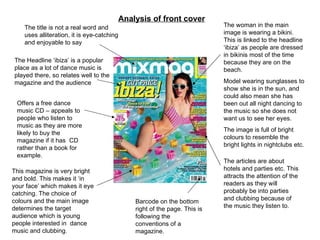
  • 1. The title is not a real word and uses alliteration, it is eye-catching and enjoyable to say The Headline ‘ibiza’ is a popular place as a lot of dance music is played there, so relates well to the magazine and the audience Offers a free dance music CD – appeals to people who listen to music as they are more likely to buy the magazine if it has CD rather than a book for example. The woman in the main image is wearing a bikini. This is linked to the headline ‘ibiza’ as people are dressed in bikinis most of the time because they are on the beach. Model wearing sunglasses to show she is in the sun, and could also mean she has been out all night dancing to the music so she does not want us to see her eyes. The image is full of bright colours to resemble the bright lights in nightclubs etc. The articles are about hotels and parties etc. This attracts the attention of the readers as they will probably be into parties and clubbing because of the music they listen to. Barcode on the bottom right of the page. This is following the conventions of a magazine. This magazine is very bright and bold. This makes it ‘in your face’ which makes it eye catching. The choice of colours and the main image determines the target audience which is young people interested in dance music and clubbing. Analysis of front cover
  • 2. The title is bright and is in a bold colour which is eye catching. The word is quite unusual but simple so will stick in people’s heads. The top bar is eye catching and is different to other magazines as many magazines do not have this. It gives a little bit more information about the magazine and is useful especially when there is little writing in the front cover. The main image is just one person with a white background. This makes all the attention go on to the person. He also has words painted on him that are associated with dance music such as ‘Attitude’ and ‘Respect’ This could show that the person and the magazine are trying to illustrate the fact that they know a lot about dance music and want to show you that. Main headline uses alliteration to catch attention of the audience. Also follows the colour scheme of red and black which adds quality to the magazine Article titles are in bold colours and there are abbreviations. This is eye catching and quick and simple to read, which makes people more likely to look at them. The barcode is located on the bottom left hand corner of the magazine. This is an unusual place for it to be, which could show that the magazine is unlike any magazine so it is worth buying. Analysis of front cover
  • 3. This celebrity is trying to make it big by getting her music into the American market. You can see this by the big text behind her saying ‘USA’ Sitting on the American flag, adding to the ‘American’ theme. Also shows she wants to be at the top in American charts because the flag is underneath her. Play of words, because her song is called ‘ You got the love’ not ‘ USA got the love’ This catches the attention of the Audience because they notice it is not the real title of the song so may read on to find out about it. Dressed provocatively- shows she is trying to fit in with the American market because that is the stereotypical way American celebrities dress. Her pose is very confident which shows she is in control and confident about her look and her music. The first letter of the article is larger than the rest And is done using calligraphy. It indicates the start of the article and makes it look quite elegant. This catches the reader’s attention and also follows the conventions of an article. Introduction is separate from the other writing which makes it stand out more. Article written in columns which follows the conventions of how articles are written so the readers are more likely to read it. Play on words to create article Image takes up 1 whole page Analysis of Double page spread
  • 4. Large image taking up about half the page. Shows to people clubbing and enjoying themselves. This adds to the ‘happy’ vibe this magazine seems to be giving off, which makes the reader happy and feel good about themselves, so they should buy it again if they want to feel happy. Multiple smaller images are also used. This could be because the magazine editor wanted to make the magazine more interesting which makes the reader want to buy the magazine again. Stereotypically, people who enjoy dance music and clubbing, do not want to read much about clubs, but would rather look at images of clubs to see what the people are like etc. The colour scheme of this double page spread is yellow and pink, following the colour scheme of this magazine’s front cover. The numbers on each of the 3 articles are in pink and look like the lights at a club. This is a good effect to use and will catch the attention of the readers. Analysis of Double page spread
  • 5. The word ‘Contents’ is in the top right hand corner in a bold font coloured white. Writing is in white and yellow. This makes the magazine look professional as it is following a colour scheme and also makes the writing easier to read as there is a black background. Large image taking approximately 1/3 of the page up. This will make it seem like there is less writing on the page, so the reader is more likely to pay attention to the writing. Track list of the free CD included with the magazine. This splits the page up and makes it different from other contents pages. Simple, easy to read contents list with the page numbers on the left hand side in yellow and the page titles to the right in white writing. This is good because it is easily understandable and the readers can use it by only looking at it in a glance. Large page number of what the image is about. This makes the story easy to find in the magazine. Analysis of contents page