

Recomendados
Más contenido relacionado
La actualidad más candente
La actualidad más candente (20)
Destacado
Similar a Shout contents page
Similar a Shout contents page (20)
Último
Último (20)
Shout contents page
- 1. Shout Contents Page By Hollie Gittins
- 2. Introduction to the magazine The music genre is pop. ‘Shout’ magazine contains content that isn’t just music based however it does include pop music in it. The publisher of ‘Shout’ Magazine is D.C Thompson & Co. Ltd The target audience is girls aged 11-14 years old with interests in pop music, the latest fashion, beauty trends, celeb gossip and true life stories.
- 3. Articles The articles are on celebrities, fashion, real life stories and problems. These articles are typically expected when targeting a young teenage audience. They also include competitions and quizzes as well as horoscopes and subscriptions to the magazine. One of the articles includes Crush of the month which is Zayn Malik who is a pop singer in One Directon which appeals to girls.
- 4. Language The language used is informal and chatty which is appropriate for the target audience as it appears it is easy to understand and they can relate more to it. The use of words such as ‘Cringe’ and ‘The Diva Dial’ show that Shout magazine is targeting young girls. By using ‘#’ it relates to twitter showing the audience which is being targeted as it is mainly teenagers that use twitter.
- 5. Page numbers There are 74 page numbers in Shout magazine. The last page focuses on what is going to appear in the next issue. Due to there being 74 pages it shows that there is a lot of content within the magazine and so shows that is worth the money that is charged for it. Some of the pages are found on the images which makes it easier for the reader to find the article.
- 6. Fonts The fonts used are rounded appropriate for the genre of pop. They appear to be feminine which is appropriate for the target audience as they aren’t masculine or ‘rocky’. The category title fonts are all in capitals and are formal as well as a larger font size compared to the article headings and the text accommodating. They seem to be quite informal fonts and most of them are bold to stand out to the reader and so that they can be easily read.
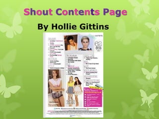
- 7. Images The images used on the contents page of ‘Shout’ are accompanied by page numbers so that the reader can easily find the page. They include small images of artists featured in the magazine. The shots of the celebrities are mid close ups to show facial expression, medium long shots to body language and long shots so there is a range of shots found on this contents page.
- 8. Colour palette The colour palette consists of pink used to underline category titles and to highlight key words. Pink connotes femininity which links to the target audience being girls. Black connotes boldness and is used for the majority of the text such as page numbers, category titles and article headings. It also stands out against the white background. White is used for Lana Del Ray’s name connoting purity. Yellow is used for the website address against a pink background which is eyecatching and bright connoting warmth and fun. The colour palette uses 4 colours which is what the majority of pop music magazine’s uses. By using simple colours and only 3 of them it draws the readers attention to the articles rather then to colours showing that ‘Shout’ magazine cares more about its content then the colours.
- 9. Layout The layout of Shout’s content page appears to be neatly laid out with the articles categorised and containing 2 images at the top of the magazine and 2 at the bottom featuring page numbers on them. The fonts are clear and easy to read which is appropriate for the target audience who are teenagers as they can find it easy to understand.
- 10. Brand identity and House style The brand identity is shown through the simple colours and neat layout of the contents page. It also shown by the website being included in the bottom right corner of the page. The house style of the magazine is shown by the rounded informal fonts as well as the use of simple and bold colours that are eye catching such as the yellow against the pink background.