1. Design balance –On this contents, I
Design symmetry – The symmetry within this
would say that it is not well
contents page is none existent. The features
balanced. The main image takes up
section detailing the content of the pages is
most of the page and the actual text
small in comparison to the main image and
for the contents page is very small
contents masthead. This could put off some
in comparison. As well, the word
readers because the content is not clear but to
‘contents’ is quite large in
some readers it may not matter.
comparison to the text as well. I
would say that this contents page
uses a horizontal balance design.
Comparison – When comparing the two
contents page, it is clear that they are two
very different styles. The Rolling Stone
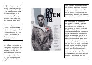
Main image – The main image is of
magazine comes across as a more formal
the main article in the magazine,
contents page to the reader. This is because
Kanye West. It takes up the majority
the balance within the page is a lot more
of the page but it still gives the
apparent compared to the Vibe contents page.
reader the information about who
I would say that the Rolling Stone magazine
the main article is about. It is a
would attract readers of an older age due to
greyscale image apart from the
this fact. In terms of colour, the Vibe contents
heart on his chest. It is also a
page is more colourful and attractive to the
medium shot.
eye. I would say that this would attract a
younger audience. Also the image used and
House style –Overall the house is content of the actual magazine is clearly aimed
very consistent. The colours do not towards a younger audience with Kanye West
clash and seem to complement each as the main image compared to the Rolling
other. Because they don’t clash, it Stone contents which is of Johnny Carson.
means that it becomes very Vibe would be classed as very image heavy
appealing to the reader and wants compared to Rolling Stone. Both contents use
them to read further into the a column style to list their contents, this keeps
magazine. The overall layout is also some form of balance within them both.
very strong with the main image
being the main and first thing you
see.