
Recomendados
Más contenido relacionado
La actualidad más candente
La actualidad más candente (20)
Destacado
Destacado (20)
Similar a Evaluation
Similar a Evaluation (20)
Último
Último (20)
Evaluation
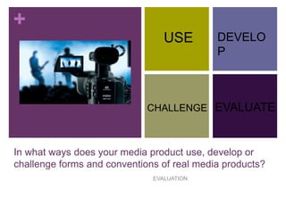
- 1. + In what ways does your media product use, develop or challenge forms and conventions of real media products? EVALUATION USE CHALLENGE DEVELO P EVALUATE
- 2. + My Music Video - Narrative The music video that I produced was based around the story of a girl and a boy who were on a date. This is not unheard of in dance/pop/house music videos, and I accompanied this narrative with integrating shots of the artist performing the song, to highlight the fact that it was all a fantasy world and was not based around a ‘real life’ event. This shows that I was making use of conventions of real media products yet I also developed them. This idea came from the fact that I was interested in creating a music video that would stand out and make a good combination with the rest of my ancillary texts. The music video follows Todorov’s Equilibrium theory as all five stages occur, including the ‘damage’ being the awkwardness in the middle of the date (middle of the song) and the repair and new equilibrium towards the end. However, the fact that there is a clear story being portrayed through the video that is shown alongside ‘raw footage’ of the artist recording the song with a full orchestra instigates that I have not only developed conventions, but challenged them.
- 3. + My Music Video - Location The music video that I produced was partially filmed in a bowling alley, in which two people were enjoying themselves on a date. Boys treating girls to a date is commonly seen in the house/pop/dance genre as it is romantic and the videos are mainly there to attract girls. However, music videos of this hybrid-genre are usually set in more exciting locations such as mansions, swimming pools/waterparks or even on the beach. However, at time of filming we unfortunately did not have access to any of these places! After using the bowling alley to the best of our ability we also shot the rest of the music video in the schools professional recording studio. Using two different locations to be featured in my music video was a development from the initial idea of having it all focused and filmed in one place. However, I believe that the change in location made the video a little more exciting and challenged conventions more. The decision was initially done to attract an audience, and the use of a good-looking female artist would work in conjunction with Laura Mulvey’s male gaze theory, which broadened my target audience and showcased my courage in trying something not seen before in this style of music video. The artist usually appears on location/as one of the main character in the narrative.
- 4. + My Music Video - Editing My music video was quite difficult to edit, however, the first thing I knew I wanted to do in order to use normal conventions of a house/pop/dance music video was edit the footage into slow motion. It was difficult to choose the ‘right’ moments to integrate between recording footage and date footage, and in the end I decided not to make the recording footage slow motion in order to ensure that the lip syncing was perfectly timed. This was not very challenging of conventions as it is commonly seen, hence why I chose to do it in the first place. However, a challenging decision that I did make was to add ‘titles’ to the beginning of the music video, i.e. to include the artists names and the song names to appear like the beginning of a movie. I also developed my ideas when editing, as after receiving initial feedback on my final edit, I swapped a few clips around to highlight the narrative and use of parallel editing to make it look as if the two events were happening at the same time.
- 5. + My Digipak - Content The digipak that I created was very much based around the responses that I got from my vox pops and survey. I made use of conventions by using bright colours, a main image, the artist name in a larger font and trying not to make anything look too busy. The back cover had the song titles in caps lock, and the featured artist names in lowercase, as I felt this would make the design a little different and more appealing to a particular audience. The side of the back cover featured horizontally dripping paint which was the same colour as the font used on the front, which also denoted the relationship between bright colours and the bowling balls. I did not really ‘challenge’ conventions to an extent throughout the design of my digipak as I believe this would be fairly difficult to do, as all digipaks need to include the same information and cannot be too overflowing with information.
- 6. + My Magazine Advertisement - Content For my third product and second ancillary text for my Advanced Portfolio, I created a magazine advertisement for an albums release (the digipak I made earlier). Whilst researching and analysing different advertisements from real media, I noted that the same image was generally used on both products but perhaps edited/formatted in a different way. I included all usual pieces of relevant information and kept the design very simple. However, I also developed the idea by using the dripping paint from the back cover and dripping it vertically from the artist name on the advertisement. I believe this created a very clear relationship between the two and would allow easy identification by consumers. Similar to my digipak, I did not really challenge conventions as there was not much to challenge in my design: I wanted to keep it plain and suited to my target audience.