
Recomendados
Más contenido relacionado
La actualidad más candente
La actualidad más candente (19)
Similar a Bi Ppt Portfolio John Harisiadis
Similar a Bi Ppt Portfolio John Harisiadis (20)
Último
Último (20)
Bi Ppt Portfolio John Harisiadis
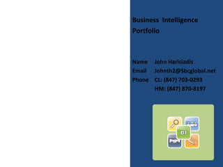
- 1. Business Intelligence Portfolio Name John Harisiadis Email Johnth2@Sbcglobal.net Phone CL: (847) 703-0293 HM: (847) 870-8197
- 2. Table of Contents • Introduction • SSIS Project - ETL Process • SSAS Projects - OLAP Cubes • SSRS Projects Relational DB Reports OLAP Cubes Reports • SharePoint
- 3. Introduction • The following slides contain samples of my technical work in some of my projects. They consist of: • An ETL process using SSIS, • A cube design using SSAS, • A chart report using SSRS, and • A SharePoint project.
- 4. ETL Process – Dataflow Task • Introduction: This is a partial design of an ETL process using SSIS • Project Goals: This design uses several dataflow tasks to read employee worked hours, contained in .csv files and store them in a database table. The design logic tests for jobs with valid ID numbers and a “not-closed” status.
- 5. ETL – Dataflow Task Design
- 6. SSAS OLAP Cube design • Introduction: This is an OLAP Cube design for the AllWorks, company using SSAS • Project Goals: This design steps through several processes, such as Datasource, DataView, and Cube creation. This cube consists of four Fact Tables and several Dimension Tables. It implements both Star and SnowFlake Schemas.
- 7. AllWorks Cube Structure diagram
- 8. ProfitPct KPI design This KPI (Key Performance Indicator) calculates the profit percentage range for each Client. It checks for < 5%, 5%-15%, and >15%. The graphical results are shown in the next slide.
- 9. EXCEL Display of ProfitPct KPI This screen is an EXCEL table showing the percent profit, ProfitPct KPI, for each client, of the AllWorks company. For percent values less than 5% it shows RED color. For percent values 5% to 15% it shows YELLOW. For percent values above 15% it shows GREEN.
- 10. MDX Code calculating Overhead Percentage This query displays the weekly over head for each overhead category, for quarters Q3 2005, Q4 2005, and the difference between the two as a percentage. The results of this Query code are displayed in the next slide.
- 11. MDX Query Results This query displays the weekly overhead for each overhead category, for quarters Q3 2005, Q4 2005, and the difference between the two, as a percentage. For reference purposes it displays all categories.
- 12. SSRS, Performance Point Server and SharePoint Reports • Introduction: • The following slides display reports using SSRS design, Performance Point Server (PPS) Scorecards, Dashboards, and SharePoint Server published Dashboards, reports and Excel “imported” Report Charts.
- 13. SSRS Report This report is designed to accept a date range, two filters for a shipping method and setting a threshold for the line total amount. It also has a Document Map, for fast access, and multiple drill- down columns.
- 14. SSRS Report This report design includes a Quarter and a Region filters (selectors), as well as a KPI Status and Trend graphical indicators. It also has four columns with “interactive” sorting ability.
- 15. Performance Point Server (PPS) Scorecard This screenshot displays a PPS Scorecard showing the KPI status, in a graphical way (green stoplight; depending on the values the color can be yellow or red, also.)
- 16. Performance Point Server (PPS) Dashboard This screenshot displays a Dashboard Bar_chart report, with a Client filter (selector) and a legend, published to the PPS server.
- 17. SharePoint Server Report This is a report published to the SharePoinrt Server
- 18. SharePoint Server Report This screen shot displays a SharePoint Dashoard, with a Scorecard. It includes a Days and a Product filters, and it shows a KPI Status and Trend graphical representations
- 19. SharePoint Server Report This is a PPS Dashboard published on the SharePoint Server. This report includes a Line-Chart Percentage display, a Bar- Chart Dollar Sales amount, and a Grid- style product display.
- 20. SharePoint Server Report This is a report generated in Excel and published (“imported into” in SharePoint Server.