

Recomendados
Más contenido relacionado
La actualidad más candente
La actualidad más candente (20)
Destacado
Destacado (18)
Similar a Evaluation q2
Similar a Evaluation q2 (20)
Último
Último (20)
Evaluation q2
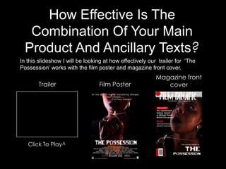
- 1. How Effective Is The Combination Of Your Main Product And Ancillary Texts? In this slideshow I will be looking at how effectively our trailer for ‘The Possession’ works with the film poster and magazine front cover. Magazine front Trailer Film Poster cover Click To Play^
- 2. Main Images: All our media products display similar main images as we wanted our work to be consistent – all of these images focus on the locket, & show that Clarissa is ‘possessed’. The photographs used on our film poster & film magazine were taken during the same photo-shoot and are extremely similar, they both highlight the significance of the locket, and the way Clarissa is holding it informs viewers that there is something wrong with her and the locket – its possessed her. It also looks as though she is trying to push the locket away from her in both the photos, this suggests that she is a victim and is trapped. In both the images we do not see Clarissas full face, this generates mystery & suspicion amongst viewers of the poster and magazine front cover. The main shots in our trailer are repeated several times to highlight their importance. The contents and focus of many of the shots are consistent with the images used on our other media products as they too focus on the locket and possession of Clarissa. The screen grabs below show examples of the shots/images I have been talking about, we hope that viewers will identify these similarities and link together the connections between the trailer, film poster and magazine front cover.
- 3. Iconography: The main icon in The Possession is the locket which possesses Clarissa. We have highlighted the significance of the icon in our trailer, film poster, and magazine front cover. In the images below I have circled how we have presented the iconic locket in our media products. In the trailer the close up of Clarissa holding the locket is repeated twice and enhanced with an x-ray effect, this informs the audience that it is important. In both the film poster and magazine front cover the locket is being pushed towards the eye of the viewer, this draws there attention and makes them question the significance of the locket. We hope that our target market will identify this icon in all our products and relate it to The Possession storyline.
- 4. Representation of horror: To help reach the right audience we made sure the horror genre of the film was expressed through all three media products. As you can see from the images to the right we included several ‘horror’ shots in our trailer, to make these as believable as possible we used makeup effects (e.g. Fake blood) and contact lenses. In the film poster & magazine front cover we also used make-up in the photographs of Clarissa to make her look un-normal, and ‘possessed’ – this is one way we have expressed the horror genre. Also, Clarissas facial expression in the magazine front cover informs people of the horror genre as she looks crazy and shocked.
- 5. Typography: Deciding what typography/fonts to use in our media products was a big part of our planning. As you can see from the screen grabs below we decided that the official font we would use to write the title of our film would be ‘LEDlight’. We used this on our film poster and magazine front cover. Below is an screen grab of the font used for the film title in our trailer. Originally we planned that the font in our trailer would be the same as the font on our film poster & magazine front cover, however after running into technical difficulties with the software ‘After Effects’ we were unable to do so, thus we decided to use a similar font that was available. The screen grab below shows the font we used for the text that appeared in our trailer. We used this font as it was clear and easy to read.
- 6. Stars: The main star of our film is Laressa Smith who plays Clarissa the main character in The Possession. Laressa is an unknown actress and therefore we did not promote her name that much. In the trailer we are introduced to her in the very first scene. Our film poster and magazine front cover both feature large pictures of Laressa, however her appearance has been manipulated to make her appear possessed and scary as the film has a horror genre. As all three products focus on introducing the audience to our main star, we hope that people will link her to our film and think of The Possession when they see her.