SlideShare una empresa de Scribd logo
1 de 4
Colour scheme of black/grey, green and white – the black
 Link to magazine                                        and white gives it a professional feel and appearance, whilst
 website –                                               the green adds brightness and therefore a sense of fun,
 students are the     Bright, bold masthead –
                                                         which is how college students may like to see themselves –
 kinds of people      immediately draws the
                                                         as having fun, whilst working hard and being professional.
 to use the           readers’ attention to the
                                                         They are all pretty neutral colours, so appeal to both male
 internet a lot, so   magazine.
                                                         and female students.
 this would appeal
 to them.


Sue of the phrase                                                                                  Bright pink puff
‘all the rage on                                                                                   stands out against
campus’ appeals                                                                                    the rest of the
to students                                                                                        magazine as is the
because they                                                                                       only pink used on the
typically want to                                                                                  whole cover.
keep up with the
latest trends. This                                                                                Buzz word – splat
makes it seem that                                                                                 emphasises idea of
by reading the                                                                                     paintballing which is
                                                                                                   a fun thing to do that
magazine they can
find out what’s                                                                                    appeals to people of
‘cool’ and popular.                                                                                the age that would be
                                                                                                   going to college –
                                                                                                   also keeps up the
                                                                                                   idea that college
Cover line – ‘Make                                                                                 students are all about
money on campus’                                                                                   having fun as well as
appeals to college                                                                                 working.
students because
they often need to
and wants to be
able to make
money – will make
them want to buy
the magazine in
order to find out
useful tips.


                                    Main image: Smart-casual clothes gives the          Quite informal language
 Use of the props of study
                                    impression of a hard working student, whilst        and mode of address
 books in the main image
                                    still being relaxed and fun-loving- Seeming         used – “HOT! HOT!
 with the quite relaxed and
                                    to the target audience of college students          HOT!” and “party chic” –
 cool, conventionally
                                    that it is a fun yet usefully academic              appeals to target
 attractive guy holding
                                    magazine. Direct mode of address – the guy          audience of college
 them – this appeals to the
                                    is looking straight at the audience, seeming        students because this is
 audience of college
                                    inviting to the reader and also giving it a         the kind of language they
 students by showing they
                                    friendly feel.                                      would use.
 can be ‘cool’ and study.
Buzz words ‘exclusive             Main image – conventionally attractive woman
 interview’ stands out with the    with direct mode of address, smiling with a
 purple background, making         friendly and slightly flirty pose giving a friendly,
 the interview seem like it will   welcoming appearance to the audience – makes
 reveal things not been said       people want to read it. She is young and
 before and that the interview     attractive which appeals to the target audience of
 is going to only be seen by       college students as she seems relatable and like
 readers of the magazine. The      them. They would assume she had similar
 way ‘Sean Kingston’ has been      interests to them and therefore the magazine
 put in larger and bold letters    would appeal to them.
 makes it stand out, catching
 the reader’s eye and
 appealing to college students                                                 The woman as the central image
 because he is a popular and                                                   would appeal to both male and
 famous musician that they are                                                 female college students. Her
 likely to listen to.                                                          friendly smile and body language
                                                                               makes girls feel they can relate to
                                                                               her – especially as she is of similar
                                                                               age – and she is conventionally
The colour scheme reflects                                                     attractive and seems to look quite
the cover lines of the articles                                                flirtatious, appealing to a more
featured in the magazine,                                                      male audience.
suggesting a predominately
female target audience. The                                                     The structured and simple
colour scheme is mainly of                                                      layout gives the impression
pink, white and sky blue and                                                    that it is still a quite
the woman’s dress is also                                                       sophisticated magazine and
pink, which is a colour                                                         that it does include more
stereotypically associated                                                      academic articles that may be
with females. The cover lines                                                   useful to college work and
“Beauty with a purpose” and                                                     studying. However, the bright
“holiday glam” also suggest                                                     pink puff and the bold colours
this edition of the magazine is                                                 used add more of a laid back
targeted mainly at female                                                       appearance, giving it a sense
college students because                                                        of fun. This appeals to the
stereotypically, women                                                          audience of college students
especially the age of college                                                   by reflecting their lives in the
students, are interested in                                                     cover layout. College students’
beauty and their appearance.                                                    main priority generally is
This would therefore appeal                                                     balancing work with having
to them, giving the                                                             fun with friends and partying,
impression that it is offering                                                  whilst the magazine appears
useful tips and information                                                     professional and academic,
about looking good.                                                             but with lots of colour and
                                                                                more social-based articles
                                                                                about beauty and fun things
                                                                                to do with friends, such as the
                                                                                “Island surf” cover line.
Images of students appeal to the target audience of
                                         college students as they are of the same age and
                                         appear to be in the same kind of situation as the
                                         reader, therefore making the reader feel they can
                                         relate to them and therefore the magazine will relate
                                         to their own lives and interests. This makes students
                                         likely to buy it as they feel it could be useful to them.


The students are shown
                                                                                     The images used are of
wearing sports kits or with                                                          only girls, suggesting it
books, creating the
                                                                                     is focused at an all-
impression that the articles                                                         girls college, or at least
featured are more academic-                                                          focused more to
based, suiting the audience
                                                                                     female students. It
of college students as they                                                          suggests, as girls are
are studying and a large part                                                        mainly used in the
of their lives is taken up by
                                                                                     images, it will have
work. It also suggests it is                                                         articles more suited to
aimed at girls interested in
                                                                                     girls’ interests and
sports, perhaps that go to a
                                                                                     needs.
sports college, and promotes
teamwork .


    Page number and headline of
    article is in bold, with a brief                      Amount of space taken up by text and images is
    description underneath in                             equal, making it appear interesting and not as
    smaller font – keeps its short,                       though the magazine will be dull or full of very
    but gives enough information                          long articles, which may not be what the target
    for the reader to be able to find                     audience would want to see – college students
    the article they want and flick to                    may get bored and typically like there to be
    that page.                                            colour and images to keep the magazine
                                                          looking fresh and interesting.


                                                Neutral colour scheme of mainly black, white and
                                                blue gives it a professional appearance, suitable to
                                                the professional atmosphere of a college however
                                                this may seem a little dull to college students and it
                                                has a very academic feeling that may put some
                                                people off if they are looking for out of college
                                                interests as well.
Colour scheme is mainly white with blues and pinks,
                                                 keeping it professional yet still bright and interesting.
                                                 The mix of blue and pink keeps it gender neutral so that
Welcome note by the editor
                                                 it is appealing to both male and female audience.
creates a friendly mode of
address, yet the language
used is still quite formal
suiting the audience of
students. This is also one of
the first things the reader
will see inside the
magazine, and so it gives a
friendly start to it. It
immediately builds up a
relationship between the
reader and the editor giving
them the feeling they will
be able to identify with
articles in the magazine.


              Divided into sections, ‘regulars’ and
              ‘features’. The ‘regulars’ section creates
              familiarity with the reader so that they
              always know what to expect in the
              magazine, whist the features are different in
              each edition of the magazine, keeping it
              interesting.

Más contenido relacionado

Más de Katieee17

Own magaine flat plan
Own magaine flat planOwn magaine flat plan
Own magaine flat planKatieee17
 
Readership profile
Readership profileReadership profile
Readership profileKatieee17
 
Final masthead ideas
Final masthead ideasFinal masthead ideas
Final masthead ideasKatieee17
 
Masthead planning
Masthead planningMasthead planning
Masthead planningKatieee17
 
College magazine questionnaire
College magazine questionnaireCollege magazine questionnaire
College magazine questionnaireKatieee17
 
Evaluation of college magazine
Evaluation of college magazineEvaluation of college magazine
Evaluation of college magazineKatieee17
 

Más de Katieee17 (6)

Own magaine flat plan
Own magaine flat planOwn magaine flat plan
Own magaine flat plan
 
Readership profile
Readership profileReadership profile
Readership profile
 
Final masthead ideas
Final masthead ideasFinal masthead ideas
Final masthead ideas
 
Masthead planning
Masthead planningMasthead planning
Masthead planning
 
College magazine questionnaire
College magazine questionnaireCollege magazine questionnaire
College magazine questionnaire
 
Evaluation of college magazine
Evaluation of college magazineEvaluation of college magazine
Evaluation of college magazine
 

Analysis of college magazines

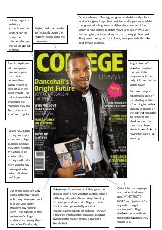
  • 1. Colour scheme of black/grey, green and white – the black Link to magazine and white gives it a professional feel and appearance, whilst website – the green adds brightness and therefore a sense of fun, students are the Bright, bold masthead – which is how college students may like to see themselves – kinds of people immediately draws the as having fun, whilst working hard and being professional. to use the readers’ attention to the They are all pretty neutral colours, so appeal to both male internet a lot, so magazine. and female students. this would appeal to them. Sue of the phrase Bright pink puff ‘all the rage on stands out against campus’ appeals the rest of the to students magazine as is the because they only pink used on the typically want to whole cover. keep up with the latest trends. This Buzz word – splat makes it seem that emphasises idea of by reading the paintballing which is a fun thing to do that magazine they can find out what’s appeals to people of ‘cool’ and popular. the age that would be going to college – also keeps up the idea that college Cover line – ‘Make students are all about money on campus’ having fun as well as appeals to college working. students because they often need to and wants to be able to make money – will make them want to buy the magazine in order to find out useful tips. Main image: Smart-casual clothes gives the Quite informal language Use of the props of study impression of a hard working student, whilst and mode of address books in the main image still being relaxed and fun-loving- Seeming used – “HOT! HOT! with the quite relaxed and to the target audience of college students HOT!” and “party chic” – cool, conventionally that it is a fun yet usefully academic appeals to target attractive guy holding magazine. Direct mode of address – the guy audience of college them – this appeals to the is looking straight at the audience, seeming students because this is audience of college inviting to the reader and also giving it a the kind of language they students by showing they friendly feel. would use. can be ‘cool’ and study.
  • 2. Buzz words ‘exclusive Main image – conventionally attractive woman interview’ stands out with the with direct mode of address, smiling with a purple background, making friendly and slightly flirty pose giving a friendly, the interview seem like it will welcoming appearance to the audience – makes reveal things not been said people want to read it. She is young and before and that the interview attractive which appeals to the target audience of is going to only be seen by college students as she seems relatable and like readers of the magazine. The them. They would assume she had similar way ‘Sean Kingston’ has been interests to them and therefore the magazine put in larger and bold letters would appeal to them. makes it stand out, catching the reader’s eye and appealing to college students The woman as the central image because he is a popular and would appeal to both male and famous musician that they are female college students. Her likely to listen to. friendly smile and body language makes girls feel they can relate to her – especially as she is of similar age – and she is conventionally The colour scheme reflects attractive and seems to look quite the cover lines of the articles flirtatious, appealing to a more featured in the magazine, male audience. suggesting a predominately female target audience. The The structured and simple colour scheme is mainly of layout gives the impression pink, white and sky blue and that it is still a quite the woman’s dress is also sophisticated magazine and pink, which is a colour that it does include more stereotypically associated academic articles that may be with females. The cover lines useful to college work and “Beauty with a purpose” and studying. However, the bright “holiday glam” also suggest pink puff and the bold colours this edition of the magazine is used add more of a laid back targeted mainly at female appearance, giving it a sense college students because of fun. This appeals to the stereotypically, women audience of college students especially the age of college by reflecting their lives in the students, are interested in cover layout. College students’ beauty and their appearance. main priority generally is This would therefore appeal balancing work with having to them, giving the fun with friends and partying, impression that it is offering whilst the magazine appears useful tips and information professional and academic, about looking good. but with lots of colour and more social-based articles about beauty and fun things to do with friends, such as the “Island surf” cover line.
  • 3. Images of students appeal to the target audience of college students as they are of the same age and appear to be in the same kind of situation as the reader, therefore making the reader feel they can relate to them and therefore the magazine will relate to their own lives and interests. This makes students likely to buy it as they feel it could be useful to them. The students are shown The images used are of wearing sports kits or with only girls, suggesting it books, creating the is focused at an all- impression that the articles girls college, or at least featured are more academic- focused more to based, suiting the audience female students. It of college students as they suggests, as girls are are studying and a large part mainly used in the of their lives is taken up by images, it will have work. It also suggests it is articles more suited to aimed at girls interested in girls’ interests and sports, perhaps that go to a needs. sports college, and promotes teamwork . Page number and headline of article is in bold, with a brief Amount of space taken up by text and images is description underneath in equal, making it appear interesting and not as smaller font – keeps its short, though the magazine will be dull or full of very but gives enough information long articles, which may not be what the target for the reader to be able to find audience would want to see – college students the article they want and flick to may get bored and typically like there to be that page. colour and images to keep the magazine looking fresh and interesting. Neutral colour scheme of mainly black, white and blue gives it a professional appearance, suitable to the professional atmosphere of a college however this may seem a little dull to college students and it has a very academic feeling that may put some people off if they are looking for out of college interests as well.
  • 4. Colour scheme is mainly white with blues and pinks, keeping it professional yet still bright and interesting. The mix of blue and pink keeps it gender neutral so that Welcome note by the editor it is appealing to both male and female audience. creates a friendly mode of address, yet the language used is still quite formal suiting the audience of students. This is also one of the first things the reader will see inside the magazine, and so it gives a friendly start to it. It immediately builds up a relationship between the reader and the editor giving them the feeling they will be able to identify with articles in the magazine. Divided into sections, ‘regulars’ and ‘features’. The ‘regulars’ section creates familiarity with the reader so that they always know what to expect in the magazine, whist the features are different in each edition of the magazine, keeping it interesting.