

Recomendados
Más contenido relacionado
La actualidad más candente
La actualidad más candente (19)
Similar a Lauralynn signup audit
Similar a Lauralynn signup audit (20)
Último
Último (20)
Lauralynn signup audit
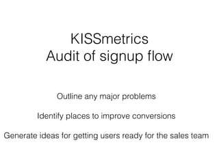
- 1. KISSmetrics Audit of signup flow ! Outline any major problems ! Identify places to improve conversions ! Generate ideas for getting users ready for the sales team
- 2. My Approach After running through the onboarding process once through to activation, I identified the users I believe the process is designed for. ! With those people in mind, I was able to take a step back and look at the onboarding experience from the perspective of each segment. ! Because the stage of commitment for each segment is different, they have different paths to activation. ! Once I had a better understanding of the people and their experience, I looked for opportunities to connect those leads with the sales team. !
- 3. 1. ONBOARDING FLOW BREAKDOWN • Home page • Segments • Activation 2. EXPERIMENTS 3. NEXT STEPS CONTENTS
- 5. SIGN UP FLOW SEGMENT 2: USER ISN’T READY TO ACTIVATE HOME PAGE SEGMENT 1 : USER IS READY TO ACTIVATE USER OPENS ACCOUNT USER CLICKS FOR MORE INFO USER CONTACTS SALES ACTIVATION
- 6. Homepage
- 8. It’s nice this image draws line of sight around the page to the CTA.
- 9. It’s nice this image draws line of sight around the page to the CTA.
- 10. It’s nice this image draws line of sight around the page to the CTA.
- 11. It’s nice this image draws line of sight around the page to the CTA.
- 12. And great that visitors know they can quickly learn more
- 13. Strong, resonating message that hits pain points and differentiates the product.
- 14. Log In button is the CTA, and the other actions are clearly separated, makes for one clear action to take.
- 15. Segment 1 : user is ready to activate
- 16. SIGN UP FLOW USER ISN’T READY TO CONVERT HOME PAGE USER IS READY TO ACTIVATE USER OPENS ACCOUNT USER CLICKS FOR MORE INFO USER CONTACTS SALES ACTIVATION
- 17. Hint to type in user website is makes it very clear what to do here.
- 18. Logging in with Google
- 20. Yay auto-fill! Very appreciated!
- 21. I also appreciate knowing the onboarding is almost done.
- 22. But there is nothing indicating these fields are required until trying to submit form. Maybe try variations of indicators for required fields?
- 23. And there was no message letting users know the password criteria until a mistake is made. To get users through this form faster, maybe use dynamic hints for password criteria?
- 24. Possibly look into speeding up the form-entry process by testing larger font size for form-field-labels and more white space between fields? Maybe test copy for ‘..start my free KISSmetrics Trial’?
- 25. Segment 2 : user isn’t ready to activate
- 26. SIGN UP FLOW USER ISN’T READY TO ACTIVATE HOME PAGE USER IS READY TO ACTIVATE USER OPENS ACCOUNT USER CLICKS FOR MORE INFO USER CONTACTS SALES ACTIVATION
- 27. Probably intentional so people gravitate to the CTA, but this line is almost invisible and if users are looking for more information they might not see this soon enough.
- 28. Builds trust to offer to have an actual person do a demo with user
- 29. Builds trust to offer to have an actual person do a demo with user And another way to speak with someone, yay!
- 30. Strong value proposition clearly posted.
- 31. Black side bar could probably be utilized more
- 32. Two conflicting calls to action can make users hesitate
- 33. Activation
- 35. Love that you are pushing! visitors to get up! and running! as fast as possible! with clear actions! to take
- 36. Just 2 Next Steps to take, no guessing. Embed code OR email developer.
- 37. Just 2 Next Steps to take, no guessing. Embed code OR email developer. Might want to test putting both actions side by side rather than stacked. But I’m assuming you want users to choose the code embed for faster activation.
- 38. Nice to see days left in trial period. No surprises, serves as a reminder and implies the trial period countdown has started.
- 39. Initial reaction. “Whow, OK. That’s startling! You want me to do what?!?” Maybe look at other event-based tracking platforms to see if they have better ways to present this step.
- 40. Great way to ask for feedback on this potentially scary page. Also alerts the user you understand things may look confusing and you are interested in what they think.
- 41. Thank you message shows feedback has been sent.
- 42. LOVE THIS!!! Contacting the developer has never been easier!!
- 43. Very nice submission form that allows for more than one email. Would like to see a message to letting user know they have sent an email (like there is for the feedback form)
- 44. Hmm, what is ‘this’ referring to? Is there a better place to be than this page?
- 45. Hmm, what is ‘this’ referring to? Is there a better place to be than this page? And what is meant by ‘all’? As a user I’m questioning if this free trial allows me access to all KISSmetrics features.
- 46. Hmm, what is ‘this’ referring to? Is there a better place to be than this page? And what is meant by ‘all’? As a user I’m questioning if this free trial allows me access to all KISSmetrics features. Isn’t that what I just did by signing up with Google?
- 47. This is a clickable button that appears to only refresh the existing page This is not intuitive as the next place to click to start using KISSmetrics. I’ve embedded the code and have come back to this get-started page. There are no clear indicators on what to do next.! ! Even worse, I feel like I am stuck on the page with no where to really go. Users may be wondering where to go to start using KISSmetrics.!
- 48. !! After some clicking around, users discover they could be waiting 2-4 hours before data starts coming in, IF things are set things up properly.!
- 49. Experiments
- 50. EXPERIMENTS FOR USERS NOT READY TO ACTIVATE Assumptions : there are two types of visitors coming to the KISSmetric homepage. 1. Users who know KISSmetrics and are ready to activate! 2. Users who know KISSmetrics and want to activate, but are hesitant! ! I also assume that the homepage bounce rate is largely attributed to Segment 2.! ! To reduce bounce rate, and improve click-through rate of the three minute overview, we could look at the following experiments.
- 51. EXPERIMENTS FOR USERS NOT READY TO ACTIVATE HIGH IMPACT MEDIUM IMPACT LOW IMPACT Test emphasis of the three-minute-overview- button.! ! Experiment with font size, enclosing layout and other variations that could make it more visible while at the same time not interfering with primary CTA. For example, try moving it to underneath the Log In button. A/B tests have shown experimenting with variations of the image can produce surprising results, or no results.! ! Try replacing man with! * cute animal! * woman! * animation Test requiring a credit card to sign up for the free trial.! ! While this is counter-intuitive, requiring a payment method up front may result in people valuing the free trial more.! ! It may also incline users to make sure they are activated and using the product sooner.
- 52. Below the fold rather than on a different page. I’m sure you’ve tested this but I thought it’s worth a mention.! If users are not ready to activate it might be because they want more information. ! ! The segment of users who want to know more before signing up may naturally scroll down the page. Test to see if links and information are more visible when placed below the main landing page content, and separate from it.
- 53. HIGH IMPACT Test adding a ‘Get A Call Back’ button in the sidebar as a rescue for those feeling stuck on the page. This can be tested against the phone number in the footer.! ! Some people may hesitate to place phone calls thinking it’ll be a time-suck, but they might be receptive to receiving a call.! ! Using a service like DemandBase could allow IP addresses associated with the phone number to be flagged as high-quality or high-interest leads that KISSmetrics can respond to within minutes.
- 54. Verify Installation Documentation HIGH IMPACT Once installation is validated we could progressively disclose some next steps.! ! Choose whichever step gets the customer closer to the “wow moment” faster.! ! That might simply be setting up some parameters ahead of time.! “Need help” seems too vague.! Experiment with interactions that set clear expectations as to what will happen when the button is clicked.! ! Opportunities to offer specific kinds of support for this page may help activation.! Test different ways to get users to next steps faster.! ! If technically feasible, validating that the script is in the site would be nice, even if it’s not pulling actual data yet. A simple yes/no will do.! ! Adding a documentation link may also help get users to next steps quicker.! MEDIUM IMPACT LOW IMPACT
- 55. HIGH IMPACT Experiment with a limited time offers, money-back guarantees, and discounted introductory packages.! ! For those who have time to make a decision and collect data, forced scarcity may drive better conversation rates.! ! Implement an offer that is only good for a certain amount of time. Make it a count down. MEDIUM IMPACT LOW IMPACT Test ‘Get in touch’ as opposed to ‘Start free trial’.! ! Help potential customers get the information they need by providing an easy way for them to receive a call back.! ! A simple form field that captures the users phone number is an extremely low amount of friction.! Test additional feature blurbs.! ! Test if long form copy will convert better for people that are looking for more information or specific information.! ! Currently, the documentation is buried under ‘More’. Exposing it may re-assure visitors that are higher up the lead generation funnel.!
- 56. Next Steps
- 57. I stopped the onboarding experience at Activation (embedding the snippet). Mainly because it didn’t seem I had installed it properly. However, if I had more time I’d dive deeper in these areas. 1. Analyze emails and suggest experiments for content to improve click through rates. 2. Click through all the actions on the features page and look opportunities for improvement.
- 58. 3. Dive more into the data for this page to determine what percentage of activated users create My First Product, and create experiments around improving that metric.
- 59. 4. And analyze the mobile site, looking for opportunities to improve the experience.
- 60. End power pose!