SlideShare una empresa de Scribd logo
1 de 3
Evaluation
Is your advertising campaign fit for purpose and why?
I believe my advertising campaign is fit for purpose. SASH
wanted something that stayed away from the stereotypical
analysis of a homeless teenager as it portrays the wrong image.
Having this in mind I tried to focus on the vulnerable side of
teenagers, reminding them that they are still children. I
achieved this by using children’s drawings as images. The
images used are sourced due to the lack of time and props I
had to work with. I have linked all my posters by using the
same image. This lets people know that they are a series and
are part of the same campaign for the same charity. I have
made sure to include the logo in every ad to ensure people
know the charity. The contact details have also been included
in each advert to let the public know how to donate or learn
more. The main purpose is to spread the word about the
charity as it is not very well known in the area. Including the
logo and contact information fulfils this requirement.

Does it communicate your message clearly and why?
The image strikes the heart and help to make the public realise the truth behind the issue.
Homelessness is real and it happens to everyone. It communicates the message because everyone
can associate with it. Everyone has drawn a happy family or a house while they were younger.
Granted it is because it was one of the more easier things to draw but it is also because we are
brought up to believe we will have a home and a family to live with and keep us safe. The images I
used reminds people of this and the shock of the amount of people who actually don’t get to have
this, right under their noses too, help them to understand the problem ultimately making them want
to help.

Is it appropriate for your target audience and why?
SASH’s target audience is 16-24, the age of the youths they help. My adverts are appropriate for this
age range because they can relate to the message that everyone wants this and everyone deserves
this. If they are in the situation that they currently don’t have a home then they will know that SASH
provides people with at least somewhere safe to sleep for the minimum of one night.
It is also appropriate because it makes them realise that they need help. Most teenagers and young
adults think it’s them against the world but my posters show them that there in fact people out
there who want to help. The images make them remember that they in fact do want a family or at
least somewhere to stay and they realise they can’t achieve this by themselves.
Compare and contrast your original intentions with the outcomes you
arrived at.
My original intentions were to create a advert that makes the youths
SASH help look innocent and steer away from the stereotype. I thought I
would do this by using a street light as a holy light or a halo for the
teenagers. I then realised this would be difficult to do without taking my
own pictures and I didn’t the time to take my own. Editing the light onto
the person would be hard as it is
difficult to figure out where the light would bounce of them,
making it looking more natural. I did decide to not include
the person at all as my first idea was aimed more at the
volunteers which are not in the age range SASH gave us to
target. Next I tried to produce the other idea I had, to use a
family photo from a special event like a wedding, to help
people realise that homeless people don’t actually achieve
the normal goals in life like getting married, moving into their first house or having a family. The plea
was going to be stamped over the image to signify the ad being stamped into the public’s head.
However this didn’t work wither as it was aimed more at the volunteers and the way I edited the
images together it didn’t look right. The black and white images made the stamped words blend into
the background when the text needs to stand out. I shadow might of fixed this but there was no
point in trying since I had targeted the wrong age group.
16-24 year olds like to see colour, bright colours are particularly effective in catching their attention.
My final idea of using kid’s drawings is appropriate for both the target audience and the aim of the
ad.

How effective are the techniques you have used and why?
I used the advertising technique of making the public feel sympathy for the youth SASH help. This
makes it more likely for them to donate or spread the word because they believe SASH is a good
cause worth mentioning, especially since they help youths. I have also used the ‘trip down memory
lane’ technique, this makes the youth remember how they want life to be.
The Photoshop techniques I used were the standard ones like crop, magic wand to remove white
backgrounds and the text tool. The other tools were colour overlay and mainly drop shadow. I had to
use these tools to achieve the look I wanted. The ‘magnets’ and pictures on the fridge have the drop
shadow effect on them as they need to look like they are actually on the fridge and this requires a
shadow.
For the chalkboard ad I had to apply a filter to make the drawing look like it was drawn with calk and
not pencil. This was hard to achieve but I ended up using the Smudge Stick filter and removed as
much white as I possibly could. Removing the white gaps between the strokes helped to make it look
more like a chalk drawing but it was hard to remove all the white without removing some of the
colour too. Also there was a lot of white, particularly in the grass. However, the effort was worth it
to have the same image in all three ads, which linked them together.
Is the content effective and why?
The content of my adverts are effective. The child’s drawing helps everyone to connect with the
advert and relate with the people it is about. Once people can relate to something they are more
likely to be effected by it. If they feel affected then they will donate and help the charity which is the
aim of the adverts.
Relating to the advert also helps the homeless teens that it targets see that there is help and people
understand how they feel. It lets them know that they are equal to everyone else. It could happen to
anyone and it isn’t their fault. That’s a common problem, they don’t seek help because they think
people won’t help them because it is their fault but it’s not and hopefully the poster helps to tackle
this problem.

What impact do you think your advertising campaign will have on the public and why?
It will raise awareness about homelessness, particularly youth homelessness. Most homeless
teenagers are sofa surfers, they stay with friends and relatives for the odd days, so they are never
seen by the public. If they aren’t seen then they don’t exist. The public are very oblivious about
things. The main way charities catch the public’s attention is shock them into reality, which is what I
have done, but they use distressing images to achieve this. I have used a happy image which will
appeal to the public. It raises their mood and then the message hits them which makes them sad.
The drastic change in mood impacts the public massively. They feel sorrier for the cause which
makes them want to donate and help.
The advert will also affect the amount of homeless teenagers. They will see the advert, know that
SASH is here to help and go to them when they have nowhere else to go. SASH have re-housed most
of the people they take in to help which is lowering the rate of homelessness, which over the years
will impact the public massively. It could ultimately lower the rate of homelessness altogether.

What are the technical and aesthetic qualities of your work?
The pictures I used in my adverts are very happy and colourful which appeals to most of the public. If
the advert is dark and gloomy then people are most likely to ignore it. No one wants their mood to
be altered downwards. On the fridge advert most of the layers have drop shadows applied to make
them look 3D. If this effect wasn’t applied then the advert wouldn’t look right. It would look like it
has been produced digitally and not a photograph of an actually fridge in a family kitchen. I also like
the way I have displayed the number of the charity on the top of the fridge. It is a good way to get
the information on the advert in a non formal way. Since the ad is aimed at 16-24 year olds informal
communication is the more favourable during this age.
The font I used on my first ad (the drawing advert) fits perfectly with the image and message I
wanted to portray. It looks like a child’s writing and then the second half looks a little neater, like a
teenagers writing. A teenager that is angry and upset. Emotions someone would hold if they were
homeless.
Together, I believe all three adverts work well together as a whole.

Más contenido relacionado

La actualidad más candente

Task 11 and 12 Final Products and Evaluation
Task 11 and 12 Final Products and EvaluationTask 11 and 12 Final Products and Evaluation
Task 11 and 12 Final Products and EvaluationHatieBruton
 
Evaluation finished
Evaluation finishedEvaluation finished
Evaluation finishedEmily Shaw
 
Production Powerpoint
Production PowerpointProduction Powerpoint
Production Powerpointhayleylou11
 
Production Powerpoint
Production PowerpointProduction Powerpoint
Production Powerpointhayleylou11
 
Social action evaluation
Social action evaluation Social action evaluation
Social action evaluation JoeHeadford
 
Homeless flat plan
Homeless flat planHomeless flat plan
Homeless flat planashboyne
 
Advertising assigment
Advertising assigmentAdvertising assigment
Advertising assigmentJamesPotts21
 
Visual Marketing: How to Promote Your Blog (and Brand) with Images
Visual Marketing: How to Promote Your Blog (and Brand) with ImagesVisual Marketing: How to Promote Your Blog (and Brand) with Images
Visual Marketing: How to Promote Your Blog (and Brand) with ImagesTai Goodwin
 
The Digital Marketer's Guide to Effective imagery
The Digital Marketer's Guide to Effective imageryThe Digital Marketer's Guide to Effective imagery
The Digital Marketer's Guide to Effective imageryFilipp Paster
 

La actualidad más candente (18)

Task 11 and 12 Final Products and Evaluation
Task 11 and 12 Final Products and EvaluationTask 11 and 12 Final Products and Evaluation
Task 11 and 12 Final Products and Evaluation
 
Evaluation finished
Evaluation finishedEvaluation finished
Evaluation finished
 
Evaluation
EvaluationEvaluation
Evaluation
 
Production Powerpoint
Production PowerpointProduction Powerpoint
Production Powerpoint
 
Production Powerpoint
Production PowerpointProduction Powerpoint
Production Powerpoint
 
Campaign PDF
Campaign PDFCampaign PDF
Campaign PDF
 
Social action evaluation
Social action evaluation Social action evaluation
Social action evaluation
 
Homeless flat plan
Homeless flat planHomeless flat plan
Homeless flat plan
 
Advertising assigment
Advertising assigmentAdvertising assigment
Advertising assigment
 
Social action Evaluation
Social action EvaluationSocial action Evaluation
Social action Evaluation
 
Evaluation
EvaluationEvaluation
Evaluation
 
Visual Marketing: How to Promote Your Blog (and Brand) with Images
Visual Marketing: How to Promote Your Blog (and Brand) with ImagesVisual Marketing: How to Promote Your Blog (and Brand) with Images
Visual Marketing: How to Promote Your Blog (and Brand) with Images
 
Evaluation
Evaluation Evaluation
Evaluation
 
The Digital Marketer's Guide to Effective imagery
The Digital Marketer's Guide to Effective imageryThe Digital Marketer's Guide to Effective imagery
The Digital Marketer's Guide to Effective imagery
 
Evaluation
EvaluationEvaluation
Evaluation
 
Evaluation
EvaluationEvaluation
Evaluation
 
Ghghggd
GhghggdGhghggd
Ghghggd
 
Task 5, 6 & 7
Task 5, 6 & 7Task 5, 6 & 7
Task 5, 6 & 7
 

Destacado

Experiments evidence template
Experiments evidence templateExperiments evidence template
Experiments evidence templateMarieSie
 
On going evaluations
On going evaluationsOn going evaluations
On going evaluationsMarieSie
 
Social Action and Community Media
Social Action and Community MediaSocial Action and Community Media
Social Action and Community MediaMarieSie
 
Homeless charities
Homeless charitiesHomeless charities
Homeless charitiesMarieSie
 
Banner development
Banner developmentBanner development
Banner developmentMarieSie
 
Advert development
Advert developmentAdvert development
Advert developmentMarieSie
 
Existing adverts
Existing advertsExisting adverts
Existing advertsMarieSie
 
Homeless charities
Homeless charitiesHomeless charities
Homeless charitiesMarieSie
 
Starting marketing and pr
Starting marketing and prStarting marketing and pr
Starting marketing and prMarieSie
 

Destacado (18)

Experiments evidence template
Experiments evidence templateExperiments evidence template
Experiments evidence template
 
Task 8
Task 8Task 8
Task 8
 
On going evaluations
On going evaluationsOn going evaluations
On going evaluations
 
Lo3
Lo3Lo3
Lo3
 
Social Action and Community Media
Social Action and Community MediaSocial Action and Community Media
Social Action and Community Media
 
Company name
Company nameCompany name
Company name
 
Homeless charities
Homeless charitiesHomeless charities
Homeless charities
 
Task 1
Task 1Task 1
Task 1
 
Banner development
Banner developmentBanner development
Banner development
 
Advert development
Advert developmentAdvert development
Advert development
 
Lo4
Lo4Lo4
Lo4
 
Existing adverts
Existing advertsExisting adverts
Existing adverts
 
Homeless charities
Homeless charitiesHomeless charities
Homeless charities
 
Task 5
Task 5Task 5
Task 5
 
StumbleUpon
StumbleUponStumbleUpon
StumbleUpon
 
Task 1
Task 1Task 1
Task 1
 
Ideas
IdeasIdeas
Ideas
 
Starting marketing and pr
Starting marketing and prStarting marketing and pr
Starting marketing and pr
 

Similar a Evaluation

Similar a Evaluation (20)

Task 12
Task 12Task 12
Task 12
 
Evaluation
EvaluationEvaluation
Evaluation
 
Evaluation
EvaluationEvaluation
Evaluation
 
Evaluation
EvaluationEvaluation
Evaluation
 
Evaluation
EvaluationEvaluation
Evaluation
 
Evaluation
EvaluationEvaluation
Evaluation
 
Evaluation
EvaluationEvaluation
Evaluation
 
Evaluationhomeless
EvaluationhomelessEvaluationhomeless
Evaluationhomeless
 
Final plan LO3
Final plan LO3Final plan LO3
Final plan LO3
 
Social action and community media presentation
Social action and community media presentationSocial action and community media presentation
Social action and community media presentation
 
Eval
EvalEval
Eval
 
existing ideas
existing ideasexisting ideas
existing ideas
 
Presentation1 1 1 1
Presentation1 1 1 1Presentation1 1 1 1
Presentation1 1 1 1
 
Smile campaign
Smile campaignSmile campaign
Smile campaign
 
All the work
All the workAll the work
All the work
 
Final evaluation
Final evaluationFinal evaluation
Final evaluation
 
Aims and considerations
Aims and considerationsAims and considerations
Aims and considerations
 
Flat Plans
Flat PlansFlat Plans
Flat Plans
 
Evaluation
EvaluationEvaluation
Evaluation
 
Sa&cp evaluation IMPROVED
Sa&cp evaluation IMPROVEDSa&cp evaluation IMPROVED
Sa&cp evaluation IMPROVED
 

Más de MarieSie

Planning pro forma
Planning pro formaPlanning pro forma
Planning pro formaMarieSie
 
Experiments evidence 2
Experiments evidence 2Experiments evidence 2
Experiments evidence 2MarieSie
 
Lo2 workbook
Lo2 workbookLo2 workbook
Lo2 workbookMarieSie
 
Lo1 workbook
Lo1 workbookLo1 workbook
Lo1 workbookMarieSie
 
Case study
Case studyCase study
Case studyMarieSie
 
Evaulation
EvaulationEvaulation
EvaulationMarieSie
 
Constraints handout
Constraints handoutConstraints handout
Constraints handoutMarieSie
 
Opportunities handout
Opportunities handoutOpportunities handout
Opportunities handoutMarieSie
 

Más de MarieSie (15)

Task 7
Task 7Task 7
Task 7
 
Task 6
Task 6Task 6
Task 6
 
Task 4
Task 4Task 4
Task 4
 
Task 3
Task 3Task 3
Task 3
 
Task 2
Task 2Task 2
Task 2
 
Task 1
Task 1Task 1
Task 1
 
Planning pro forma
Planning pro formaPlanning pro forma
Planning pro forma
 
Experiments evidence 2
Experiments evidence 2Experiments evidence 2
Experiments evidence 2
 
Lo2 workbook
Lo2 workbookLo2 workbook
Lo2 workbook
 
Lo1 workbook
Lo1 workbookLo1 workbook
Lo1 workbook
 
Case study
Case studyCase study
Case study
 
Evaulation
EvaulationEvaulation
Evaulation
 
Constraints handout
Constraints handoutConstraints handout
Constraints handout
 
Opportunities handout
Opportunities handoutOpportunities handout
Opportunities handout
 
Stages
StagesStages
Stages
 

Evaluation

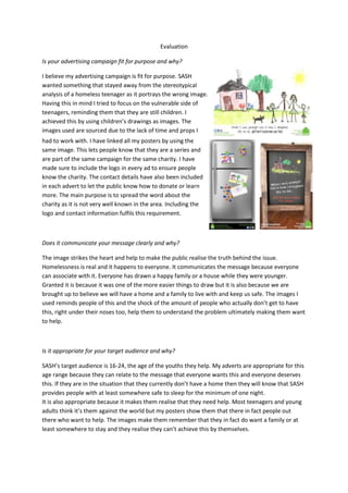
  • 1. Evaluation Is your advertising campaign fit for purpose and why? I believe my advertising campaign is fit for purpose. SASH wanted something that stayed away from the stereotypical analysis of a homeless teenager as it portrays the wrong image. Having this in mind I tried to focus on the vulnerable side of teenagers, reminding them that they are still children. I achieved this by using children’s drawings as images. The images used are sourced due to the lack of time and props I had to work with. I have linked all my posters by using the same image. This lets people know that they are a series and are part of the same campaign for the same charity. I have made sure to include the logo in every ad to ensure people know the charity. The contact details have also been included in each advert to let the public know how to donate or learn more. The main purpose is to spread the word about the charity as it is not very well known in the area. Including the logo and contact information fulfils this requirement. Does it communicate your message clearly and why? The image strikes the heart and help to make the public realise the truth behind the issue. Homelessness is real and it happens to everyone. It communicates the message because everyone can associate with it. Everyone has drawn a happy family or a house while they were younger. Granted it is because it was one of the more easier things to draw but it is also because we are brought up to believe we will have a home and a family to live with and keep us safe. The images I used reminds people of this and the shock of the amount of people who actually don’t get to have this, right under their noses too, help them to understand the problem ultimately making them want to help. Is it appropriate for your target audience and why? SASH’s target audience is 16-24, the age of the youths they help. My adverts are appropriate for this age range because they can relate to the message that everyone wants this and everyone deserves this. If they are in the situation that they currently don’t have a home then they will know that SASH provides people with at least somewhere safe to sleep for the minimum of one night. It is also appropriate because it makes them realise that they need help. Most teenagers and young adults think it’s them against the world but my posters show them that there in fact people out there who want to help. The images make them remember that they in fact do want a family or at least somewhere to stay and they realise they can’t achieve this by themselves.
  • 2. Compare and contrast your original intentions with the outcomes you arrived at. My original intentions were to create a advert that makes the youths SASH help look innocent and steer away from the stereotype. I thought I would do this by using a street light as a holy light or a halo for the teenagers. I then realised this would be difficult to do without taking my own pictures and I didn’t the time to take my own. Editing the light onto the person would be hard as it is difficult to figure out where the light would bounce of them, making it looking more natural. I did decide to not include the person at all as my first idea was aimed more at the volunteers which are not in the age range SASH gave us to target. Next I tried to produce the other idea I had, to use a family photo from a special event like a wedding, to help people realise that homeless people don’t actually achieve the normal goals in life like getting married, moving into their first house or having a family. The plea was going to be stamped over the image to signify the ad being stamped into the public’s head. However this didn’t work wither as it was aimed more at the volunteers and the way I edited the images together it didn’t look right. The black and white images made the stamped words blend into the background when the text needs to stand out. I shadow might of fixed this but there was no point in trying since I had targeted the wrong age group. 16-24 year olds like to see colour, bright colours are particularly effective in catching their attention. My final idea of using kid’s drawings is appropriate for both the target audience and the aim of the ad. How effective are the techniques you have used and why? I used the advertising technique of making the public feel sympathy for the youth SASH help. This makes it more likely for them to donate or spread the word because they believe SASH is a good cause worth mentioning, especially since they help youths. I have also used the ‘trip down memory lane’ technique, this makes the youth remember how they want life to be. The Photoshop techniques I used were the standard ones like crop, magic wand to remove white backgrounds and the text tool. The other tools were colour overlay and mainly drop shadow. I had to use these tools to achieve the look I wanted. The ‘magnets’ and pictures on the fridge have the drop shadow effect on them as they need to look like they are actually on the fridge and this requires a shadow. For the chalkboard ad I had to apply a filter to make the drawing look like it was drawn with calk and not pencil. This was hard to achieve but I ended up using the Smudge Stick filter and removed as much white as I possibly could. Removing the white gaps between the strokes helped to make it look more like a chalk drawing but it was hard to remove all the white without removing some of the colour too. Also there was a lot of white, particularly in the grass. However, the effort was worth it to have the same image in all three ads, which linked them together.
  • 3. Is the content effective and why? The content of my adverts are effective. The child’s drawing helps everyone to connect with the advert and relate with the people it is about. Once people can relate to something they are more likely to be effected by it. If they feel affected then they will donate and help the charity which is the aim of the adverts. Relating to the advert also helps the homeless teens that it targets see that there is help and people understand how they feel. It lets them know that they are equal to everyone else. It could happen to anyone and it isn’t their fault. That’s a common problem, they don’t seek help because they think people won’t help them because it is their fault but it’s not and hopefully the poster helps to tackle this problem. What impact do you think your advertising campaign will have on the public and why? It will raise awareness about homelessness, particularly youth homelessness. Most homeless teenagers are sofa surfers, they stay with friends and relatives for the odd days, so they are never seen by the public. If they aren’t seen then they don’t exist. The public are very oblivious about things. The main way charities catch the public’s attention is shock them into reality, which is what I have done, but they use distressing images to achieve this. I have used a happy image which will appeal to the public. It raises their mood and then the message hits them which makes them sad. The drastic change in mood impacts the public massively. They feel sorrier for the cause which makes them want to donate and help. The advert will also affect the amount of homeless teenagers. They will see the advert, know that SASH is here to help and go to them when they have nowhere else to go. SASH have re-housed most of the people they take in to help which is lowering the rate of homelessness, which over the years will impact the public massively. It could ultimately lower the rate of homelessness altogether. What are the technical and aesthetic qualities of your work? The pictures I used in my adverts are very happy and colourful which appeals to most of the public. If the advert is dark and gloomy then people are most likely to ignore it. No one wants their mood to be altered downwards. On the fridge advert most of the layers have drop shadows applied to make them look 3D. If this effect wasn’t applied then the advert wouldn’t look right. It would look like it has been produced digitally and not a photograph of an actually fridge in a family kitchen. I also like the way I have displayed the number of the charity on the top of the fridge. It is a good way to get the information on the advert in a non formal way. Since the ad is aimed at 16-24 year olds informal communication is the more favourable during this age. The font I used on my first ad (the drawing advert) fits perfectly with the image and message I wanted to portray. It looks like a child’s writing and then the second half looks a little neater, like a teenagers writing. A teenager that is angry and upset. Emotions someone would hold if they were homeless. Together, I believe all three adverts work well together as a whole.