
Recomendados
Más contenido relacionado
La actualidad más candente
La actualidad más candente (20)
Similar a Fitbit App - UX Review
Similar a Fitbit App - UX Review (20)
Último
Último (20)
Fitbit App - UX Review
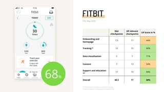
- 1. Met checkpoints All relevant checkpoints UX Score in % Onboarding and homepage 7.5 17 44% Tracking * 12 15 80% Data visualisation 5 7 71% Content 7 13 54% Support and education ** 17 19 89% Overall 48.5 71 68% 68% FITBIT iOS, May 2020 * Scored based on activity and food tracking ** Scored based on free guided programmes
- 2. Onboarding and homepage | Guideline #1 Consider delaying account creation until user has tried the app. Fitbit doesn’t allow users to use the app as a guest. The goal of onboarding flow should be to allow users to experience the benefits of the app as soon as possible. Requesting people to create accounts upfront adds unnecessary steps to the flow. The app should provide value to the user first, before asking for something in return. Users who tried the app and experienced some benefits will be more comfortable providing personal information. doesn’t meet
- 3. Onboarding and homepage | Guideline #4 Make sure there is a clear and explicit opt-in to terms and conditions. Fibit requires users to provide explicit opt-in to Terms and Conditions and Privacy Policy and the checkbox isn’t pre-selected. The app also provides a summarised explanation of key points so that the user doesn’t have to read the full legal text. meets
- 4. Onboarding and homepage | Guideline #5 Keep the sign-up flow short and allow people to skip unnecessary steps. Fitbit onboarding flow includes several steps that could be removed to streamline the flow e.g. account creation and up-selling the trackers. They also force the user to allow motion tracking before they can proceed with the sign up flow. This is a significant friction point as the user is forced to leave the app amid the sign up flow. doesn’t meet
- 5. Onboarding and homepage | Guideline #6 Allow the user to step back in the onboarding process and show how many steps are left. Fitbit provides a ‘back’ button to return to previous steps in the onboarding flow, however, the app doesn’t show how many steps are left to complete the flow. Displaying the number of steps left in the sign up flow sets the right expectations which encourages the user to progress through steps. partially meets
- 6. Onboarding and homepage | Guideline #7 Ask for the minimum data you need. Fitbit asks for four pieces of personal information during the sign up flow - date of birth, sex, weight and height. This isn’t an excessive number, but in some cases they could improve how they ask for information. For example, they don’t need the full date of birth to calculate BMI or metabolic rate - they need age. To streamline the process and minimise the amount of personal data they hold, the app should ask for age or year of birth instead of full date of birth. partially meets
- 7. Onboarding and homepage | Guideline #8 Explain why you need the data and how you use it. While the app displays an introductory statement before asking for personal information, a more transparent approach would be to display an explicit explanation on each screen where the user answers personal questions. For example in this case the app could explain why they need to know user’s sex and how they are going to use this information. doesn’t meet
- 8. Onboarding and homepage | Guideline #10 Allow users to pick their goal or area of interest and tailor the experience to that goal. Users can customise their nutrition and activity goals in the settings area but the app doesn’t guide them to do that during the first interaction. When people download a new app to try they typically have a specific goal in mind. If the app can tailor the first-time experience towards that goal, the user gains trust that the app can help them achieve their goals and are more likely to stick to using the app. doesn’t meet
- 9. Onboarding and homepage | Guideline #18 Design the home screen around the main function of the app and the most important user tasks. The home screen is designed around most important tasks and information - current stats and tracking. If the user has a challenge or a guided programme that is in-progress, those will also appear here. These are the things people are most likely to want to access every time they log in to the app. meets
- 10. Tracking | Guideline #25 Streamline the process of adding entries as far as possible. Fitbit makes it easier for the user to track both activity and nutrition through trackers and bar code scanning. meets
- 11. Tracking | Guideline #27 Provide shortcuts based on previous app activity. When tracking food, users can choose form a list or recently or frequently added items. The app also provides suggestions for items that are frequently added together. meets
- 12. Tracking | Guideline #26 If your app provides content that can also be tracked, allow it to quickly add those entries. After watching a workout video the user is prompted to automatically add duration and burnt calories to their exercise tracker. However, some of the guided programmes include suggested recipes which can’t be automatically added to food tracker. partially meets
- 13. Content | Guideline #38 Allow bookmarking / adding to favourites. Apps that include large libraries of content should allow users to ‘bookmark’ or ‘add to favourites’ individual pieces of content so that they can easily return to them later. doesn’t meet
- 14. Content | Guideline #40 To support browsing, organise content by problem area not by content type. In Fitbit users can browse content primarily by content type (e.g. stats, guided programmes, workouts). Additionally, health apps should allow users to browse by goal or problem area (e.g. sleep, weight loss). When people start using a health or wellbeing app, they likely have a goal in mind or an area they want to work on. Browsing by problem area will help them find relevant solutions more easily (they want to find a solution to a problem regardless if it’s a tracker, guided programme or a video). doesn’t meet
- 15. Content | Guideline #41 Provide useful filtering options. When searching for content, people typically choose a high- level category (e.g. sleep) and then use filters to narrow down the list. Providing useful filtering options helps them find suitable content more easily. doesn’t meet Content | Guideline #42 Use a label instead of an icon for filters. Significant proportion of users in user testing sessions don’t recognise ‘filer’ icons. To make sure people can easily find this function, use a label instead of an icon. doesn’t meet
- 16. Content | Guideline #49 Present content in a way that is easy to scan visually. Articles in guided programmes are written as step- by-step instructions and the text is broken up with headings, bullet points and images. Presenting the content in a digestible way will allow users to engage with it more easily. meets
- 17. Support and education | Guideline #51 Include ‘duty of care’ information. Before starting a guided programme, Fitbit users are advised that the information is presented for informational purposes and that they should consult a healthcare professional if they have a specific health concern. This approach increases app’s transparency and encourages users to make informed decisions about their health. meets
- 18. Support and education | Guideline #52 Provide practical tips related to everyday issues. Fitbit app provides mindfulness exercises related to mindful eating and body image. By addressing specific topics that their user base is likely to be interested in, they are making the experience more relevant and relatable. meets
- 19. Support and education | Guideline #53 Tailor to a specific audience. Content that is relevant to a specific audience and addresses the topics this audience is likely to be interested in is more engaging than generic content. Fitbit provides audience-specific content e.g. by providing exercise videos for kids and community groups for specific user segments. meets
- 20. Support and education | Guideline #56 Guide and recommend but don’t force the user to follow the path you have designed for them. Health apps can guide users toward better choices more successfully if they balance guidance and user autonomy. That means users need to be given a freedom to choose their own goals and adjust recommended plans. In Fitbit some of the guided programmes provide a sense of autonomy (e.g. in ‘Habits for Restful Sleep’ users can choose their own goals and habits) while others don’t (e.g. in ‘Intro to Healthy Habits’ users can’t change recommended workouts or recipes). partially meets
- 21. Support and education | Guideline #59 Create an easy to follow content path. As part of guided programme ‘Habits for Restful Sleep’ Fitbit app recommends most suitable mindfulness exercises. This way the app provides personalised recommendations and surfaces the right content at the right time. meets
- 22. Support and education | Guideline #65 Help people create a routine that works for their lifestyle. In the ‘Habits for Restful Sleep’ guided programme the app prompts the user to enter their bedtime. This way the app can tailor the recommendations to their daily routine, making it more relevant and personalised. meets
- 23. Support and education | Guideline #66 Make the reminders customisable, granular and an explicit opt in. In Fitbit app users can selectively opt-in to specific notifications. Allowing users to choose what they want to be notified about increases the chances that they will pay attention to the reminders (in comparison to generic notifications). meets