Poster Presented at the American Astronomical Society 227th Meeting
•Descargar como PPT, PDF•
1 recomendación•76 vistas

Poster Presented at the American Astronomical Society 227th Meeting
Recomendados

Recomendados
Más contenido relacionado
Similar a Poster Presented at the American Astronomical Society 227th Meeting
Similar a Poster Presented at the American Astronomical Society 227th Meeting (20)
Más de Matthew Doyle
Más de Matthew Doyle (12)
Último
Último (20)
Poster Presented at the American Astronomical Society 227th Meeting
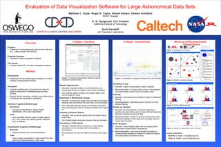
- 1. Figure 3. Navigation bar example. Figure 4. Details on demand example. Figure 5. Small multiples example. Figure 6. Additional visualization options example. Contact Information: • Matthew C. Doyle: mdoyle@oswego.edu • Roger S. Taylor: roger.taylor@oswego.edu Overview Problem: • Challenge of interpreting large astronomical data sets (e.g., Large Synoptic Sky Survey). Potential Solution: • Utilization of data visualization software. This Study: • Critique Caltech/JPL iViz data visualization software. Method Participants • Participants for the walkthrough consisted of 14 SUNY Oswego undergraduate students. Procedure • Cognitive walkthroughs of scenarios and tasks for goals of researchers investigating large synoptic surveys. • Specific metrics (accuracy, duration, non-critical errors) of interface and visualization capabilities. Interface Cognitive Walkthrough • Scenarios • Supernovae Identification, Kepler Object Identification, RR Lyrae Classification • Task • Users identified different types of stellar objects (e.g., RR Lyraes) and retrieve specific attributes (e.g., amplitude). Visualization Cognitive Walkthrough • Scenario • Eclipsing Binary & RR Lyrae Identification • Task • Users created visualization to help classify the data points into Eclipsing Binary or RR Lyrae. Evaluation of Data Visualization Software for Large Astronomical Data Sets Matthew C. Doyle, Roger S. Taylor, Shashi Kanbur, Damian Schofield SUNY Oswego S. G. Djorgovski, Ciro Donalek California Institute of Technology Scott Davidoff Jet Propulsion Laboratory Critique: Visualization Figure 2. Visualization to distinguish between RR Lyrae & W UMa. Flexibility of Use • Heuristic: system should satisfy range of skillsets. • Recommendation: Providing wider range of visualizations can assist needs of both novice and expert users. Filtering • Heuristic: Users should have efficient means of interactive filtering. • Recommendation: Relocating search function for more efficient filtering. Details on Demand • Heuristic: Providing details on demand regarding a specific data point allows user to make informed decisions about the possible grouping of data. • Recommendation: Details on demand should show users descriptive statistics of the data point and allow users to create lists of outliers. Small Multiples • Heuristic: Small multiples allow user to visualize same data across multiple linked visualizations. • Recommendation: Users would benefit from ability to visualize linked datasets of outliers for additional insights into relationships and trends in data. Critique: Interface Figure 1. Screen for assigning data variables to specific visualization parameter slots. Spatial Organization • Heuristic: Important buttons or icons that drive core functionality should be visible to users when necessary. • iViz: Buttons, search function, and system status were hard to locate for users. Aesthetics & Minimalistic Design • Heuristic: Unnecessary design items should be eliminated because they may distract the user from core functionality. • iViz: Application displays some unnecessary information when prompting the user to visualize variables (see Figure 1). Visibility of System Status • Heuristic: User should be able to view the system status at all times. • iViz: System status should be moved to the top of screen. Consistency & Standards • Heuristic: Interface should conform to current design standards and be consistent with other platform conventions. • iViz: Sprocket icon has two different functions (see Figure 2). Mock-up of Recommended Visualizations