
Recomendados
Más contenido relacionado
La actualidad más candente
La actualidad más candente (20)
Similar a Evaluation question 2
Similar a Evaluation question 2 (20)
Último
Último (20)
Evaluation question 2
- 1. How Does Your Main Product and Your Ancillary Texts Link Together?
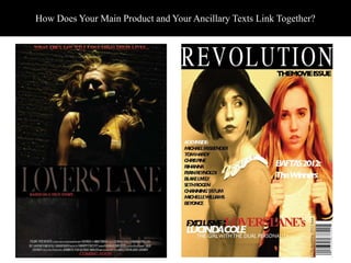
- 2. Magazine Cover. Our 3 texts link together in a combination of visual synergy. Both our Poster and our Magazine are raising the brand awareness of our film. Our Magazine uses the main image of our Movie Star, however with the Magazine we have added a more professional photo shoot feel by taking additional photographs. Both the poster and the magazine cover tell different parts We used a sepia tone of the story whilst remaining in synergy. throughout our three products The poster shows predominantly the to represent the period aspect horror aspect of the movie, whilst the of our story. With the magazine magazine is focusing more on the period in particular we used a sepia side and the idea of the 2 stories that run tone in the background and on throughout our trailer. We wanted both the image of our main actor at the past and the present to feature on the the front. However we used a cover as this is a big part of our Hybrid colour image of our main actor genre of “Found-Footage Period Horror”. again in the second image of her As we used the same actor to play both on the cover to represent the the main female protagonist of the past time difference between the and the present in our trailer I thought it two characters played by the would be a unique idea to have them both same actor. The styling of the feature on the magazine cover, although it two looks also represent the is essentially the same person, we used difference. Rather than use a alternative styling and effects to show the screen shot from the trailer for differences between them. the Magazine cover we decided to take a separate photo shoot for the magazine cover to create a more professional feel.
- 3. Movie Poster. Our poster continues the synergy and is in theme with our horror genre. The main image is different to what we have used on the magazine but it is a still straight out The colours in the poster are in of the trailer, it is a memorable moment in synergy with the colours on the the trailer and is one of the last things you magazine cover and the trailer, we see in the trailer. Having this as the poster have used very subdued tones. ties in well as it means the last thing they Typical of a horror movie we have remember from the trailer is the first thing used black and red, along with a they see on the poster and this will sepia tone to represent the period resonate with the audience as it will be a feature of our film. The lighting on recognizable image stamped into their the face of the main image is mind. The main text for the name of the effective I feel, as it casts shadows in film is in the same font as the trailer her eyes and mouth and so her facial however we have changed it from the features aren’t instantly blood red that it is in the trailer to a more recognizable. The lighting we used subdued tone of red, we wanted to was just xenon headlights of my car achieve a mud red to mix in the themes of as we filmed at night, however we the lane and the blood shed. The poster is feel this has created the perfect compiling of 3 images which is in synergy desired effect on the image. The with the magazine which comprises of 2 strap line at the top of the poster images on the cover, an unusual “what they saw will cost them their convention for a magazine. The poster has lives” comes straight out of the the main statement image which draws trailer and so this again shows the audience in however it then has 2 instant synergy between these two smaller images at the bottom which aren’t products. We have used the same noticeable unless looked at closely. 1 is of colour for this strap line as in the the lane and the other is the flash image trailer and this all adds to the of the killer which appears in the trailer. audiences recognition of the poster being linked to the trailer.
- 4. Synergistic Features – Trailer and Poster The synergy between the fonts used in both the trailer and in the poster are the same with slight colour difference; the font in the poster is more of a burnt red whilst the colour of the trailer text is blood red. This slight difference I feel is important as I think that as much as we want synergy we also want there to be a difference between each of the products we have created. The magazine uses a different font for the cover lines, however to create synergy we used the recognised film font from the trailer and the poster for the cover of the magazine. The synergy between the poster and the trailer is very noticeable as they literally reflect each other, the poster is a still straight out of the movie.
- 5. Synergistic Features – Magazine and Trailer The main synergistic features between our trailer and our magazine cover is the feature of the female protagonist. We used one actress to portray both past and present female roles and so this is a unique feature that we carried across to the cover of our magazine. We also continued the theme of using a sepia tone for the past character however the present day character is seen in saturated colour. We used the same colour scheme in all 3 of our products and we also used the same font for the cover of the magazine for the name “Lovers Lane” as this feature allows the audience to instantly identify that the magazine is an ancillary text to the trailer as the font is the same. This has been seen before most memorably with the film Tron, where the light blue font was noticeable in all media products relative to the film. The images are slightly different but this is because the magazine would have its own style.
- 6. How Does Your Main Product and Your Ancillary Texts Link Together? Overall the strong links between our three media pieces are the font- this has created an identity for our film and is an easy and effective way of linking them all together. The reoccurrence of the main female protagonist- when an audience sees the actress they will instantly know what film she is from because of the focus on her throughout. Our female character is perceived in the poster as you would expect from a horror film, she is shown as helpless and in pain. Whereas in the magazine cover we see the story behind the film portrayed in a more artistic way, she represents the female character in a more fashion styled photo shoot. We could have shown various different characters throughout our cover and poster, such as the killer or the male protagonist but this wouldn’t have been as effective in making a brand. The colour scheme throughout our trailer and poster is predominately black and red, following in the typical horror genre. The colours can then link the pieces together, however because the colour combination is so popular within horror films the relation may not be that strong. The colour scheme isn’t as identifiable on the cover of the magazine as our inspiration was more fashion – alternative lifestyle magazines that produce a movie special, therefore it would be more likely to have its own stylistic features that would be recognised by its own target readership.. To make our whole brand stronger I think we could have used a stronger colour scheme and more effectively.