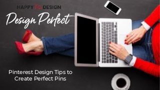
Pinterest Design Tips to Create Perfect Pins
•
0 recomendaciones•52 vistas

Creating Pinterest pins is the first impression your audience will have. Learn to create pins that attract and compel users to click and visit your product or page.

Recomendados
Recomendados
Más contenido relacionado
Último
Último (20)
Destacado
Destacado (20)
Pinterest Design Tips to Create Perfect Pins
- 1. Design Perfect Pinterest Design Tips to Create Perfect Pins
- 2. Check that you are using a 2:3 ratio for your Pinterest sizing. This is 1000 x 1500 px or 900 x 600 px, for example. If you don’t use a 2:3 ratio, your image might get truncated. The Basics
- 3. Go to Pinterest and be a “regular user” looking through the feed for pins that pop out and catch your eye. Save those pins to a secret board. Analyze why these pins are attractive, eye-catching, and worth stopping to look at. Take note of this for your own pin strategy. Be a Pinterest Spy
- 4. Use high-quality images that stand out and coordinate with the theme of your post. Use images that speak to your audience. Pinterest says the best photos are ones showing someone using your product or idea. While not everyone has time to take their own photos, that’s also an option. Use websites such as Kaboompics, Unsplash, Ivory Mix, and Pexels. See my post on stock images to find more places to source your images. Stock Photos
- 5. Design Design by Numbers Use the Rule of Thirds in your designs. Break up your space into 3’s by using a grid (you can do this in most design programs) and then use the grid as a guide for placement. Rules After breaking up the space into 3’s, decide what’s most important. Your most important text or image will take up 2/3rd of the space. The less prominent text or image will take up the rest. Decide What’s Important The Golden Ratio Use the Golden Ratio to decide hierarchy in your text. Take your biggest text size and divide it by 1.6. For instance, if your heading is 104 in size, then you could use smaller text in size 65, 41, 25, and 16. You can also multiply the heading number by 1.6 if you need to go higher and keep the hierarchy consistent.
- 6. Branding When creating pins, you need to keep in mind your own brand. Even if you are just starting up, you don’t want to use inconsistent colors, fonts, and styles. It’s best to keep to a color palette, a few fonts or a font combination, and a consistent logo and style. Here’s an example of my branding that I keep consistent. I use the same fonts, colors, and imagery throughout my social media, website, and materials. Branding
- 7. Alignment & Text Alignment Spacing Give your text space to breath at the top, bottom, and sides. Your text can get cut off if it is too close to any of the edges. Also check the LEADING or spacing between lines of text so it’s not too close together or too far apart. If you plan on centering your header text, keep the rest of your text consistent. Whether you use right, left, or center alignment, keep it uniform instead of jumping around with different ones. Spacing Source: Graphic Design Institute Notice in this example that the text is taking up the top 2/3 space while the photo, which is less important sits in 1/3 of the space. The text has breathing room; however the hierarchy could use a bit of help.
- 8. POPS OF There are various ways to add contrast, color, and make your text stand out Add shapes behind your text to make your text pop forward Use a color overlay to make your text pop. Contrast works well such as a dark color with a light color to bring the text forward. (The only thing I’d change on this is the way they used the text hierarchy) Use color behind text like this, or you can also underline words to make them stand out. Adding arrows, doodles, and other illustrations can also make your pin image pop. Use these wisely though. Too many graphics can be distracting. When creating pins, simple is best. Color
- 9. Call to Action When creating pins, Pinterest suggests using your logo. This works well for established businesses and well- known websites, but for smaller operations, you might want to stick with your website address instead of a logo until you become famous (ha!). In addition, you could also add in a call-to-action (CTA) which is a direction you want the viewer to take. This could be “Learn more at (website)” or “Get the free download”. This isn’t necessary, but might help in getting people to your website landing page. CTA CTA & Website Link
- 10. Design StepsJust for you 1. Set up 2:3 ratio using your design program and split the space into 3 parts equally. I’m choosing horizontal for this one. 2. Decide what’s most important: the image (is it stand-alone and tells a story?) or the text. Place your most important part in 2/3 of the space either on the top or bottom. Text goes here Text goes here Text goes here Text goes here Text goes here Text goes here Text goes here Text goes here Text goes here 3. Figure out the hierarchy using the golden ratio (1.6). Choose the most important text (header) and then divide by 1.6 to get the sizes for the smaller text. Add a clear, eye-catching stock photo. 4. Add pops of color, contrast, and align text consistently. Also add a call to action and a logo or website. Save your Pinterest image with keywords and SEO (hint: use the Pinterest search to find keywords!)
- 11. Hi there ! Design is my jam I hope you enjoyed this resource and it’s helped you get a head start to your Pinterest strategy. I’m Michelle Buck and I’m a graphic designer, digital strategist, and lover of copy. I help bloggers and brands simplify their Pinterest game by teaching them design skills and how to make “happy pins”. I teach you productive ways to design so you aren’t sitting at a computer all day wasting precious time. You can find me at Happy Pin Designs or on Pinterest.