
Recomendados
Más contenido relacionado
La actualidad más candente
La actualidad más candente (20)
Similar a Saul bass presentation
Similar a Saul bass presentation (20)
Más de Nicolavickery
Más de Nicolavickery (20)
Saul bass presentation
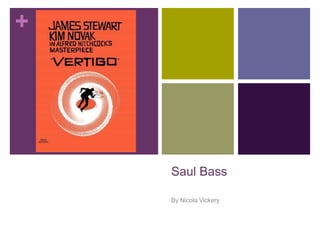
- 1. + Saul Bass By Nicola Vickery
- 2. + Who is Saul Bass? Saul bass was both a graphic designer and a film maker, and was particularly famous for his design of film posters and title sequences due to his new and creative form of constructing these two features . Saul Bass worked for some of Hollywood's greatest filmmakers such as Alfred Hitchcock, who allowed Bass to design the opening title sequence for the film vertigo. With some of Bass’s most popular title sequences being the man with the golden arm and north by northwest. Bass wanted the opportunity to create a title sequence which would enhance the experience for the audience and portray something new to them as their interactions with title sequences had been based on simplicity and had no meaningful purpose from the introduction of the films themes of story. Bass was also one of the first people to acknowledge the creative potential for the opening title sequences and how they could work to portray a sense of the film to an audience.
- 3. + Saul Bass’s work… Bass uses basic geographic shapes which are artistically combined to form an image which goes through process of being a simple shape to a sophisticated object. However as well as focussing on shapes for a central image Bass also took into consideration the typography and invented a new kinetic typography for many films including the famous psycho. This style of using basic shapes had never been seen before for the use of a title thus having a huge impact on people’s viewing experience in the 1950’s which still remains consistent to this day. Saul Bass started out doing print work for film advertisements, this was when he was recognised by film maker Otto Preminger who Saul Bass designed a film poster for, to promote his film Carmen Jones. With the satisfaction from the film poster Preminger asked Bass to produce a title sequence as well, this was when Bass’s mind was opened up to title sequences and the effect they could have on an audience.
- 4. + The impact Saul Bass had on title sequences… Saul Bass was responsible for title sequences to be viewed in a new and exciting way which has changed the way in which we acknowledge title sequences and their purpose. Since Bass had the creative talent to match a title sequence to a films controversial subject it was obvious that his way of working inspired others thus impacting on the design of title sequences To this day all title sequences which work to successfully deliver and introduce the theme or mood of a film can be seen as a legacy to the work of Saul Bass. The opening sequences of modern films based around the time era of the 1960’s often consist the graphic style in which Bass use for his work to create a deliberate resemblance of Bass’s work to show just how much of an inspiration he actually was. By doing this it suggests no 1960’s film is complete without Bass’s significant form of title sequence.
- 5. + How his work has lived on… This is a print screen from the title sequence of kiss kiss bang bang. It has clearly been inspired by Saul bass through the use of geographical shapes forming images and by the colour black to create the people, which Bass often did which resulted in silhouette effect. Bass is also responsible for the creation of some of the most recognisable logos such as Kleenex which is still used to this very day with the original design.
- 6. + Analysing anatomy of murder The use of a dark grey background creates and eerie atmosphere for the reader. The colour grey represents depression which could be a way or foreshadowing later events linked to sinister actions which have resulted in some form of depression for a character. This also resembles a pavement which reveals the film is likely to be set in a city, and the fact the body is found on pavement shows a strong disgust the killer had towards the victim due to the disrespectful placement of the body.
- 7. + Music The use of wind instruments throughout the sequence allow the music to fall into the genre of jazz music, which was extremely popular in the 1960’s. This reveals to the audience the time era in which the film is set and produced. The music also creates a film noire style to the sequence which could suggest that mystery is a theme running throughout the film. The music has a rather upbeat tone to it which creates a blissful atmosphere which doesn’t fit with what is being shown visually, this creates an enigma for the audience as it is unclear as the whether this death resulted in a form of happiness. This could also be used to foreshadow upcoming events as it could reveal that justice will be served in the film or that the death was for a good purpose. When the actors name appears the music suddenly heightens, this has an impact on the audience as it allows shock to be created. I think this was done to show the shock in which a character felt when discovering the body thus the audience can connect with the character through the same emotion of shock.
- 8. + Font colour The colour white has been used for the font which connotes innocence, this could mean the victim was an innocent man, or that he himself had done something sinister to an innocent person.
- 9. + Mise-en-scene Body parts start to slowly appear which work in sync with a part of the title, anatomy (which is the bodily structure of an organism) due to the construction of a body being shown. As a result of this it reveals a possible theme of the film could be science, as the body is a scientific object. This could also resemble the uncovering of a body or the case slowly coming together.
- 10. + Typography The typography used to introduce the title looks extremely distinct due to the contrast between black and white which reveals the body was easily found. The typography represents blood due to the liquid effect it portrays. The fact the scale of the lettering differs with each letter portrays the disarray of the murder. Again, the font is white and the fact it is placed on the body suggest the victim is innocent. The fact the word ‘murder’ is placed on his chest could show his cause of death had something to do with his heart or it could also represent him dying for love due to the heart being a common association with romance.
- 11. + Camera angles The body is shown in a long shot, from a birds eye view which portrays the audience are seeing this image from another characters perspective, possibly the killers. The effect this shot has on the audience is that the characters perspective we are seeing this from is fleeing the scene due to the long range from the body which could suggest the cause of death was by a sniper.
- 12. + Mise-en-scene Certain body parts are then portrayed in a close up shot to emphasis there significance, starting with the head. The fact the head is the first thing to be shows conveys to the audience that the identity of the victim is of importance ,or was the first thing to discovered, this creates an enigma for the audience as they wonder who the victim is and why they are now dead.
- 13. + Mise-en-scene The arms of the body are then shown, the way they are positioned gives an impression of the victim dragging there body along which shows the killing wasn’t a suicide and that the victim longed to live. It also creates an enigma for the audience as it appears the victim was reaching for something and they are intrigued to find out what.
- 14. + One arm is then thrust forwards which creates confusion for the audience as it has a violent undertone since it is shown to be almost like a punch. This gives a sense of the character having a violent personality or having committed a violent deed especially since arms are often associated with punching thus resulting the audience questioning where this person was innocent or not.
- 15. + Parts of the body then split into sections which could simply represent broken bones or possibly a shatter in the case due to the colour black connoting obscurity, thus it is typical for audience to think the solving of the case isn’t as straight forward as it appears.
- 16. + The hand of the body is seen once again reaching for something, this to me looks almost sexual firstly because I believe the death has something to do with romance and secondly because it is assumed you will do anything for those whom you love and his dedication to reach for a part of a body appears immensely strong. However the fact the hand then breaks shows he is unsuccessful in reaching it which shows his death has stopped the victim getting what he wants
- 17. + The extreme close of the hand emphasis violence, but also could show the character is metaphorically holding the fate of the killer in his hands. The style of the title sequence is very cartoonish, yet it still appears sophisticated and suits the theme of the film due to the colour choice and Mise-en-scene. The fact the body is the only object to be shown portrays it is was the story hangs upon, and stresses the importance of it.