
Recomendados
Más contenido relacionado
La actualidad más candente
La actualidad más candente (20)
Similar a Kandinsky painting
Similar a Kandinsky painting (20)
Más de Ondrian Duncan Reid
Más de Ondrian Duncan Reid (16)
Último
Último (20)
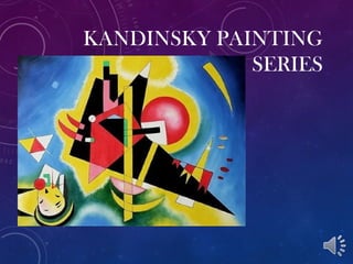
Kandinsky painting
- 3. “I see colours when I listen to music.” Kandinsky Studied music and was a trained musician, he played the cello. Experienced the world with synesthesia. His experience with music led him to creating art and painting on canvas.
- 4. SYNESTHESIA ! Wassily Kandinsky Black Strokes I (1913) Let’s chat a bit about everyone’s favorite neurological condition.... Seeing sounds! Tasting music! Hearing odors...? Feeling colors!
- 5. Wassily Kandinsky began his study of art at 30. He left Russia to study art in Germany. Claude Monet Impressionist Kandinsky was inspired by the work of Monet, who practiced creating the effects of light and color through painting. Seeing the work of Monet was Kandinsky’s first time seeing art that was not about strict realism.
- 6. A FATHER OF ABSTRACTI ON Sketches based on a concert of composer Arthur Schoenberg’s music. Kandinsky later said the music he heard that evening changed the way he thought about art.
- 7. He listened to music to help decide what colours and shapes to use.
- 9. KANDINSKY LINKED ART MAKING, THE USE OF COLORS, MUSIC, AND EMOTIONALISM ALL TOGETHER AS A FORM OF EXPRESSION.
- 10. WASSILY KANDINSKY AJP • Review your aesthetics page. • Which style of art does Kandinsky fall under? • What details about his work led you to this answer? • What are the aesthetic qualities of Kandinsky’s work? • Do you think that his work is successful? Follow your rubric!!
- 11. ABSTRACT EXPRESSIONISM- ART WHICH EMPHASIZES THE USE OF ELEMENTS RATHER THAN RECOGNIZABLE SUBJECTS. FOCUS IS ON EMOTION AND FEELINGS. Principles of Design: Rhythm: creates a feeling of movement across a composition. Unity: the quality of wholeness or oneness from the effective use of the elements of design. Repetition: Technique which creates rhythm and unity by repeating elements in a composition.
- 12. ABSTRACT EXPRESSIONISM- ART WHICH EMPHASIZES THE USE OF ELEMENTS RATHER THAN RECOGNIZABLE SUBJECTS. FOCUS IS ON EMOTION AND FEELINGS. Design Parameters: 1. Create an abstract design which utilizes rhythm and repetition to create a unified composition. Consider the mood/ expression of the design. 2. Include repeating lines AND use at least 12 shapes. 3. Crop some shapes on all 4 sides of the composition.
- 15. • Once a design has been chosen, you will redraw it larger in a 6”x6” square. • Design layout will be repeated 4 times and each one will have a different color scheme and use of media: • The watercolor painting will be done on watercolor paper. All others will be done on drawing paper. • Some shapes and backgrounds must have blended values or colors. • Craftsmanship is very important. Your neatness and attention to detail makes a big difference in the final presentation. Color Schemes Media 1.Monochromatic positive shapes with Complementary negative space 1. Magazine Collage 2. Analogous colors 2. Tempera 3. Split Complement 3. Watercolor 4. Free Choice- but please consider color relationships 4. Mixed Media: Tempera or Watercolor with ink and color pencil
- 16. Monochromatic Color Scheme with complimentary background Analogous color scheme 3-4 colors that are next to each other on the color wheel One color and the hues on each side of its compliment Violet with its compliment Yellow in the background Blue-Green, Blue, Blue- Violet, Red-Violet, Yellow-Green, Yellow-Orange
- 17. ALL 4 TOGETHERComplimentary Color Scheme Analogous Color Scheme Split- Compliment Color Scheme Student Choice Primary Color Scheme with tints and shades
- 18. STUDENT EXAMPLES
Notas del editor
- https://artsy.net/post/ibiayi-seeing-sounds-kandinsky-plus-schoenberg