As a business owner, you might have heard about responsive design. This presentation is to help you understand what it is, how it works and how it can help you appeal your customers who use mobile devices to browse web on a daily basis.
2. About Us
• Founded in 2008 by
Jonathan Passley (me)
• Website Design &
Online Marketing
• Your strategic partner in
generating customers
• We service SMB
• www. pdrwebsolutions.com
3. Today we will talk about
• What is responsive web design?
• The difference between responsive design
and a mobile website
• Benefits of responsive design
• Design tips and best practices with live
examples
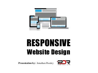
4. What is Responsive Design?
The Goal of responsive web design is to provide the best viewing
experience across a wide range of devices.
• Responsive = responds & adjusts to the
environment (size of the screen)
• One website for every screen
• Easy reading with minimal zooming and scrolling
• Simplified navigation
• Custom layout
• Designed for touchscreens
5.
6. Why Bother?
• 58% of all US
consumers already own
a smartphone. Source: comScore
• 61% of people have a
better opinion of brands
when they offer a good
mobile experience.
Source: Latitude
• 90% of people move
between devices to
accomplish a goal.
Source: Google
7. Responsive vs. Mobile
A mobile website is a separate site with different code and URL. Your
main site will redirect to the mobile version when accessed via a mobile
phone. Example: m.yourwebsite.com
Advantages of Responsive Design
• Simplicity: manage one site instead of two
• Adaptable to all screens, not just smartphones
• Responsive design is recommended by
Google
• Easy to maintain and update
• Faster loading times
8. Best Practices
Predict user intent and adjust design, content and calls to action
accordingly
•
•
•
•
•
•
•
Readable font size
Prominent navigation with easy-to-touch buttons
Back-to-top link to reduce scrolling
Simplified content
Click-to-call phone number
Custom layouts for portrait and landscape views
Easily accessible address with a map view