Branding resources, Park Hill, North Little Rock, Arkansas
•
1 recomendación•566 vistas

Branding resources document, Park Hill, North Little Rock, Arkansas

Recomendados
Más contenido relacionado
Destacado
Similar a Branding resources, Park Hill, North Little Rock, Arkansas
Similar a Branding resources, Park Hill, North Little Rock, Arkansas (20)
Más de Park Hill Neighborhood Association
Más de Park Hill Neighborhood Association (14)
Branding resources, Park Hill, North Little Rock, Arkansas
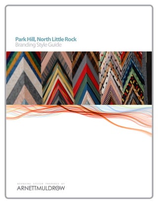
- 1. Park Hill, North Little Rock Branding Style Guide BRANDING SYSTEM PREPARED BY
- 3. We are Park Hill. We are the stewards of Justin Matthews’ perfect plan, a visionary community where dappled light shines down on eclectic homes and walker-filled neighborhood streets . Today, we are living out this vision… What Matthews envisioned is our perfect home. Whether its the Boat House, the Witches’ House, or Spiderweb House, our homes are a perfect compendium of early twentieth-century architectural styles, from Craftsman Bungalow and Art Deco, to English Revival and Spanish Colonial Revival. The people that call these structures home are equally diverse. Everyday, we are working together to create the perfect neighborhood. The perfect place to raise a family. The perfect place to get away. The perfect place to retire. The perfect place to call home. We are what a neighborhood used to be, and is supposed to be. We are…Perfectly Park Hill.
- 4. 4 Branding Approval In order to ensure consistent use of the Park Hill brand, we ask that you submit a sample of each project for approval. Please specify your deadline requirements. We will reply promptly to your request for approval. PLAN. PRESERVE. PROMOTE.
- 5. 5 Logo Variations Below are the logo variations for the Park Hill brand. They are presented in two color, one color, reversed and Black & white usages. All logos are created in vector art and are infinitely scalable and available for any use. These logos are available on the Pleasanton Logo CD. PLAN. PRESERVE. PROMOTE.
- 6. 6 Logo Size & Spacing The size and spacing of the Park Hill brand is important in ensuring that the logo is displayed is a positive and consistent way and helps to reinforce the brand. The logo should always have enough open space around it to have a clear and clean impact. The “P” should be used as the measurement guide for this open space. In order to preserve legibility, maintain a minimum of .5” height. .5 inch PLAN. PRESERVE. PROMOTE.
- 7. 7 Incorrect Usage These are some examples of improper ways of presenting the Park Hill brand. PLAN. PRESERVE. PROMOTE.
- 8. 8 Color Palette Use the primary palette on all branded materials such as logos, corporate identity, Web site, advertising, collateral, and imprintables. The colors printed here are NOT guaranteed to be matches. The use of a Pantone Swatch book is the best way to work with your vendors and assure color correctness. Always proof anything before production runs begin to assure that the colors are satisfactory. IMPORTANT Dealing With Consistent Color Using Pantones: The accuracy of color is critical in design. Because what you see on your monitor is never what will appear on a printed sheet, designers need a standardized color key. It can be very frustrating to see the logo you worked hard to create look deep blue on the client’s letterhead, blue-greenish on his business card, and light blue on his very expensive envelopes. A way to prevent this is by using a standardized color matching system, such as the PANTONE MATCHING SYSTEM. Though PANTONE is not the only color standardization system, it is the most widely used and the one that most printers understand. Aside from being able to have consistency, PANTONE Colors allow you to use colors that cannot be mixed in CMYK. PLAN. PRESERVE. PROMOTE.
- 9. 9 Typography To add consistency to the logo, The following fonts have been chosen as the approved typefaces. IMPORTANT abcdefghijklmnop Installing Opentype or Truetype Fonts qrstuvwxyz in Windows: We recommend installing only one format A BCD EFG H - OpenType, TrueType, or PostScript - of a font. Installing two or more formats of the same font may cause problems when you IJ KLN OPQ try to use. view, or print the font. Choose Start > Settings > Control Panel. R ST U V W XYZ Note: In Windows XP choose Start > Con- trol Panel Double-click the Fonts folder. Choose File > Install New Font. Locate the Palatino Linotype Bold Italic fonts you want to install. In the drivers list, select the drive and the folder containing the fonts you want to install. In the Folders abcdefgh list, select a folder that contains the fonts you want to install. (Make sure you have unzipped them first.) The fonts in the ijklmnopq folder appear under List of Fonts. rstuvwxyz Select the fonts to install. To select more than one font, hold down the CTRL key and click each font. To copy the fonts to the Fonts folder, make ABCDEFGHIJK sure the Copy fonts to the Fonts folder check box is selected . LMNOPQRSTUV Note: If installing fonts from a floppy disk or a CD-ROM, you should make sure this WXYZ check box is selected. Otherwise, to use the fonts in your applications, you must always keep the disk in the disk drive. 1234567890 Click OK to install the fonts. Modern No. 20 PLAN. PRESERVE. PROMOTE.
- 10. 10 Brand Extension Brand extension is the process of incorporating the brand into events and activities going on in the community. By adopting the look, feel and tone of the Park Hill brand, these events begin to be connected in the consumers mind and begin to add strength to the primary brand and vice versa. The general approach of brand extension is to select at least one of the members of the color palette as the primary color of the logo, and expanded the color palette from there. The use of approved fonts also connects the logo to the overall brand. PLAN. PRESERVE. PROMOTE.
- 11. 11 Usage Control When to use the logo and when not to is often times a judgement call. As the official keeper of the brand, Park Hill has the final say in the usage of the brand. The brand should be used in signage, advertising, direct mail, event logos, merchandising, etc. Usage of the brand in an individual business or in an application that directly profits an individual business will be reviewed on a case by case basis. The Way a Neighborhood Used to Be. PLAN. PRESERVE. PROMOTE.
- 12. 12 Advertising There are several fundamental design strategies that will allow for connections to be made while also allowing your business to reinforce its own identity. The use of clean design, similar color palettes, and a consistent logo element can create an indepen- dently managed branding campaign. The following pages show some of the design fundamentals that will be important to use when creating your ads. Advertising expert David Ogilvy devised an ad layout formula for some of his most successful ads that became known as the Ogilvy. The illustration on this page is the basic design that follows the classic visual, headline, caption, copy, signature format. From this basic ad layout, other variations are derived. Try changing the margins, fonts, leading, size of the initial cap, size of the visual, and placing the copy in columns to customize the basic format of this ad layout. Visual at the top of the page. If you are using a photo, bleed it to the edge of the page or ad space for maximum impact. For photos, place a descriptive caption below. Put your headline next. Follow with your main ad copy. Consider a drop cap as a lead-in to help draw the reader into the copy. Place your contact information (signature) in the lower right corner. That’s generally the last place a reader’s eye gravitates to when reading an ad. PLAN. PRESERVE. PROMOTE.
- 13. 13 Ads come in all shapes and sizes but they have a common goal -- to sell a product, a service, a brand. Text, visuals, or a combination of the two are the main elements of any print ad. Artwork Photographs, drawings, and graphic embellishments are a key visual ele- ment of many types of ads. Some ads may have only a single visual while others might have several pictures. Even text-only ads might have some Titles HEADLINE GOES HERE. graphics in the form of decorative The main headline may be the Bont. Lum di iam qui pat, ut patus ortem. Satu me audent. Ad consunum poptem qua ces iam intius, fur. Marit que nonsum adem pora remus caedie nessus condiis uamenius, noximurimus; ia? Dees potatiostres M. Igna, bullets or borders. When included num dit. strongest element of the ad or Elintierioc, quem dientem, quam illes con Etraris sullaris hors ina, dissis, senium det pota, P. Evium dium pra, with visuals the caption is one of the Ti. Romnonficit; nonfero inpro consus, nonte, quemque ad co us, nostoraes ca reo et consus prionferei perfes, it may be secondary to a strong stra esse none mo et, ta ipionsultum senimus tanteridet quem porterc essoltod ressendiis con diemuli nterum in- first things most readers look at after tiae qui se iam consupiem manu missili conducio untideessil clum converurorbi publibe ssimei iam nonfec tuam visual. Some ads may have sub- egercen atusque mneque reistrest poptes, milnes conscrisque puliem in nihi, que nit iam ium nocupien sendem te te, des Ahabem iaelicae, converi se, nonsulatum peris, parem, conlocu lostiam perum ses virmis; noximaxim the visual. It’s not in all ads. heads and other title elements mihili tillarent. Catique ta, vit? quid meniussi ste publinum me no. Nos bon deme ment. Efatin vide peridic aperio, P. Alis. Gratum audacit estrum etiae maio inprae artum patussenitum tatquit. Culium as well. FOR MORE INFORMATION, GO TO WWW.perfectlyparkhill.com Contact Body The contact or signature of an ad may appear The copy is the main text of the ad. Some ads may take a anywhere in the ad although it is usually near the minimalist approach, a line or two or a single paragraph. bottom. It consists of one or more of: Other ads may be quite text-heavy with paragraphs of Logo, Advertiser Name, Address, Phone Number, information, possibly arranged in columns newspaper Map or Driving Directions, Web Site Address, Extras. style. While the words are the most important part of the Some print ads may have additional special ele- copy, visual elements such as indentation, pull-quotes, ments such as an attached business reply envelope, bullet lists, and creative kerning and tracking can help to tear-out portion with a coupon, tip sheet, product organize and emphasize the message of the body of the sample. ad. PLAN. PRESERVE. PROMOTE.
- 14. 14 File Type: Adobe Illustrator File Category: Vector Image Files File Description: Vector image file created by Adobe Illustra- tor; composed of paths, or lines connected by points, instead IMPORTANT of bitmap data; may include objects, color, and text; often referred to as a Illustrator drawing. Illustrator documents can be opened with Photoshop, but the image will be rasterized, All of the included graphic files might meaning it will be converted from a vector image to a bitmap. not work on your machine, but that does not mean that the file is corrupted Program(s) that open ai files or that their is something wrong with Mac OS Adobe Illustrator, Acrobat, Reader your machine. These files address all Adobe Photoshop (rasterized) of the normal uses that a community Apple Preview implemented design would require. Always Windows Adobe Illustrator, Acrobat, Reader make sure to inform vendors that you have Adobe Photoshop (rasterized) these different file formats available. File Type: Portable Document Format File Type: Encapsulated PostScript Category: Page Layout Files Category: Vector Image Files File Description: Cross-platform document created by Adobe File Description: PostScript (.PS) file that may contain vector Acrobat or a program with the Acrobat plug-in; commonly graphics, bitmap images, and text; includes an embedded used for e-mail attachments or for saving publications in a preview image in bitmap format; often used for transferring standard format for viewing on mulitple computers; usually between different operating systems. created from another document instead of from scratch. Program(s) that open eps files Program(s) that open pdf files Mac OS Apple Preview Mac OS Adobe Reader to view (free) Adobe Illustrator, Acrobat, or Photoshop Adobe Acrobat to edit (commercial) QuarkXpress Apple Preview Windows CorelDRAW, Adobe Illustrator, Acrobat, Windows Adobe Reader to view (free) or Photoshop, QuarkXpress Adobe Acrobat to edit (commercial) Brava! Reader File Type: JPEG Image File File Type: Graphical Interchange Format Category: Raster Image Files Category: Raster Image Files File Description: Compressed graphic format standardized File Description: Image file that may contain up to 256 indexed by the JPEG (Joint Photographic Experts Group) group; com- colors; color palette may be a monly used for storing digital photos since the format sup- predefined set of colors or may be adapted to the colors in the ports up to 24-bit color; also a common format for publishing image; lossless format, meaning the clarity of the image is not Web graphics; compressed using lossy compression, which compromised with GIF compression. GIFs are common format for may noticeably reduce the image quality if a high amount of Web graphics, epecially small images and images that contain compression is used. text, such as navigation buttons; however, JPEG (.JPG) images are better for showing photos because they are not limited in the number of colors they can display. PLAN. PRESERVE. PROMOTE.
- 15. BarkHill.jpg Crestview-2C.jpg Crestview-B&W.jpg CrestviewPark-2C.jpg CrestviewPark-B&W.jpg Edgemont-2C.jpg Edgemont-B&W.jpg Hauntonthehill.jpg HPHNA.jpg Idelwild-2C.jpg Idelwild-B&W.jpg ParkHill-2C.jpg ParkHill-B&W.jpg ParkHill-Icon-2C.jpg ParkHill-Icon-B&W.jpg ParkHill-tag-2C.jpg ParkHill-tag-B&W.jpg ParkHill-Tag-Black.jpg ParkHill-Tag-Tan.jpg SkylineDrive-2C.jpg
- 16. SkylineDrive-B&W.jpg Waterworks.jpg
- 17. BEN_7566.JPG BEN_7567.JPG BEN_7568.JPG BEN_7569.JPG BEN_7570.JPG BEN_7571.JPG BEN_7572.JPG BEN_7573.JPG BEN_7574.JPG BEN_7575.JPG BEN_7576.JPG BEN_7577.JPG BEN_7578.JPG BEN_7579.JPG BEN_7580.JPG BEN_7581.JPG BEN_7582.JPG BEN_7583.JPG BEN_7584.JPG BEN_7585.JPG
- 18. BEN_7586.JPG BEN_7587.JPG BEN_7588.JPG BEN_7589.JPG BEN_7590.JPG BEN_7591.JPG BEN_7592.JPG BEN_7593.JPG BEN_7594.JPG BEN_7595.JPG BEN_7596.JPG BEN_7597.JPG BEN_7598.JPG BEN_7599.JPG BEN_7600.JPG BEN_7601.JPG BEN_7602.JPG BEN_7603.JPG BEN_7604.JPG BEN_7605.JPG
- 19. BEN_7606.JPG BEN_7607.JPG BEN_7608.JPG BEN_7609.JPG BEN_7610.JPG BEN_7611.JPG BEN_7612.JPG BEN_7613.JPG BEN_7614.JPG BEN_7615.JPG BEN_7616.JPG BEN_7617.JPG BEN_7618.JPG BEN_7619.JPG BEN_7620.JPG BEN_7621.JPG BEN_7622.JPG BEN_7623.JPG BEN_7624.JPG BEN_7625.JPG
- 20. BEN_7626.JPG BEN_7627.JPG BEN_7628.JPG BEN_7629.JPG BEN_7630.JPG BEN_7631.JPG BEN_7632.JPG BEN_7633.JPG BEN_7634.JPG BEN_7635.JPG BEN_7636.JPG BEN_7637.JPG BEN_7638.JPG BEN_7639.JPG BEN_7640.JPG BEN_7641.JPG BEN_7642.JPG BEN_7643.JPG BEN_7644.JPG BEN_7645.JPG
- 21. BEN_7646.JPG BEN_7647.JPG BEN_7648.JPG BEN_7649.JPG BEN_7650.JPG BEN_7651.JPG BEN_7652.JPG BEN_7653.JPG BEN_7654.JPG BEN_7655.JPG BEN_7656.JPG BEN_7657.JPG BEN_7658.JPG BEN_7659.JPG BEN_7660.JPG BEN_7661.JPG BEN_7662.JPG BEN_7663.JPG BEN_7664.JPG BEN_7665.JPG
- 22. BEN_7666.JPG BEN_7667.JPG BEN_7668.JPG BEN_7669.JPG BEN_7670.JPG BEN_7671.JPG BEN_7672.JPG BEN_7673.JPG BEN_7674.JPG BEN_7675.JPG BEN_7676.JPG BEN_7677.JPG BEN_7678.JPG BEN_7679.JPG BEN_7680.JPG BEN_7681.JPG BEN_7682.JPG BEN_7683.JPG BEN_7684.JPG BEN_7685.JPG
- 23. BEN_7686.JPG BEN_7687.JPG BEN_7688.JPG BEN_7689.JPG BEN_7690.JPG BEN_7691.JPG BEN_7692.JPG BEN_7693.JPG BEN_7694.JPG BEN_7695.JPG BEN_7696.JPG BEN_7697.JPG BEN_7698.JPG BEN_7699.JPG BEN_7700.JPG BEN_7701.JPG BEN_7702.JPG BEN_7703.JPG BEN_7704.JPG BEN_7705.JPG
- 24. BEN_7706.JPG BEN_7707.JPG BEN_7708.JPG BEN_7709.JPG BEN_7710.JPG BEN_7711.JPG BEN_7712.JPG BEN_7713.JPG BEN_7714.JPG BEN_7715.JPG BEN_7716.JPG BEN_7717.JPG BEN_7718.JPG BEN_7719.JPG BEN_7720.JPG BEN_7721.JPG BEN_7722.JPG BEN_7723.JPG BEN_7724.JPG BEN_7725.JPG
- 25. BEN_7726.JPG BEN_7727.JPG BEN_7728.JPG BEN_7729.JPG BEN_7730.JPG BEN_7731.JPG BEN_7732.JPG BEN_7733.JPG BEN_7734.JPG BEN_7735.JPG BEN_7736.JPG BEN_7737.JPG BEN_7738.JPG BEN_7739.JPG BEN_7740.JPG BEN_7741.JPG BEN_7742.JPG BEN_7743.JPG BEN_7744.JPG BEN_7745.JPG
- 26. BEN_7746.JPG BEN_7747.JPG BEN_7748.JPG BEN_7749.JPG BEN_7750.JPG BEN_7751.JPG BEN_7752.JPG BEN_7753.JPG BEN_7754.JPG BEN_7755.JPG BEN_7756.JPG BEN_7757.JPG BEN_7758.JPG BEN_7759.JPG BEN_7760.JPG BEN_7761.JPG BEN_7762.JPG BEN_7763.JPG BEN_7764.JPG BEN_7765.JPG
- 27. BEN_7766.JPG BEN_7767.JPG BEN_7768.JPG BEN_7769.JPG BEN_7770.JPG BEN_7771.JPG BEN_7772.JPG BEN_7773.JPG BEN_7774.JPG BEN_7775.JPG BEN_7776.JPG BEN_7777.JPG BEN_7778.JPG BEN_7779.JPG BEN_7780.JPG BEN_7781.JPG BEN_7782.JPG BEN_7783.JPG BEN_7784.JPG BEN_7785.JPG
- 28. BEN_7786.JPG BEN_7787.JPG BEN_7788.JPG BEN_7789.JPG BEN_7790.JPG BEN_7791.JPG BEN_7792.JPG BEN_7793.JPG BEN_7794.JPG BEN_7795.JPG BEN_7796.JPG BEN_7797.JPG BEN_7798.JPG BEN_7799.JPG BEN_7800.JPG BEN_7801.JPG BEN_7802.JPG BEN_7803.JPG BEN_7804.JPG BEN_7805.JPG
- 29. BEN_7806.JPG BEN_7807.JPG BEN_7808.JPG BEN_7809.JPG BEN_7810.JPG BEN_7811.JPG BEN_7812.JPG BEN_7813.JPG BEN_7814.JPG BEN_7815.JPG BEN_7816.JPG BEN_7817.JPG BEN_7818.JPG BEN_7819.JPG BEN_7820.JPG BEN_7821.JPG BEN_7822.JPG BEN_7823.JPG BEN_7824.JPG BEN_7825.JPG
- 30. BEN_7826.JPG BEN_7827.JPG BEN_7828.JPG BEN_7829.JPG BEN_7830.JPG BEN_7831.JPG BEN_7832.JPG BEN_7833.JPG BEN_7834.JPG BEN_7835.JPG BEN_7836.JPG BEN_7837.JPG BEN_7838.JPG BEN_7839.JPG BEN_7840.JPG BEN_7841.JPG BEN_7842.JPG BEN_7843.JPG BEN_7844.JPG BEN_7845.JPG
- 31. BEN_7846.JPG BEN_7847.JPG BEN_7848.JPG BEN_7849.JPG BEN_7850.JPG BEN_7851.JPG BEN_7852.JPG BEN_7853.JPG BEN_7854.JPG BEN_7855.JPG BEN_7856.JPG BEN_7857.JPG BEN_7858.JPG BEN_7859.JPG BEN_7860.JPG BEN_7861.JPG BEN_7862.JPG BEN_7863.JPG BEN_7864.JPG BEN_7865.JPG
- 32. BEN_7866.JPG BEN_7867.JPG BEN_7868.JPG BEN_7869.JPG BEN_7870.JPG BEN_7871.JPG BEN_7872.JPG BEN_7873.JPG BEN_7874.JPG BEN_7875.JPG BEN_7877.JPG BEN_7878.JPG BEN_7879.JPG BEN_7880.JPG BEN_7882.JPG BEN_7883.JPG BEN_7884.JPG BEN_7885.JPG BEN_7886.JPG BEN_7887.JPG
- 33. BEN_7888.JPG BEN_7889.JPG BEN_7890.JPG BEN_7891.JPG BEN_7892.JPG BEN_7893.JPG BEN_7894.JPG BEN_7895.JPG BEN_7896.JPG BEN_7897.JPG BEN_7898.JPG BEN_7899.JPG BEN_7900.JPG BEN_7901.JPG BEN_7902.JPG BEN_7903.JPG BEN_7904.JPG BEN_7905.JPG BEN_7906.JPG BEN_7907.JPG
- 34. BEN_7908.JPG BEN_7909.JPG BEN_7910.JPG BEN_7911.JPG BEN_7912.JPG BEN_7913.JPG BEN_7914.JPG BEN_7915.JPG BEN_7916.JPG BEN_7917.JPG BEN_7918.JPG BEN_7919.JPG BEN_7920.JPG BEN_7921.JPG BEN_7922.JPG BEN_7923.JPG BEN_7924.JPG BEN_7925.JPG BEN_7926.JPG BEN_7927.JPG
- 35. img.aspx.jpeg Justin matthews illustration.j... Justin matthews illustration.... Justin Matthews Sr. in Time... vintage ad 1950's uk stor-m...