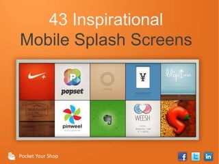
43 Inspirational Mobile Splash Screens
•Descargar como PPTX, PDF•
46 recomendaciones•60,192 vistas

This document provides 43 examples of splash screen designs for mobile apps. It begins with an introduction explaining what a splash screen is and its purpose. It then shows examples organized into categories like professional/clean, colorful/fun, and unique/eye-catching. Each example includes an image of the splash screen, brief description, and creator. The document concludes by encouraging the reader to learn about their target audience to design an eye-catching splash screen that sparks curiosity.

Recomendados
Más contenido relacionado
La actualidad más candente
La actualidad más candente (10)
Destacado
Destacado (15)
Similar a 43 Inspirational Mobile Splash Screens
Similar a 43 Inspirational Mobile Splash Screens (20)
Último
Último (20)
43 Inspirational Mobile Splash Screens
- 1. 43 Inspirational Mobile Splash Screens Pocket Your Shop
- 2. Table of Contents Introduction 3 23 Colorful / Fun What Is A Splash Screen? 4 37 Unique / Eye-Catching Professional / Clean 5 50 Conclusion
- 3. Introduction You never get a second chance to make a first impression. That is why a splash screen is a key part of any mobile app. The splash screen is a hook that needs to grab attention and impress. If a new user does not like what they see, they will be turned off immediately. We’ve compiled 43 examples of genius splash screen design to inspire your own. But first, let’s go over what a splash screen is and the elements that make up a good one. 3
- 4. What Is A Splash Screen? A splash screen is image that appears when an app is loading. This is the first thing users see when opening an app, so it needs to be relevant and grab their attention. Below you can see the basic elements that make up a splash screen. 4
- 5. PROFESSIONAL / CLEAN EXAMPLES. Share Collection 5
- 6. Lift • The bright blues and whites make this splash screen stand out. • Colors work nicely with the vertical stripes. • Caption is creative and inspirational. By: Lift Worldwide 6
- 7. Coaster • Beautiful plaid pattern. • Purple to blue gradient makes it pop. • Simple title. By: Coaster 7
- 8. Agent PC • Logo is vibrant and center stage. • Bright glow surrounds logo and draws people in. By: Mail.Ru 8
- 9. TagTile • Very simple and clean design. • The green logo on the dark gradient makes it stand out. By: TagTile 9
- 10. Residence Inn: Marriott Anaheim • Wood background welcomes users in. • Looks professional without being too formal. • The engrained logo is polished and gorgeous. By: Pocket Your Shop 10
- 11. Listn • Very deep black background looks good on high quality displays. • The reflection below the logo makes a subtle but powerful impact. By: Listn, LLC 11
- 12. Simple • Unique bulletin board design. • Very clean look and makes users interested. By: Simple Finance 12
- 13. JackThreads • Impresses users immediately from unique texture. • Caption is short and sweet. By: Thrillist 13
- 14. Recood • Beautiful gradients and textures. • Design at the bottom makes this splash screen look elegant and professional. By: Ahiku Corp. 14
- 15. Forkly • Clever use of chalk. • Works nicely with black chalkboard texture. By: Forkly 15
- 16. Square Wallet • Clean pattern that makes brings out logo. • Clean look that flows well with the rest of the app. By: Square, Inc. 16
- 17. Wenzani • Simple design. • Logo is colorful and stands out against the black background By: Wenzani 17
- 18. Drum Guru • Logo is embedded into the pattern. • Pattern is unique and works nicely against the gradient. By: Iron Horse Ent Inc. 18
- 19. Zaarly • Collage of photos makes for a nice background. • Logo, text and pictures are all clear and easy to read. By: Zaarly 19
- 20. Jamie Oliver’s Recipes • App icons are at the bottom of the splash screen. • Provides a smoother transition into the app itself. • Fun icons below title are a nice touch. By: Zolmo 20
- 21. COLORFUL / FUN EXAMPLES. Share Collection 21
- 22. Tracks • Clever use of the logo and title over a beautiful image of the sky. • Interesting and impressive design. By: Tracks Media, Inc. 22
- 23. Blip Me • Pretty texture patterns for the wall and wood floor. • Colors are vibrant and fit nicely with the rest of the app. By: Camino Real, Inc. 23
- 24. DailyCost • Eye-catching logo. • Very clean design. • Impresses users at first glance. By: Guopeng Liang 24
- 25. Weesh • Shading and text looks childish, yet professional. • This adds a unique feel that is inviting to users. • The caption is also very clever. By: Capple Factory 25
- 26. Localmind • Contemporary colors and feel. • Bright colors and dotted patterns make a beautiful design. • Feels like a cutting edge app before you open it. By: Localmind, Corp. 26
- 27. Popset • Colorful logo and simple background. • Title has a unique texture that stands out. By: Eeve Ltd. 27
- 28. Key Ring • Modern and clean looking wood design. • Simple and effective. By: Mobestream Media 28
- 29. Vimeo • Bright, vibrant colors that are very pleasing to the eye. • Beautiful trees and birds make new users feel welcome, By: Vimeo, LLC 29
- 30. Foodspotting • Intriguing background image • Embedded box for caption makes it stand out and easy to read By: Foodspotting, Inc. 30
- 31. Cloudee • Each cloud’s pattern is different when overlapping another cloud. • Unique and incredibly clever design. By: Boxee, Inc. 28
- 32. Vyclone • Interesting pattern inside of the logo. • Beautiful range of colors. • Title is written in cursive. By: Vyclone Inc. 32
- 33. Pinweel • Plain white background, simple logo, and a short caption. • Sometimes that’s all you need. By: Pinweel, Inc. 33
- 34. WOO • The bright yellow background catches the attention users. • Cool logo sparks curiosity and entices users to explore the rest of the app. By: Berker Sirman 34
- 35. Weathermob • Colorful logo in the center. • The shadow beneath logo makes it more pronounced and bold. By: Weathermob, Inc. 35
- 36. UNIQUE / EYE- CATCHING EXAMPLES. Share Collection 36
- 37. Nike+ Running • The bright red background in contrast to the glowing white logo really pops. • The track design at the bottom is very clever and clean. By: Nike, Inc. 37
- 38. Wrappit • Only uses purple, orange and white. • The three colors complement each other and makes for a beautiful design. By: Saturised 38
- 39. iSpice • Makes good use of real spices to create an interesting effect. • Uses both bright and dark colors. By: Sutro Media 39
- 40. Evernote • Uses bright green to stand out and impress new users. • Features a pretty collage of icons, some of which are their other apps. By: Evernote 40
- 41. PayPal • Beautiful and professional texture. • Title is embedded into the background. By: PayPal, an eBay Company 41
- 42. Lemon Wallet • Captures the look and feel of a leather wallet. • The details like the stitching and texture on the logo make a great first impression. By: Lemon, Inc. 42
- 43. National Parks • Realistic texture to show off the app design. • Breathtaking image to show off content of the app itself. By: National Geographic Society 43
- 44. Flipboard • Beautiful image to impress users. • Literally welcomes users in with the caption. By: Flipboard Inc. 44
- 45. Band of the Day • Big tiles with wood finish makes for a clean and professional look • Gives the impression of a high-quality app By: 955 Dreams 45
- 46. LocalHero • Very unique design. • Cartoonish pictures and text give it a look and feel that will spark some curiosity. By: LocalHero, Inc. 46
- 47. Everyme • Cool pattern in background. • Logo is set over interesting image. • The caption has a more creative and fun approach let users know the app is loading. By: Everyme, Inc. 47
- 48. Viddy • Beautiful texture. • Logo is equally beautiful and fits perfectly on top of the texture. By: Viddy, Inc. 48
- 49. LivingSocial • Creative and clever design. • Uses icons all the things you can do using the app. By: LivingSocial 49
- 50. Foursquare • Beautiful baby blue background. • Fun, transparent icons that fill up most of the screen. By: Foursquare Labs, Inc. 50
- 51. Conclusion With all of these great examples, it might be difficult to find a style that reflects your brand. Your goal is to create an eye-catching and inviting splash screen that will also spark your visitors curiosity and give them a reason to stick around. Take the time to learn about your target audience, and determine what design style would really capture their attention. 51
- 52. Fastest way to grow your mobile audience. Talk to a Pocket Your Shop expert about how our all-in-one app solution for hotels, restaurants, and retailers can improve and rapidly grow your mobile audience. Pocket Your Shop