1. Justifications:
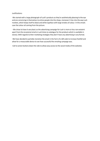
-We started with a large photograph of Lush’s products as they’re aesthetically pleasing to the eye
and are convincing in themselves to entice people into the shops, moreover it ties into the way Lush
markets, which keeps itself to black and white typeface with large strokes of colour. In this emails
case the colour all coming from the picture.
- We chose to have it very basic as the advertising campaign for Lush is more or less non-existent
apart from the occasional email or Lush times (a catalogue for the products which is available in
stores). With regards to their marketing strategies they don’t have any advertising in any format.
-We have decided to partially monetize the email in the form of a QR code to increase footfall and
allow for a measurable device to see how successful the emailing campaign was.
-Call to action buttons down the side to allow easy access to the social media of the websites