A complete guide to flexbox
•
0 recomendaciones•95 vistas

Flex stands for flexibility, adaptability. Thus, flexible layout elements are flexible boxes. The ability to fill extra areas without using javascript is one of the key advantages of flexbox.
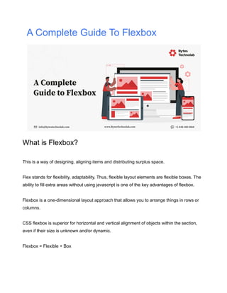
![Flex Browser & Layout Support:
By September 2020, CSS Flexible Box Layouts are supported by 98.69% of the installed
browsers, or by 99.29% of the desktop and 100% of mobile.
All desktop/mobile/tablet browsers with the newest version support, in addition to the IE 11
desktop browser. Partial support is provided in the IE 11 desktop browser.
Flex CSS Syntax:
div { display: flex; } => [ div: Selector | display: Property | flex: Value ]
Flexbox Example With Different Requirement:
Main axis
Main axis stands for a flex container as the primary axis, all flex items are managed with the
main axis.
Main-start | main-end
The flex items are placed within the container starting on the main-start side and going
toward the main-end side.](data:image/gif;base64,R0lGODlhAQABAIAAAAAAAP///yH5BAEAAAAALAAAAAABAAEAAAIBRAA7)
Recomendados
Más contenido relacionado
Similar a A complete guide to flexbox
Similar a A complete guide to flexbox (20)
Más de Bytes Technolab Inc.
Más de Bytes Technolab Inc. (14)
Último
Último (20)
A complete guide to flexbox
- 1. A Complete Guide To Flexbox What is Flexbox? This is a way of designing, aligning items and distributing surplus space. Flex stands for flexibility, adaptability. Thus, flexible layout elements are flexible boxes. The ability to fill extra areas without using javascript is one of the key advantages of flexbox. Flexbox is a one-dimensional layout approach that allows you to arrange things in rows or columns. CSS flexbox is superior for horizontal and vertical alignment of objects within the section, even if their size is unknown and/or dynamic. Flexbox = Flexible + Box
- 2. Flex Browser & Layout Support: By September 2020, CSS Flexible Box Layouts are supported by 98.69% of the installed browsers, or by 99.29% of the desktop and 100% of mobile. All desktop/mobile/tablet browsers with the newest version support, in addition to the IE 11 desktop browser. Partial support is provided in the IE 11 desktop browser. Flex CSS Syntax: div { display: flex; } => [ div: Selector | display: Property | flex: Value ] Flexbox Example With Different Requirement: Main axis Main axis stands for a flex container as the primary axis, all flex items are managed with the main axis. Main-start | main-end The flex items are placed within the container starting on the main-start side and going toward the main-end side.
- 3. Horizontal alignment Main size | main size property The width or height of a flex container or flex item, whichever is in the main dimension, is that box’s main size. Cross axis The axis perpendicular to the main axis is called the cross axis. It extends in the cross dimension. Cross-start | cross-end Flex lines are filled with items and placed into the container starting on the cross-start side of the flex container and going toward the cross-end side. Vertical alignment Cross size Cross size defines all flex items vertical heights. Also Read:[What Is A Headless Content Management System(CMS)?] 3.1. How to create Flex Containers using flex or inline-flex Property: display Value: flex | inline-flex Applies to: flex containers flex: The flex value contains full width. inline-flex: With the inline-flex value contain inline width based on content.
- 4. 3.2. How to set Ordering and Orientation in flex. 2.1. Flex Flow Direction: the flex-direction property Property: flex-direction Value: row | row-reverse | column | column-reverse Initial: row Applies to: flex containers row: flex items arranged in horizontal alignment, sequence 1 2 3. row-reverse: flex items arranged in reverse horizontal alignment, sequence 3 2 1. column: flex items arranged in vertical alignment, sequence 1 2 3. column-reverse: flex items arranged in reverse vertical alignment, sequence 3 2 1. 3.3. How to wrap content using flex-wrap Name: flex-wrap Value: nowrap | wrap | wrap-reverse Initial: nowrap Applies to: flex containers nowrap: The flex container is single-line. wrap: The flex container is multi-line. wrap-reverse: Same as wrap but, line sequence reverse order not items.
- 5. 3.4. How to display contents using Display Order Property Name: order Value: <integer> Initial: 0 Applies to: flex items order: defines the flex items order.
- 6. 3.5. How to set width using Flex items width Applies to: flex items .flex-item { width: 80px; } => Set flex items width with 80px. .flex-item { width: 80px; flex: auto; } => Set flex items width according to row remaining space but, consider flex items width 80px or more.
- 7. 3.6. How to set content horizontally using justify-content property. flex items horizontal alignment property: Name: justify-content Value: flex-start | flex-end | center | space-between | space-around Initial: flex-start Applies to: flex containers
- 9. 3.7. How to set content vertically using the align property? flex containers vertical alignment property: Name: align-items Value: flex-start | flex-end | center | baseline | stretch Initial: stretch Applies to: flex containers Name: align-self Value: auto | flex-start | flex-end | center | baseline | stretch Initial: auto Applies to: flex items baseline: practically baseline alignment consider same as flex-start.
- 11. Not Supported CSS Property in Flexbox:
- 12. In the context of Flexbox Layout, some characteristics designed to assume the block layout don’t apply. CSS Property not supported: The column* properties in the Specific[CSS3 col-*] The Multi-column Layout module has no impact on a flex container. Float and clear have no effect and do not take off-flow on the flex item. The float property may, however, still affect the flex box. A flex item has no vertical-align effect. the ::first-line and ::first-letter pseudo-elements do not apply to flex containers, and flex containers do not contribute a first formatted line or first letter to their ancestors. Wrapping up Over the next few years there will still be handy floats, tables and all other strategies for layouting dead soon. Each member of this “family of layout tools” nonetheless has some limitations in developing layouts. These drawbacks stem from standards which did not anticipate the layouts of today. That is why Flexbox comes in handy.