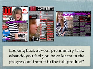
1. Looking back at your preliminary task,
what do you feel you have learnt in the
progression from it to the full product?
2. Pre-Lim Product Final Product
More professional
Very basic masthead Amateur red strip
masthead Tagline
and white
background which
No is unappealing
tagline
Space filled
well with
Main title more
attractive
lures
Amateur
No main
shape as
title
lure
No bar Bar code
code
Hard to read caption
Lots of ‘dead
More
space’
professional Captions can be read
‘splash’ due to differing fonts/
Fonts the same - quite shape colours
boring
3. Pre-Lim Product Final Product
House Style colours/
House Style colours/ No main image of Main image of cover
fonts continued
fonts slightly different cover model artist
throughout
No
editorial Sub-lines
Again Editorial
amateur
shape
Clear
No sub- columns
lines with
headings
so easy to
navigate
Articles quite hard Quite cluttered, but
to read and page good use of images Articles clearly readable
numbers not including page numbers
No use of columns
obvious One striking image
so could be hard to
and page layout
navigate
simple