
Recomendados
Más contenido relacionado
Destacado
Más de SaanaKJ
Último
Último (20)
Digipak rihana analysis
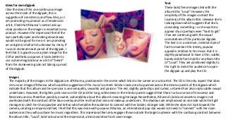
- 1. Images The majority of the images in the digipak are of Rihanna, positioned in the centre which links to her career as a solo artist. The CD is the only aspect that does not use an image of Rihanna which could be suggestive of the music’s content. Similar roses are also panned across the interior panels of the digipak which indicate that this album and her persona is one sensuality, sexuality and passion. The red, slightly parted lips and curled, untamed hair also imply subtle sexual undertones. However, the lighter, pink roses on the CD and the long, white dress in the interior panels suggest that there is also a sense of innocence and femininity and so therefore possibly a sweet, vulnerability about this album’s meaning/message. Nevertheless, Rihanna’s bold and eccentric image is not overlooked with the contrast of the blue overlay and the red hair/red skin and makeup undertones. The shadows are emphasised on one side while the light manages to catch her sharp jawline and tattoo which enables the audience to connect with her bolder, stronger side. While she does not look towards the camera, creating an impersonal feel, I feel that this was done with purpose. Rihanna, an international pop star would not need to “connect” with her main audience as they will purchase her music regardless. This impersonal feel only engages those outside the target audience with the confusing contrast between the album title, “Loud”, bold colours and the impersonal, almost secretive front cover image. Text These bold, fierce images link with the album title, “Loud”. However, the simplicity of the images contrast the loudness of the album title. Likewise she is looking down which suggests that she is concealing something – or she wants to appear shy or perhaps even “hard to get” if we are continuing with the sexual connotations of this particular digipak. The text is in a common, minimal style of font to maintain the trendy, popular appeal in relation to her music. But it is slightly paradoxical to have a thin, subtle, barely visible font style for an album title of “Loud”. They are positioned slightly to the right to invite the audience to open the digipak up and play the CD. Ideas for own digipak I like the idea of the one continuous image across the inside of the digipak; this is suggestive of consistency and flow. Also, as I am promoting my product as a female solo artist, I feel that Rihanna’s central and up- close position in the images is essential to my product. However the impersonal feel of the eyes partially open and looking down/away would not be good for me as I am promoting an unsigned, small artist unknown by many. If I was to dominate each panel of the digipak, I feel that it is good to use a plain image for the CD for aesthetic purposes. It looks better to use a plain image/colour as a bit of “break” from the domineering solo act taking up most of the digipak.