
Recommended
More Related Content
What's hot
What's hot (19)
Viewers also liked
Viewers also liked (14)
Similar to Vibe magazine
Similar to Vibe magazine (20)
More from SianLynes
More from SianLynes (20)
Recently uploaded
Recently uploaded (20)
Vibe magazine
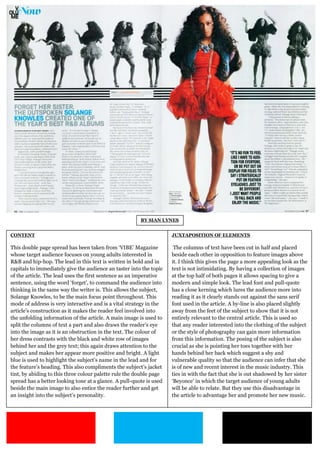
- 1. BY SIAN LYNES CONTENT JUXTAPOSITION OF ELEMENTS This double page spread has been taken from ‘VIBE’ Magazine The columns of text have been cut in half and placed whose target audience focuses on young adults interested in beside each other in opposition to feature images above R&B and hip-hop. The lead in this text is written in bold and in it. I think this gives the page a more appealing look as the capitals to immediately give the audience an taster into the topic text is not intimidating. By having a collection of images of the article. The lead uses the first sentence as an imperative at the top half of both pages it allows spacing to give a sentence, using the word ‘forget’, to command the audience into modern and simple look. The lead font and pull-quote thinking in the same way the writer is. This allows the subject, has a close kerning which lures the audience more into Solange Knowles, to be the main focus point throughout. This reading it as it clearly stands out against the sans serif mode of address is very interactive and is a vital strategy in the font used in the article. A by-line is also placed slightly article’s construction as it makes the reader feel involved into away from the feet of the subject to show that it is not the unfolding information of the article. A main image is used to entirely relevant to the central article. This is used so split the columns of text a part and also draws the reader’s eye that any reader interested into the clothing of the subject into the image as it is an obstruction in the text. The colour of or the style of photography can gain more information her dress contrasts with the black and white row of images from this information. The posing of the subject is also behind her and the grey text; this again draws attention to the crucial as she is pointing her toes together with her subject and makes her appear more positive and bright. A light hands behind her back which suggest a shy and blue is used to highlight the subject’s name in the lead and for vulnerable quality so that the audience can infer that she the feature’s heading. This also compliments the subject’s jacket is of new and recent interest in the music industry. This tint, by abiding to this three colour palette rule the double page ties in with the fact that she is out shadowed by her sister spread has a better looking tone at a glance. A pull-quote is used ‘Beyonce’ in which the target audience of young adults beside the main image to also entice the reader further and get will be able to relate. But they use this disadvantage in an insight into the subject’s personality. the article to advantage her and promote her new music.