SlideShare una empresa de Scribd logo
1 de 10
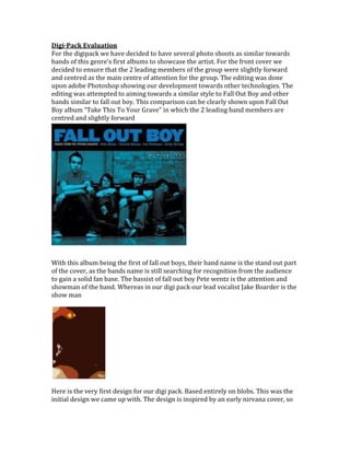
  Digi-Pack Evaluation<br />01650365For the digipack we have decided to have several photo shoots as similar towards bands of this genre’s first albums to showcase the artist. For the front cover we decided to ensure that the 2 leading members of the group were slightly forward and centred as the main centre of attention for the group. The editing was done upon adobe Photoshop showing our development towards other technologies. The editing was attempted to aiming towards a similar style to Fall Out Boy and other bands similar to fall out boy. This comparison can be clearly shown upon Fall Out Boy album “Take This To Your Grave” in which the 2 leading band members are centred and slightly forward <br />With this album being the first of fall out boys, their band name is the stand out part of the cover, as the bands name is still searching for recognition from the audience to gain a solid fan base. The bassist of fall out boy Pete wentz is the attention and showman of the band. Whereas in our digi pack our lead vocalist Jake Boarder is the show man <br />Here is the very first design for our digi pack. Based entirely on blobs. This was the initial design we came up with. The design is inspired by an early nirvana cover, so after doing a similar photo shoot to the nirvana cover we took it into the Photoshop programme were we used the ‘cut out’ filter to simplify the image.<br />I then added text with the band name and song, I used the distortion tool on the text to bend round the light, in my opinion this effect works fairly well on the image.<br />Here is the original single cover for fall out boy – I don’t care. Very basic but yet enough information is provided. I added the date released, the Itunes information and another song.<br />  This is the finished design of the first draft of the single. We changed the colour scheme by using the ‘colour saturation’ on the Photoshop programme, we then added a photo of the band in the bottom corner, we then used a ‘accented edges’ filter on the photo, and used paint on the image to create a cartoony effect. We then added text to the image to thank the people who worked on the album etc.<br />Here is the bassist Craig, page 1 of the booklet, with a little comic humour to describe the band member, we also used the colour saturation again on this image to make the image look different, however we still wanted to keep the same theme through out, we also added an image of Craig and again used paint to create a cartoony effect.<br />We also did the same for these images, obviously changing the colour on the colour saturation, adding images and amusing comments to the posters.<br /> <br />Poster promotion, the red background is based on the red used in our first music video ‘ I don’t care’. We used the ‘poster edges’ filter on the image to create a cartoony effect; this is a constant theme through out digipack. We also have the same band logo in this poster as the rest of the digipack, in the background we can see some black blotches’ and lines, this is also a constant theme running through our digipack and refers to the trees and leaves that were used in the music video, however they’ve been blacked out! In our opinions the blacking out of the leaves works well as it symbolizes the emo genre, nothings pretty and everything’s dull and dark!<br />The back cover is still sporting the red and black background, with the band in a medium close up. There has been a bar code placed in the bottom right corner to show its retailer ship. It still has the same black blotches, which refers to the leaves and trees in the video. It has the band logo, as does the rest of the digipack. It uses the text ‘bold condensed’<br />Matthew Pounder- Guitarist <br />Lee Porritt- Drummer <br />Jake Boarder- Vocals <br />Craig Harman- Bassist<br />The pictures has been photo shopped ‘accented edges’ to give off a more airbrushed cartoon effect, there is still a red and black theme in the background, and the ‘bass, guitar, drums, vocals’ use the same font as the band logo.<br />Front cover of the digi pack shows a highly favoured picture by bands on their first album to get their faces in the public eye and recognised. The sign in the bottom corner of the picture shows an explicit content advisory to show bad language may appear and for the buyer not to be offended by such language. It still features the red and black theme, with the leaves and trees blacked out in the background.<br />                                                                          <br />Spine of the digi pack shows the font so often used in the same font. Its basic and not to fancy as obviously ‘I don’t care’ is what its based on.<br />Another band poster of the band in the cold conditions. The picture is only moderately edited with the background being changed from colour to black and white.  The band poster derived from this original image.                                                                                                                                                                                                                                                                                                                                                                                                                                                                                                                                                                                                                                                                                                                                                                                                                   <br />
Digi evaluation
Digi evaluation
Digi evaluation
Digi evaluation
Digi evaluation
Digi evaluation
Digi evaluation
Digi evaluation
Digi evaluation

Más contenido relacionado

Similar a Digi evaluation

Dawn Of The Dead Textual Analysis
Dawn Of The Dead Textual Analysis Dawn Of The Dead Textual Analysis
Dawn Of The Dead Textual Analysis Valvainolivi
 
Goodnight gorilla-printables
Goodnight gorilla-printablesGoodnight gorilla-printables
Goodnight gorilla-printablesCristina Nunes
 
Analysisofsnapshotsfromtrailertimharfield
AnalysisofsnapshotsfromtrailertimharfieldAnalysisofsnapshotsfromtrailertimharfield
Analysisofsnapshotsfromtrailertimharfieldbir
 
Volantone GameStop Ottobre 2012
Volantone GameStop Ottobre 2012Volantone GameStop Ottobre 2012
Volantone GameStop Ottobre 2012GameStop Italia
 
Digital Typography: Font Management - ebookcraft 2016 - Charles Nix
Digital Typography: Font Management - ebookcraft 2016 - Charles NixDigital Typography: Font Management - ebookcraft 2016 - Charles Nix
Digital Typography: Font Management - ebookcraft 2016 - Charles NixBookNet Canada
 
樂與怒,香港製造
樂與怒,香港製造樂與怒,香港製造
樂與怒,香港製造shihfang Ma
 
Sample portfolio bookmarked
Sample portfolio bookmarkedSample portfolio bookmarked
Sample portfolio bookmarkednatrybas
 
Identifying the rhetorical tools of ethos, logos
Identifying the rhetorical tools of ethos, logosIdentifying the rhetorical tools of ethos, logos
Identifying the rhetorical tools of ethos, logosmonamars
 
Geoboard workshop
Geoboard workshopGeoboard workshop
Geoboard workshopPractiques2
 
Open bk assn bca
Open bk assn bcaOpen bk assn bca
Open bk assn bcaDilraj Kaur
 
Emerging Markets Neighborhood Retail & Restaurant Site Tour Handout
Emerging Markets Neighborhood Retail & Restaurant Site Tour HandoutEmerging Markets Neighborhood Retail & Restaurant Site Tour Handout
Emerging Markets Neighborhood Retail & Restaurant Site Tour HandoutWashington, DC Economic Partnership
 
Kane's fun park story
Kane's fun park storyKane's fun park story
Kane's fun park storytakahe2
 
Kane's fun park story
Kane's fun park storyKane's fun park story
Kane's fun park storytakahe2
 
Photography Production Portfolio
Photography Production PortfolioPhotography Production Portfolio
Photography Production PortfolioMelissaMz
 

Similar a Digi evaluation (20)

Dawn Of The Dead Textual Analysis
Dawn Of The Dead Textual Analysis Dawn Of The Dead Textual Analysis
Dawn Of The Dead Textual Analysis
 
Goodnight gorilla-printables
Goodnight gorilla-printablesGoodnight gorilla-printables
Goodnight gorilla-printables
 
Analysisofsnapshotsfromtrailertimharfield
AnalysisofsnapshotsfromtrailertimharfieldAnalysisofsnapshotsfromtrailertimharfield
Analysisofsnapshotsfromtrailertimharfield
 
Volantone GameStop Ottobre 2012
Volantone GameStop Ottobre 2012Volantone GameStop Ottobre 2012
Volantone GameStop Ottobre 2012
 
Adele album
Adele albumAdele album
Adele album
 
Digital Typography: Font Management - ebookcraft 2016 - Charles Nix
Digital Typography: Font Management - ebookcraft 2016 - Charles NixDigital Typography: Font Management - ebookcraft 2016 - Charles Nix
Digital Typography: Font Management - ebookcraft 2016 - Charles Nix
 
樂與怒,香港製造
樂與怒,香港製造樂與怒,香港製造
樂與怒,香港製造
 
Sample portfolio bookmarked
Sample portfolio bookmarkedSample portfolio bookmarked
Sample portfolio bookmarked
 
Identifying the rhetorical tools of ethos, logos
Identifying the rhetorical tools of ethos, logosIdentifying the rhetorical tools of ethos, logos
Identifying the rhetorical tools of ethos, logos
 
Tanaka
TanakaTanaka
Tanaka
 
Geoboard workshop
Geoboard workshopGeoboard workshop
Geoboard workshop
 
Open bk assn bca
Open bk assn bcaOpen bk assn bca
Open bk assn bca
 
Emerging Markets Neighborhood Retail & Restaurant Site Tour Handout
Emerging Markets Neighborhood Retail & Restaurant Site Tour HandoutEmerging Markets Neighborhood Retail & Restaurant Site Tour Handout
Emerging Markets Neighborhood Retail & Restaurant Site Tour Handout
 
Kane's fun park story
Kane's fun park storyKane's fun park story
Kane's fun park story
 
Kane's fun park story
Kane's fun park storyKane's fun park story
Kane's fun park story
 
S3 smile
S3 smileS3 smile
S3 smile
 
Photography Production Portfolio
Photography Production PortfolioPhotography Production Portfolio
Photography Production Portfolio
 
R1 roll along
R1 roll alongR1 roll along
R1 roll along
 
D2 downtown
D2 downtownD2 downtown
D2 downtown
 
Design improv final pres
Design improv final presDesign improv final pres
Design improv final pres
 

Digi evaluation

  • 1. Digi-Pack Evaluation<br />01650365For the digipack we have decided to have several photo shoots as similar towards bands of this genre’s first albums to showcase the artist. For the front cover we decided to ensure that the 2 leading members of the group were slightly forward and centred as the main centre of attention for the group. The editing was done upon adobe Photoshop showing our development towards other technologies. The editing was attempted to aiming towards a similar style to Fall Out Boy and other bands similar to fall out boy. This comparison can be clearly shown upon Fall Out Boy album “Take This To Your Grave” in which the 2 leading band members are centred and slightly forward <br />With this album being the first of fall out boys, their band name is the stand out part of the cover, as the bands name is still searching for recognition from the audience to gain a solid fan base. The bassist of fall out boy Pete wentz is the attention and showman of the band. Whereas in our digi pack our lead vocalist Jake Boarder is the show man <br />Here is the very first design for our digi pack. Based entirely on blobs. This was the initial design we came up with. The design is inspired by an early nirvana cover, so after doing a similar photo shoot to the nirvana cover we took it into the Photoshop programme were we used the ‘cut out’ filter to simplify the image.<br />I then added text with the band name and song, I used the distortion tool on the text to bend round the light, in my opinion this effect works fairly well on the image.<br />Here is the original single cover for fall out boy – I don’t care. Very basic but yet enough information is provided. I added the date released, the Itunes information and another song.<br /> This is the finished design of the first draft of the single. We changed the colour scheme by using the ‘colour saturation’ on the Photoshop programme, we then added a photo of the band in the bottom corner, we then used a ‘accented edges’ filter on the photo, and used paint on the image to create a cartoony effect. We then added text to the image to thank the people who worked on the album etc.<br />Here is the bassist Craig, page 1 of the booklet, with a little comic humour to describe the band member, we also used the colour saturation again on this image to make the image look different, however we still wanted to keep the same theme through out, we also added an image of Craig and again used paint to create a cartoony effect.<br />We also did the same for these images, obviously changing the colour on the colour saturation, adding images and amusing comments to the posters.<br /> <br />Poster promotion, the red background is based on the red used in our first music video ‘ I don’t care’. We used the ‘poster edges’ filter on the image to create a cartoony effect; this is a constant theme through out digipack. We also have the same band logo in this poster as the rest of the digipack, in the background we can see some black blotches’ and lines, this is also a constant theme running through our digipack and refers to the trees and leaves that were used in the music video, however they’ve been blacked out! In our opinions the blacking out of the leaves works well as it symbolizes the emo genre, nothings pretty and everything’s dull and dark!<br />The back cover is still sporting the red and black background, with the band in a medium close up. There has been a bar code placed in the bottom right corner to show its retailer ship. It still has the same black blotches, which refers to the leaves and trees in the video. It has the band logo, as does the rest of the digipack. It uses the text ‘bold condensed’<br />Matthew Pounder- Guitarist <br />Lee Porritt- Drummer <br />Jake Boarder- Vocals <br />Craig Harman- Bassist<br />The pictures has been photo shopped ‘accented edges’ to give off a more airbrushed cartoon effect, there is still a red and black theme in the background, and the ‘bass, guitar, drums, vocals’ use the same font as the band logo.<br />Front cover of the digi pack shows a highly favoured picture by bands on their first album to get their faces in the public eye and recognised. The sign in the bottom corner of the picture shows an explicit content advisory to show bad language may appear and for the buyer not to be offended by such language. It still features the red and black theme, with the leaves and trees blacked out in the background.<br /> <br />Spine of the digi pack shows the font so often used in the same font. Its basic and not to fancy as obviously ‘I don’t care’ is what its based on.<br />Another band poster of the band in the cold conditions. The picture is only moderately edited with the background being changed from colour to black and white. The band poster derived from this original image. <br />