
Recomendados
Más contenido relacionado
La actualidad más candente
La actualidad más candente (20)
Similar a Design Principles
Similar a Design Principles (20)
Más de Steve Guinan
Más de Steve Guinan (20)
Último
Último (20)
Design Principles
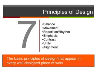
- 1. Principles of Design The basic principles of design that appear in every well-designed piece of work. •Balance •Movement •Repetition/Rhythm •Emphasis •Contrast •Unity •Alignment
- 2. Principles of Design How we apply the Principles of design determines how successful we are in creating a work of art. The principles of good design are the tools used by an artist or designer to create an effective composition or design. They are rules to help guide a designer how to arrange the various elements of a composition in relation to each other and the overall design.
- 3. Balance Balance provides stability and structure to a design. Balance is the weight distributed in the design by the placement of your elements. Balance can be achieved by placing a large element on one side of your design and several small elements on the other side.
- 4. Balance Balance can be achieved in 3 ways: Symmetrical Symmetrical balance is achieved when the weight of the elements on both halves of the design is even, given a centre line. Asymmetrical In asymmetrical balance, the sides are different but still look balanced. Radial In radial balance, the elements are arranged around a central point and may be similar.
- 6. SYMMETRICAL BALANCE in WEBSITES The elements of a composition are the same on either side of an axis line.
- 7. ASYMMETRICAL BALANCE in WEBSITES Objects on the page are arranged so that, despite their differing size, shape, tone, or placement, they equalize the weight of the page.
- 8. FAILING TO ACHIEVE BALANCE
- 9. Movement Movement is the path our eyes follow when we look at a work of art. Movement can be directed along lines, edges, shape, and color within the work of art.
- 10. Repetition / Rhythm Repetition strengthens a design by tying together individual elements. Repetition helps to create association and consistency. Consistent repetition of an element is widely used in multi-page documents & websites.
- 11. Repetition
- 13. Use the same colors, textures and other design elements throughout the page and from page to page REPETITION in WEBSITES
- 14. Emphasis Emphasis is the part of the design that catches the viewer’s attention Emphasis is used by designers to create dominance and focus in their work. Traditionally emphasis was the central part of the design, from which all other parts radiated.
- 15. Contrast attracts the attention of your viewers. EMPHASIS in WEBSITES
- 16. Contrast attracts the attention of your viewers. FAILING TO ACIEVE EMPHASIS in WEBSITES
- 17. Contrast Contrast allows you to emphasize or highlight key elements within your design. Contrast is created when two elements are total opposites It must be strong and obvious. It needs to make an impact. It can be achieved with fonts (classic/contemporary), lines (thick/thin) and shapes (big/small), just to name a few.
- 18. Contrast attracts the attention of your viewers.
- 19. Contrast
- 20. Contrast attracts the attention of your viewers. CONTRAST in WEBSITES
- 21. Contrast attracts the attention of your viewers. CONTRAST in WEBSITES
- 22. Unity Unity is the feeling of harmony between all parts of the work of art, which creates a sense of completeness. When all the elements in a work look as though they belong together, the artist has achieved unity.
- 23. Use the same colors, textures and other design elements throughout the page and from page to page UNITY in WEBSITES
- 24. FAILING TO ACHIEVE UNITY in WEBSITES
- 25. Alignment Alignment governs how text and graphics line up with each other. The use of grids and guides can aid in placement and alignment of both text and graphics.
- 26. Alignment
- 28. In Conclusion… The difference between a weak design and a strong one is completely dependent upon the artist's knowledge of the design principles and how well he/she applies them. All art, whether it is Web design, industrial design, fine art, sculpture, commercial art, or graphic art, is subject to the same principles of good design.