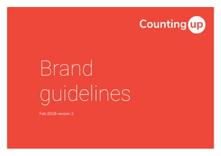
Countingup style guide - brand guidelines
•
0 recomendaciones•639 vistas

This document provides brand guidelines for Countingup, including sections on logo usage, colour palette, typography, and applications of the brand elements. The logo comes in 3 versions for different backgrounds and an icon is used for social media. Roboto and Nunito Sans typfaces are used. Colour palette includes primary and secondary colours. Examples show using the brand elements in documents, photography choices, and email layouts.

Recomendados
Más contenido relacionado
La actualidad más candente
La actualidad más candente (20)
Similar a Countingup style guide - brand guidelines
Similar a Countingup style guide - brand guidelines (20)
Último
Último (20)
Countingup style guide - brand guidelines
- 2. 2 Contents Logo & icon The logo p. 4 Incorrect logo usage p. 5 Using the logo on backgrounds p. 6 The icon p. 7 Logo and icon size p. 8 Colour palette Colour palette p. 10 Typography Typography p. 12 Using the typography p. 13 Grammar guide p. 14 Applications Typography in Google Docs p. 16 Choosing photography p. 17 Visual styling p. 18 Google Slides p. 20 Email layouts p. 21
- 3. 3 Logo & icon Countingup uses a different brand artwork for different situations. A set of logos have been created for use on light, dark or busy backgrounds and an icon for use on social media and mobile apps.
- 4. 4 2x x x The logo This is our logo. It comes in 3 versions to use on light, dark or coloured/busy backgrounds. Minimum clear space Original 2 colour Inverted 2 colour White version
- 5. 5 Incorrect logo usage Don’t change the font of the logo Don’t change the proportions of the logo components Don’t stretch or squash the logo disproportionately Don’t add any shadow or glow effects to the logo Don’t change the colours of the logo Don’t rotate the logo 1 2 3 5 4 6 1 2 3 4 5 6
- 6. 6 Using the logo on backgrounds Incorrect logo usage If the background is too dark it can make it hard to see the logo. If the background is red then the red icon component would be hard to see, it would be advised to use the white logo instead. Correct logo usage The original logo can be used if the background is light enough and clean. If the background is black, the inverted logo can be used to ensure the contrast is highest and most legible. Use the original logo where possible as it expresses our brand identity the best.
- 7. 7 6x x x The icon To be used for the Favicon, certain social media and app stores where it would be too small for the logo. Minimum clear space
- 8. 8 Logo and icon size There are minimum sizes for these brand marks to ensure they are always legible no matter in which format. Minimum size The smallest the logo can be is 27px in height or 9mm in height. Icon usage In a situation where you would require a logo smaller than 27px or 9mm in height, it is advised to use the icon instead. 27px in height, 101px in width 27px in height, 27px in width 9mm in height, 9mm in width 9mm in height, 34mm in width
- 9. 9 Colour palette Red is the main colour for Countingup as it’s energetic, warm and provides visual impact. For the most basic colour scheme, Jelly Red, Coal Black and white would work well. The grey and blue tones in the colour palette help bring a sense of confidence, and trust to Countingup’s message.
- 10. 10 Colour palette Primary colours A basic, minimal layout which consists of mainly typography can be achieved using only these colours. Tints and shades can be used for all colours where appropriate. Secondary colours These act as supporting colours for the primary colours. Dark Red can act as a shadow colour for Jelly Red, same for both of the Teals, and the Purples. Tints and shades can be used for all colours where appropriate. Jelly Red #E63C2F R230 G60 B47 C1 M87 Y83 K0 Pantone 179 C Medium Grey #BDC5C2 R190 G198 B195 C30 M17 Y23 K7 Pantone 441 C Eagle Teal #004D71 R0 G78 B114 C100 M58 Y33 K23 Pantone 3025 C Visual Purple #62259D R99 G38 B158 C79 M91 Y0 K0 Pantone 267 C Coal Black #262829 R38 G40 B42 C75 M64 Y57 K72 Pantone 426 C Midnight Teal #003D51 R0 G62 B82 C100 M61 Y45 K42 Pantone 3035 C Dark Purple #3D0F50 R61 G16 B80 C89 M100 Y34 K32 Pantone 2627 C Cash Green #00945E R0 G148 B94 C98 M5 Y79 K0 Pantone 340 C Dark Grey #4E5758 R79 G88 B88 C65 M48 Y49 K41 Pantone 445 C Dark Red #A22929 R161 G40 B40 C25 M94 Y83 K21 Pantone 7628 C Citrus Green #CEDC00 R206 G220 B0 C25 M0 Y98 K0 Pantone 381 C Dark Citrus Green #BBBB14 R187 G187 B19 C34 M14 Y99 K2 Pantone 7744 C Light Grey #EDEDED R237 G237 B237 C8 M6 Y7 K0 White #FFFFFF R255 G255 B255 C0 M0 Y0 K0 Saffron Orange #FF963B R255 G143 B28 C0 M45 Y69 K0 Pantone 1495 C Middle Blue #6AD1E3 R106 G209 B227 C48 M0 Y9 K0 Pantone 310 C
- 11. 11 Typography Countingup uses 2 typefaces, Roboto was chosen to reinforce the clean, no-nonsense, yet empathetic aesthetic we are after for the use of headings. Nunito Sans is a display font which was designed to be highly legible even when the size of the text is small. This section introduces the typefaces and presents a set of principles for styling textual content.
- 12. 12 Typography Large headings Body text We suggest not using Extra-Light and Black weights as they would not be as legible in a small size. Roboto Thin Roboto Bold Nunito Sans Light Light Italic Regular Regular Italic Semi-Bold Semi-Bold Italic Bold Bold Italic
- 13. 13 Roboto Thin & Bold for titles Roboto Thin for subheadings Nunito Sans Bold for third subheadings Nunito Sans Regular for paragraph body text. Bold can be used for emphasis. Italics can also be used for emphasis. Nunito Sans Regular for small text, annotations and captions. Using the typography Size 45pt, line height 54pt Roboto Bold is to be used in juxtaposition to Roboto Thin for emphasis and not on its own. Size 36pt, line height 45pt Size 15pt, line height 27pt Bold and italics can be used for emphasis. Size 18pt, line height 27pt Size 12pt, line height 18pt The text sits on a baseline of 9pt. So the line height and bottom margins are always a multiple of 9 (or if that’s not possible, 4.5). Different print and web layouts will have different sizes to maximise readabilty. This example could be suitable for desktop web view:
- 14. 14 Write the date as the day of the month, followed by the name of the month in full, and the four digit year E.g. 7 April 2018 Grammar guide Always use sentence case Use sentence case even for headings and titles. All paragraph body text will need a full stop at the end. Titles, headings and subheadings won’t need full stops. Use British spelling Ensure that words like colour, centre and recognise, aren’t the American spelling. Always use spell check. Countingup is one word when in writing Don’t spell it as separate words. The U is lower-case. No need to include http://www. at the beginning of a URL and no / at the end E.g. countingup.com Use superscript ordinals in print and cardinals for online 17th September for print 17 September for online We use the 24 hour time format E.g. 14:35 Numbers as numerals followed by a word E.g. 10 million Postcode in all caps and space in between E.g. W14 0QL
- 15. 15 Applications This part of the guide will illustrate principles for using the logo, colour palette and typography together. The following examples serve as inspiration for basic layouts, additional design elements will need more design considerations.
- 16. 16 Typography in Google Docs Text will follow the baseline grid of 9pt though it might fall out of it on occasion. Template is available on request. Roboto Thin for titles Roboto Thin for subheadings Roboto Thin for second subheadings Nunito Sans Bold for third subheadings Nunito Sans Bold for fourth subheadings Nunito Sans Bold for fifth subheadings Nunito Sans Bold for sixth subheadings Nunito Sans Regular for normal text. Bold can be used for emphasis. Italics can also be used for emphasis. Ut enim ad minim veniam, quis nostrud exercitation ullamco laboris nisi ut aliquip ex ea commodo consequat. “Roboto Thin Italics for quotes.” Nunito Sans Italic and Nunito Sans Bold Italic for small text, annotations and captions. Size 38, line spacing 1.18 spacing before: 9, after: 6 Size 30, line spacing 1.20 spacing before: 3, after: 6 Size 24, line spacing 1.25 spacing before: 0, after: 9 Size 16, line spacing 1.69 spacing before: 9, after: 0 Size 12, line spacing 1.13 spacing before: 5, after: 4 Size 10, line spacing 1.35 spacing before: 6, after: 3 Size 10, line spacing 1.35 spacing before: 6, after: 3 Size 13, line spacing 1.7 spacing before: 9, after: 18 Size 18, line spacing 1.50 spacing before: 0, after: 3 Size 10, line spacing 1.80 spacing before: 9, after: 0
- 17. 17 Choosing photography Countingup prefers uplifting photography that heighten positive emotions. Choose images that show a sense of wonder, excitement, achievement or confidence, fun and celebration; an appreciation of the atmosphere. Photos of people having fun, trying something together or creating a good memory, either on their own, pairs or groups fit the Countingup brand well. It’s preferred to include some colours of the Countingup colour palette within the photography. It would be ideal to have part of the subject of the photo in red to tie it in with the brand’s main colour.
- 18. 18 Visual styling It is encouraged that designers maximise creative freedom in order to achieve visually captivating designs for Countingup. All we ask is for these brand elements to be well incorporated into both web and print designs where suitable. Large white borders Most recommended for print mediums. Another example would be this styleguide. Big areas of white space or Jelly Red The Countingup style likes lots of breathing space, so it’s recommended that lots of white space is used or alternatively large blocks of colour. Our favourite would be to use the brand colour Jelly Red. Large background photography Photography can be used to emphasis the brand values and create the right atmosphere. It’s no secret that navigating tax regulations can be a minefield for sole traders, especially when it comes to knowing what you can and can’t deduct come tax return season. Of course you want to take advantage of the maximum deductions but you don’t want to run the risk of making a mistake on your self-assessment and including something you shouldn’t. Use this simple list of the top 10 deductible business expenses to help you navigate HMRC tax rules and regulations. Top 10 expenses What can I claim?
- 19. 19 Our big splotches of Light Grey for backgrounds Make use of curved lines. Light Grey can also be tinted lighter. The title pattern matching with the Mastercard Tile pattern is available upon request. Large, blurry, top-down shadows Creating the drop shadow effect in Adobe Illustrator Go to Effect > Illustrator Effects > Stylise > Drop Shadow and use the following settings using the colour #000000. Use these settings as inspiration for print and web layouts. The effect we are after is a subtle, blurry shadow where the light source above the object.
- 20. 20 Google Slides 3 layout styles are provided in the Countingup Google Slides template Ideally, the text size, colour and placement should not be altered. If a new layout is needed, ensure to follow the grid lines. If there is too much text, spread the content over 2 pages instead of decreasing text side where possible. Template is available on request. To toggle on the grid Go to Slide > Edit master. From the master page, right click on a blank space and select Image options. Adjust the image Transparency.
- 21. 21 Email layout Mobile view The Countingup logo is sized at 36px height and sits at the top with top and bottom margins of 36px. The left and right margins of the email are 36px. The button is 45px tall with 4px radius corners in Jelly Red. Font size 18pt, line height 27pt bold white text. Desktop view The desktop view is the same as the mobile view except for the areas mentioned. The white area where the main body of the email has left and right padding of 72px and top and bottom padding of 36px. The maximum width of the white area is 600px. Beyond this area is coloured Light Grey. Desktop 600pxMobile 320px
- 22. 22 Email layout typography Desktop 600pxMobile 320px Paragraph text Size 15pt, line height 27pt, margin after 18pt, Coal Black Display text Size 27pt, line height 36pt, margin after 18pt, Dark Grey Small text Size 12pt, line height 18pt, margin after 18pt, Coal Black Hyperlinks and horizontal rules are in the colour Jelly Red Social media icons are in Eagle Teal
- 23. 23 Email layout illustration images Desktop 600pxMobile 320px Illustration Place illustration at the top under the logo with 36px margin above and below it. Ensure to not distort the image ratio. The ideal way to include an image for the email is to have an illustration sized for mobile view at minimum 178px high and 248px wide and have it centred. When the image is seen on desktop, it should be within the white area, still centred with 36px padding above and below it.
- 24. 24 Email layout photographic images Desktop 600pxMobile 320px Photography A photo may sit at the top of the email under the logo. It is best to set the photograph as a background cover to ensure it fills up the intended area for both mobile and desktop view and to also ensure to not distort the image’s aspect ratio. There should be a margin of 36px underneath it before the text starts,
- 25. 25