
Recomendados
Recomendados
Más contenido relacionado
La actualidad más candente
La actualidad más candente (15)
Destacado
Similar a Store windows
Similar a Store windows (20)
Store windows
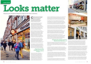
- 1. 51June / July 2013 | C&I | www.c-store.com.auJune / July 2013 | C&I | www.c-store.com.au50 C REATING THE RIGHT STORE BRAND IMAGE THROUGH WELL DESIGNED shop fronts, store signage and logos, attractive colour schemes and store windows are essential tools of retailing that increase store recognition and entice customers into the store. It’s evident that a stronger retail visual brand identity for smaller format store designs is needed in Australia for independents and chains operating stores of under 1,000sqm in supermarket, grocery, food to go, convenience and petrol station stores. Independent stores need a real point of difference to compete with the national food chains and their huge marketing, store design and refurbishment budgets. However, Australia has some good shopfront design in this market, seen mainly in convenience from groups such as Caltex Star Mart, 7-Eleven, UCB’s fast&easy, Lucky 7 and some of the larger independent supermarkets. Among the better designs are gourmet/fresh grocers such as Woolworths’ Thomas Dux, Leo’s in Melbourne and Harris Farm in NSW, who try harder to create a distinctive or clean and open shopfront look. Cities like London and New York are regulary visited by designers and retailers for inspiration. In London, good store designs include gourmet food to go shops such as Pret A Manger and Camden Food Co, and grocery convenience stores Waitrose, Marks & Spencer and Sainsbury Local. One of the best U.S. convenience store designs is the new WAWA store found at gas station sites. In New York, Duane Reade drugstores offer groceries and food to go. Their 40 Wall Street ‘up market’ store won the 2012 Convenience Store News Store Design contest for Best Foodservice Presentation. Opening up the shopfront is good design: Finschi phd Director of Finschi, phd, Port Melbourne, Paul Hickman says there are major differences between high streets and shopping centres, with the latter encouraging very large format grocers. Colonial Fresh in Melbourne has a completely open store and a shop front would create a barrier for entry for a large format store. Finschi, phd aims to create the largest shopfront opening, while natural timber could be used to create a portal around the entry. Improve your shopfront design & image to win more customers Looks matter A gift store may add 30% glazing to the shopfront or store to display goods; shopfronts are about merchandising and the higher up the client is in the market, there is more need to display goods. If you are in an A grade Westfield shopping centre it will have very strong design specifications. The shopfront entry is also about establishing a brand positioning through signage. If you’re trying to sell fruit and vegetables or flowers, don’t have a barrier to the customers. But on high streets, retailers often cannot afford to have wide glass fronts and may have to compromise on space and limit entry/exit doors and consider the air conditioning. Larger grocers such as Coles use strong corporate images, while smaller grocers and greengrocers have limitations. We try to give them a distinctive, branded and graphic look using timber frames or sometimes aluminium panels around the shopfront and to make shopfronts more interesting and colourful or distinctive, while it’s better to let people see into the store. Thomas Dux is one of the better high street gourmet grocer/ supermarkets designs. They leave a fair amount of the store open with a good graphic branding on shopfront glazing, such as at Black Rock, Melbourne, good signage and merchandising. They bring a certain amount of merchandise out and activate the entry and the footpath. Thomas Dux doesn’t use huge signage and it’s only part of the presentation. I don’t believe you need to use a lot of wording on signage and brand positioning could run with the name and logo and use some wording to establish it. But shopfront signage, positioning, graphics and textures, and natural materials could be used to improve the brand image and attract customers into the store, Mr Hickman says. Shopfronts require strong, distinctive identity: Edge id Megan Roberts of Edge interior design, Annandale, Sydney says the initial impression of a store happens at the shopfront. Customers make their decision to go into a store generally within moments of passing by the frontage, whether they are on a street or within a shopping centre. So what draws them into your store? A strong, distinctive identity is required to the shopfront so as to create a prominent visual presence upon approach. The name and logo design are an integral part to creating a positive store image, however the facade treatment, merchandising and overall 3D environment all play an important role in creating a strong visual identity for the store. All shopfront elements must be looked at holistically. The logo for the shopfront signage must be well considered to provide a brand identity that not only reflects the product offer, but also provides a visually strong image to the store facade. Additional graphic elements may also be required to reinforce the product offer inside, however they must be carefully considered to ensure that the customer is not overwhelmed by too many design elements and messages. Visual clutter causes information overload for customers. The location of the store and its surrounding environment must also be a consideration when designing the shopfront. Yes, the store needs to stand out from the other stores around, however this does not mean that it has it has to be bright, colourful and overbearing. It can be visually in- keeping with its environment, making it part of the local community and not an eyesore. The overall ambience and the positive impact that it has on its customer is the most critical focus for the store. However, a store exterior may need to have colour and movement, depending on the type of store and its relationship to the surrounding environment. The illumination of the retail store is also important. An over illuminated space can be a harsh, unwelcoming environment to shop in. Of course a dimly lit space is also not the right approach, however there needs to be a balance so as to create a more welcoming experience for customers. The display windows for instance, in both high street and shopping centre stores, should have a brighter level of illumination to provide visual impact to the shopfront area. Vision into the store is important to create a more inviting, open feel. Visual clutter, entries that are difficult to access and blocked windows send a negative and unwelcome message to customers. Well merchandised shopfront windows are another consideration: the type of product offer on display will determine if it is worth displaying at the shopfront line. Displaying fresh produce at the front of a grocery / fruit and vegetable store is imperative. However, with a convenience store, it may be best to keep the windows free from display to allow clear vision to the merchandise offer inside. Basically there must be a balance to create a strong, visually stimulating, uncluttered shopfront that entices and invites customers into the retail environment. STORE DESIGN
- 2. 53June / July 2013 | C&I | www.c-store.com.auJune / July 2013 | C&I | www.c-store.com.au52 Jack Rabbit’s unique convenience store image Jack Rabbit is a unique convenience store design that opened in Taree in October 2012 alongside a BP service station after store co-owner Wade Death investigated convenience and retail store designs in London, Europe and New York. The store has a distinctive image with attention-grabbing shopfront and creative, bold store name and rabbit logo, which looks equally good day or night. The welcoming, open glass shopfront is supported by creative window graphics promoting the offer, such as “great coffee” and “fresh made rolls & salad”. “We invested a lot in better presentation and the store front look,” Wade says. “The customer reaction has been great and we’re very happy with customer feedback and sales growth. Our store sales compared with the previous store sales initially were growing 25% month-on-month, to the point where we’ve hit a 100% sales improvement on the previous store. It’s now levelling out to a more manageable level. “It was about creating a point of difference and people leave with a good experience - customers are very impressed and ask where the store design comes from. We did not trade off cost in designing the store and needed to achieve the look and design we wanted.” Marks & Spencer and Waitrose are both great examples of convenience/supermarket stores in the UK, Ms Roberts says. Strong visibility important on high streets: Blue Leaves Design Anshuman Bhargava, creative head with New Delhi, India Blue Leaves Design says a retail store design needs to offer a unique experience and support the brands it sells, to remain fresh, flexible and intriguing, maintain the interest of customers and ensure repeat business. “A high-street store should be visible enough from a distance since the customers are usually far from the store and at times even in a car or a bus,” he says. “So it should be able to catch the customer’s attention immediately. Everything must stand out more and be bolder – the branding, the signage, the facade, etc.” Mr Bhargava believes high street storefronts need to be designed for both day and night, while the lighting within the high-street store and its external signage should be adjustable according to the time of day. New protein fix in two great flavours T HERE IS A NEW PRODUCT launching into the market which will deliver a protein fix unlike any other! Life + is an Egg white based protein drink, launching with 2 great flavours – Chocolate Fudge and French Vanilla. Packed with natural ingredients, Life + is a healthier alternative to current products which are available on the market. Life+ is an innovative protein shake - made with real egg whites. It makes a great breakfast for trades and health conscious individuals. Drink it as a meal replacement or use it for muscle recovery and sustained energy post workout. Life + contains 45g of protein, is low in carbs and contains less than 1% fat. Life+ promises "a whopping 5 hours maximum protein in your muscles" and will have strong in-store appeal. So, muscle in on Life+ and get it in your fridge while it's hot. Life+ sports packaging with attitude and will create a bold presence in store. It's masculine, muscular and memorable. Life+ offers the advantage of a long shelf life (45 days) but should be stored at <5°C. So, make sure you stock it in your milk fridge (next to flavoured milks). Contact Sales at Icon Foods | 02 95190700 Sales@iconfoods.com.au | www.iconfoods.com.au MuscleMuscle in onin on Life+Life+ SKU CODE DESCRIPTION UNIT BARCODE VOLUME FORMAT CONFIGURATION 1201 Life + Choc Fudge 9345172000085 500ml Carton 6 x 500ml 19345172000 1202 Life + French Vanilla 9345172000061 500ml Carton 6 x 500ml 19345172000 • Natural Ingredients and great taste • Healthier alternative to current products on the market • Healthy meal replacement • Sustained Energy to keep you on the go! BENEFITS FOR YOUR CONSUMERS: