SlideShare una empresa de Scribd logo
1 de 40
Descargar para leer sin conexión
Back to the lab again
                        Barcamp Gent #4 - 25 juni 2011


Saturday 25 June 2011
Johan Ronsse
     Mijn naam is

         Johan
Saturday 25 June 2011
Ik werk voor mijn kleine
                        freelance design studio:


                            Wolf’s Little Store

Saturday 25 June 2011
Ik ontwerp graag


                                      Maar noem het
                                      alsjeblief niet “creatief”


Saturday 25 June 2011
Ik speel al eens eens
            graag een spelletje


Saturday 25 June 2011
Of schrijf een blogpost


Saturday 25 June 2011
Vandaag ga ik het hebben over

                            Responsive
                            webdesign

Saturday 25 June 2011
2   Opmerkelijke
                            statistieken


Saturday 25 June 2011
1


                 Phil Schiller zegt:
            “ 73% of our Mac sales
              are notebooks.”
Saturday 25 June 2011
2          Eric Schmidt zegt:
                        “ One of the interesting estimates is
                         that are are about 35 billion devices
                         connected to the internet. Soon, there
                         will be so many that we’ll stop
                         counting.”


Saturday 25 June 2011
De wereld
              verandert snel...

Saturday 25 June 2011
en alles kan
                        tegenwoordig
                        op internet
Saturday 25 June 2011
En dus moet uw site
                        moet daar rekening
                        mee houden.

                                              Illustration by Leonardo da Vinci

Saturday 25 June 2011
Hoe?
                                Een van de mogelijkheden:


                 Responsive design
                         (Het alternatief: een aparte
                        mobiele website)


Saturday 25 June 2011
Meet Jos.
                        • 52 jaar
                        • Werkt in den bouw maar
                        wil webdesigner worden
                        • Houdt van zijn vrouw,
                          iPhone en iPad


                                 Face intentionally blurred for privacy reasons

Saturday 25 June 2011
Bijvoor
                beeld
                 Jos surft op zijn
                 iPhone naar een
                 website. De layout
                 is aangepast aan
                 de breedte van het
                 scherm.


Saturday 25 June 2011
Knoppen geschikt
                 voor dikke vingers


                 Opties weggestopt
                 in uitklapmenu om
                 op de inhoud te
                 focussen


Saturday 25 June 2011
‘s Avonds kijkt Jos     *Dit is dezelfde website
        nog eens naar de
        jobs op zijn laptop*:


Saturday 25 June 2011
Dezelfde website:


      320px
      Smartphone
                        768px
                        iPad (portrait)
                                          1024px
                                          Desktop
                        Netbook           iPad (landscape)


Saturday 25 June 2011
De beste manier om het te snappen...


                              ... is het zelf eens proberen.

                              http://mediaqueri.es
                                       Photo by Mike Rohde - http://www.flickr.com/photos/rohdesign/3534506648/

Saturday 25 June 2011
WARNING! TECHNICAL PART!


                 Hoe moet je dat
                 dan maken?


Saturday 25 June 2011
WARNING! TECHNICAL PART!


                 Media
                 queries
                 Een media query is een CSS techniek om layout te bepalen
                 op basis van een parameter, in dit geval dat het medium
                 “screen” is.

                  @media screen {
                    body { font-family: sans-serif; }
                  }


Saturday 25 June 2011
WARNING! TECHNICAL PART!


                 Media
                 queries
                 Deze parameter kan dus ook de breedte zijn van je scherm:
                  @media (min-width:768px) {
                      img {
                          width: 100%;
                      }
                  }


Saturday 25 June 2011
Op deze manier bouwen we een site op:                 WARNING! TECHNICAL PART!

                 @media all {
                     /*
                        CSS regels voor alles, de @media
                        query kan je hier weglaten
                     */
                 }

                 @media (min-width:320px) {
                     /* CSS regels voor smartphones*/
                 }

                 @media (min-width:768px) {
                     /* CSS regels voor tablets */
                 }

                 @media (min-width:960px) {
                     /* CSS regels voor desktop*/
                 }


Saturday 25 June 2011
Wat kan je weten?
                  • De schermbreedte


                 Wat niet?
                  • Waarom de bezoeker de site bezoekt
                  • Welk toestel hij gebruikt
                  • Of hij een snelle internetverbinding heeft of niet


Saturday 25 June 2011
Bijvoor
                beeld
                 De mobiele
                 website van Viget
                 labs (dit is een
                 aparte mobiele
                 website)


Saturday 25 June 2011
Vereenvoudigde
                 navigatie


         Veronderstelling
         dat de bezoeker
         onderweg is en de
         weg wil weten


Saturday 25 June 2011
Schermbreedte bepaalt de
              context van de gebruiker niet
               E.g. een smartphone gebruiker ligt misschien gezellig te
               surfen voor het slapengaan in plaats van “onderweg” te
               zijn. (Het kan echter wel)


Saturday 25 June 2011
Mobiele sites die
         een versimpeling
         zijn van de echte
         site zijn verwarrend

                Ik wil herladen, valt
                dat nu onder
                mobiel of niet?


Saturday 25 June 2011
Aparte mobiele site:
             waarom nog de moeite          Goed
                                       voorbeeld
             doen?

          1 woord:

          Performance
             1 probleem met responsive site:
             de site blijft even zwaar om te
             laden als desktop versie*.


                                                   *Ik besef dat dit een beetje kort door de bocht is

Saturday 25 June 2011
EVERYTHING
                 OLD IS NEW
                 AGAIN
Saturday 25 June 2011
THE GREAT 1998-2007

                        Liquid   VS.   Fixed
                                           DEBATE


Saturday 25 June 2011
Flickr organizer
                        Appropriate liquid design


Saturday 25 June 2011
Mint   Responsive before
                               the book was written


Saturday 25 June 2011
Samenvatting
              Fixed
              Alle controle: print designers like this
              Maar: veelal achterhaald. Je website wordt op veel
              verschillende devices bekeken.


              Fluid
               Bruikbaarder maar de hel om goed te krijgen in IE, potentieel
               heel lelijk (op grote schermen) extra werk, geen typografische
               controle

              Responsive
               = The best of both worlds
               Uiteraard extra werk maar relatief doenbaar

Saturday 25 June 2011
Juist toen je dacht alles te weten:


                        Back to the lab again

Saturday 25 June 2011
Vragen?

Saturday 25 June 2011
Bedankt!
                        http://www.wolfslittlestore.be
                        @wolfr_ op Twitter


Saturday 25 June 2011
Resources
      1. Technisch (Hoe doe ik dit nu?)
     http://mediaqueri.es/ : gallerij met responsive designs
     http://www.alistapart.com/articles/responsive-web-design/ : het artikel dat alles startte
     Boek: http://www.abookapart.com/products/responsive-web-design : hier is nu een boek over

     http://www.alistapart.com/articles/fluid-images/ : stuk uit het boek
     Old: http://unstoppablerobotninja.com/entry/fluid-images/ : de post waar het mee begon voor fluid
     images

     https://github.com/scottjehl/Respond/ : Javascript fix om media queries te doen werken in IE
     http://filamentgroup.com/examples/responsive-images/
     http://webdesignerwall.com/tutorials/css-elastic-videos


      1B. Technisch - performance
     http://www.cloudfour.com/where-are-the-mobile-first-responsive-web-designs/
     http://warpspire.com/talks/responsive/


Saturday 25 June 2011
Resources
      2. Filosofisch (waarom geen aparte mobiele site? Hoe zit het met mobiel
      tegenwoordig?)
       Yiibu presentations on slideshare:
       http://www.slideshare.net/yiibu/beyond-themobilewebbyyiibu
       http://www.slideshare.net/yiibu/the-trouble-with-context

       http://www.andybudd.com/archives/2011/06/dose_screen_size_really_matter/
       Geschiedenis responsive design: http://adactio.com/journal/4593/


        3. Belgisch
       http://www.thehotseat.be/2/blog/post/sleepstreet-mijn-eerste-responsive-ontwerp


Saturday 25 June 2011

Más contenido relacionado

Destacado

AI Trends in Creative Operations 2024 by Artwork Flow.pdf
AI Trends in Creative Operations 2024 by Artwork Flow.pdfAI Trends in Creative Operations 2024 by Artwork Flow.pdf
AI Trends in Creative Operations 2024 by Artwork Flow.pdfmarketingartwork
 
PEPSICO Presentation to CAGNY Conference Feb 2024
PEPSICO Presentation to CAGNY Conference Feb 2024PEPSICO Presentation to CAGNY Conference Feb 2024
PEPSICO Presentation to CAGNY Conference Feb 2024Neil Kimberley
 
Content Methodology: A Best Practices Report (Webinar)
Content Methodology: A Best Practices Report (Webinar)Content Methodology: A Best Practices Report (Webinar)
Content Methodology: A Best Practices Report (Webinar)contently
 
How to Prepare For a Successful Job Search for 2024
How to Prepare For a Successful Job Search for 2024How to Prepare For a Successful Job Search for 2024
How to Prepare For a Successful Job Search for 2024Albert Qian
 
Social Media Marketing Trends 2024 // The Global Indie Insights
Social Media Marketing Trends 2024 // The Global Indie InsightsSocial Media Marketing Trends 2024 // The Global Indie Insights
Social Media Marketing Trends 2024 // The Global Indie InsightsKurio // The Social Media Age(ncy)
 
Trends In Paid Search: Navigating The Digital Landscape In 2024
Trends In Paid Search: Navigating The Digital Landscape In 2024Trends In Paid Search: Navigating The Digital Landscape In 2024
Trends In Paid Search: Navigating The Digital Landscape In 2024Search Engine Journal
 
5 Public speaking tips from TED - Visualized summary
5 Public speaking tips from TED - Visualized summary5 Public speaking tips from TED - Visualized summary
5 Public speaking tips from TED - Visualized summarySpeakerHub
 
ChatGPT and the Future of Work - Clark Boyd
ChatGPT and the Future of Work - Clark Boyd ChatGPT and the Future of Work - Clark Boyd
ChatGPT and the Future of Work - Clark Boyd Clark Boyd
 
Getting into the tech field. what next
Getting into the tech field. what next Getting into the tech field. what next
Getting into the tech field. what next Tessa Mero
 
Google's Just Not That Into You: Understanding Core Updates & Search Intent
Google's Just Not That Into You: Understanding Core Updates & Search IntentGoogle's Just Not That Into You: Understanding Core Updates & Search Intent
Google's Just Not That Into You: Understanding Core Updates & Search IntentLily Ray
 
Time Management & Productivity - Best Practices
Time Management & Productivity -  Best PracticesTime Management & Productivity -  Best Practices
Time Management & Productivity - Best PracticesVit Horky
 
The six step guide to practical project management
The six step guide to practical project managementThe six step guide to practical project management
The six step guide to practical project managementMindGenius
 
Beginners Guide to TikTok for Search - Rachel Pearson - We are Tilt __ Bright...
Beginners Guide to TikTok for Search - Rachel Pearson - We are Tilt __ Bright...Beginners Guide to TikTok for Search - Rachel Pearson - We are Tilt __ Bright...
Beginners Guide to TikTok for Search - Rachel Pearson - We are Tilt __ Bright...RachelPearson36
 
Unlocking the Power of ChatGPT and AI in Testing - A Real-World Look, present...
Unlocking the Power of ChatGPT and AI in Testing - A Real-World Look, present...Unlocking the Power of ChatGPT and AI in Testing - A Real-World Look, present...
Unlocking the Power of ChatGPT and AI in Testing - A Real-World Look, present...Applitools
 
12 Ways to Increase Your Influence at Work
12 Ways to Increase Your Influence at Work12 Ways to Increase Your Influence at Work
12 Ways to Increase Your Influence at WorkGetSmarter
 

Destacado (20)

AI Trends in Creative Operations 2024 by Artwork Flow.pdf
AI Trends in Creative Operations 2024 by Artwork Flow.pdfAI Trends in Creative Operations 2024 by Artwork Flow.pdf
AI Trends in Creative Operations 2024 by Artwork Flow.pdf
 
Skeleton Culture Code
Skeleton Culture CodeSkeleton Culture Code
Skeleton Culture Code
 
PEPSICO Presentation to CAGNY Conference Feb 2024
PEPSICO Presentation to CAGNY Conference Feb 2024PEPSICO Presentation to CAGNY Conference Feb 2024
PEPSICO Presentation to CAGNY Conference Feb 2024
 
Content Methodology: A Best Practices Report (Webinar)
Content Methodology: A Best Practices Report (Webinar)Content Methodology: A Best Practices Report (Webinar)
Content Methodology: A Best Practices Report (Webinar)
 
How to Prepare For a Successful Job Search for 2024
How to Prepare For a Successful Job Search for 2024How to Prepare For a Successful Job Search for 2024
How to Prepare For a Successful Job Search for 2024
 
Social Media Marketing Trends 2024 // The Global Indie Insights
Social Media Marketing Trends 2024 // The Global Indie InsightsSocial Media Marketing Trends 2024 // The Global Indie Insights
Social Media Marketing Trends 2024 // The Global Indie Insights
 
Trends In Paid Search: Navigating The Digital Landscape In 2024
Trends In Paid Search: Navigating The Digital Landscape In 2024Trends In Paid Search: Navigating The Digital Landscape In 2024
Trends In Paid Search: Navigating The Digital Landscape In 2024
 
5 Public speaking tips from TED - Visualized summary
5 Public speaking tips from TED - Visualized summary5 Public speaking tips from TED - Visualized summary
5 Public speaking tips from TED - Visualized summary
 
ChatGPT and the Future of Work - Clark Boyd
ChatGPT and the Future of Work - Clark Boyd ChatGPT and the Future of Work - Clark Boyd
ChatGPT and the Future of Work - Clark Boyd
 
Getting into the tech field. what next
Getting into the tech field. what next Getting into the tech field. what next
Getting into the tech field. what next
 
Google's Just Not That Into You: Understanding Core Updates & Search Intent
Google's Just Not That Into You: Understanding Core Updates & Search IntentGoogle's Just Not That Into You: Understanding Core Updates & Search Intent
Google's Just Not That Into You: Understanding Core Updates & Search Intent
 
How to have difficult conversations
How to have difficult conversations How to have difficult conversations
How to have difficult conversations
 
Introduction to Data Science
Introduction to Data ScienceIntroduction to Data Science
Introduction to Data Science
 
Time Management & Productivity - Best Practices
Time Management & Productivity -  Best PracticesTime Management & Productivity -  Best Practices
Time Management & Productivity - Best Practices
 
The six step guide to practical project management
The six step guide to practical project managementThe six step guide to practical project management
The six step guide to practical project management
 
Beginners Guide to TikTok for Search - Rachel Pearson - We are Tilt __ Bright...
Beginners Guide to TikTok for Search - Rachel Pearson - We are Tilt __ Bright...Beginners Guide to TikTok for Search - Rachel Pearson - We are Tilt __ Bright...
Beginners Guide to TikTok for Search - Rachel Pearson - We are Tilt __ Bright...
 
Unlocking the Power of ChatGPT and AI in Testing - A Real-World Look, present...
Unlocking the Power of ChatGPT and AI in Testing - A Real-World Look, present...Unlocking the Power of ChatGPT and AI in Testing - A Real-World Look, present...
Unlocking the Power of ChatGPT and AI in Testing - A Real-World Look, present...
 
12 Ways to Increase Your Influence at Work
12 Ways to Increase Your Influence at Work12 Ways to Increase Your Influence at Work
12 Ways to Increase Your Influence at Work
 
ChatGPT webinar slides
ChatGPT webinar slidesChatGPT webinar slides
ChatGPT webinar slides
 
More than Just Lines on a Map: Best Practices for U.S Bike Routes
More than Just Lines on a Map: Best Practices for U.S Bike RoutesMore than Just Lines on a Map: Best Practices for U.S Bike Routes
More than Just Lines on a Map: Best Practices for U.S Bike Routes
 

Responsive design

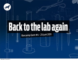
  • 1. Back to the lab again Barcamp Gent #4 - 25 juni 2011 Saturday 25 June 2011
  • 2. Johan Ronsse Mijn naam is Johan Saturday 25 June 2011
  • 3. Ik werk voor mijn kleine freelance design studio: Wolf’s Little Store Saturday 25 June 2011
  • 4. Ik ontwerp graag Maar noem het alsjeblief niet “creatief” Saturday 25 June 2011
  • 5. Ik speel al eens eens graag een spelletje Saturday 25 June 2011
  • 6. Of schrijf een blogpost Saturday 25 June 2011
  • 7. Vandaag ga ik het hebben over Responsive webdesign Saturday 25 June 2011
  • 8. 2 Opmerkelijke statistieken Saturday 25 June 2011
  • 9. 1 Phil Schiller zegt: “ 73% of our Mac sales are notebooks.” Saturday 25 June 2011
  • 10. 2 Eric Schmidt zegt: “ One of the interesting estimates is that are are about 35 billion devices connected to the internet. Soon, there will be so many that we’ll stop counting.” Saturday 25 June 2011
  • 11. De wereld verandert snel... Saturday 25 June 2011
  • 12. en alles kan tegenwoordig op internet Saturday 25 June 2011
  • 13. En dus moet uw site moet daar rekening mee houden. Illustration by Leonardo da Vinci Saturday 25 June 2011
  • 14. Hoe? Een van de mogelijkheden: Responsive design (Het alternatief: een aparte mobiele website) Saturday 25 June 2011
  • 15. Meet Jos. • 52 jaar • Werkt in den bouw maar wil webdesigner worden • Houdt van zijn vrouw, iPhone en iPad Face intentionally blurred for privacy reasons Saturday 25 June 2011
  • 16. Bijvoor beeld Jos surft op zijn iPhone naar een website. De layout is aangepast aan de breedte van het scherm. Saturday 25 June 2011
  • 17. Knoppen geschikt voor dikke vingers Opties weggestopt in uitklapmenu om op de inhoud te focussen Saturday 25 June 2011
  • 18. ‘s Avonds kijkt Jos *Dit is dezelfde website nog eens naar de jobs op zijn laptop*: Saturday 25 June 2011
  • 19. Dezelfde website: 320px Smartphone 768px iPad (portrait) 1024px Desktop Netbook iPad (landscape) Saturday 25 June 2011
  • 20. De beste manier om het te snappen... ... is het zelf eens proberen. http://mediaqueri.es Photo by Mike Rohde - http://www.flickr.com/photos/rohdesign/3534506648/ Saturday 25 June 2011
  • 21. WARNING! TECHNICAL PART! Hoe moet je dat dan maken? Saturday 25 June 2011
  • 22. WARNING! TECHNICAL PART! Media queries Een media query is een CSS techniek om layout te bepalen op basis van een parameter, in dit geval dat het medium “screen” is. @media screen { body { font-family: sans-serif; } } Saturday 25 June 2011
  • 23. WARNING! TECHNICAL PART! Media queries Deze parameter kan dus ook de breedte zijn van je scherm: @media (min-width:768px) { img { width: 100%; } } Saturday 25 June 2011
  • 24. Op deze manier bouwen we een site op: WARNING! TECHNICAL PART! @media all { /* CSS regels voor alles, de @media query kan je hier weglaten */ } @media (min-width:320px) { /* CSS regels voor smartphones*/ } @media (min-width:768px) { /* CSS regels voor tablets */ } @media (min-width:960px) { /* CSS regels voor desktop*/ } Saturday 25 June 2011
  • 25. Wat kan je weten? • De schermbreedte Wat niet? • Waarom de bezoeker de site bezoekt • Welk toestel hij gebruikt • Of hij een snelle internetverbinding heeft of niet Saturday 25 June 2011
  • 26. Bijvoor beeld De mobiele website van Viget labs (dit is een aparte mobiele website) Saturday 25 June 2011
  • 27. Vereenvoudigde navigatie Veronderstelling dat de bezoeker onderweg is en de weg wil weten Saturday 25 June 2011
  • 28. Schermbreedte bepaalt de context van de gebruiker niet E.g. een smartphone gebruiker ligt misschien gezellig te surfen voor het slapengaan in plaats van “onderweg” te zijn. (Het kan echter wel) Saturday 25 June 2011
  • 29. Mobiele sites die een versimpeling zijn van de echte site zijn verwarrend Ik wil herladen, valt dat nu onder mobiel of niet? Saturday 25 June 2011
  • 30. Aparte mobiele site: waarom nog de moeite Goed voorbeeld doen? 1 woord: Performance 1 probleem met responsive site: de site blijft even zwaar om te laden als desktop versie*. *Ik besef dat dit een beetje kort door de bocht is Saturday 25 June 2011
  • 31. EVERYTHING OLD IS NEW AGAIN Saturday 25 June 2011
  • 32. THE GREAT 1998-2007 Liquid VS. Fixed DEBATE Saturday 25 June 2011
  • 33. Flickr organizer Appropriate liquid design Saturday 25 June 2011
  • 34. Mint Responsive before the book was written Saturday 25 June 2011
  • 35. Samenvatting Fixed Alle controle: print designers like this Maar: veelal achterhaald. Je website wordt op veel verschillende devices bekeken. Fluid Bruikbaarder maar de hel om goed te krijgen in IE, potentieel heel lelijk (op grote schermen) extra werk, geen typografische controle Responsive = The best of both worlds Uiteraard extra werk maar relatief doenbaar Saturday 25 June 2011
  • 36. Juist toen je dacht alles te weten: Back to the lab again Saturday 25 June 2011
  • 38. Bedankt! http://www.wolfslittlestore.be @wolfr_ op Twitter Saturday 25 June 2011
  • 39. Resources 1. Technisch (Hoe doe ik dit nu?) http://mediaqueri.es/ : gallerij met responsive designs http://www.alistapart.com/articles/responsive-web-design/ : het artikel dat alles startte Boek: http://www.abookapart.com/products/responsive-web-design : hier is nu een boek over http://www.alistapart.com/articles/fluid-images/ : stuk uit het boek Old: http://unstoppablerobotninja.com/entry/fluid-images/ : de post waar het mee begon voor fluid images https://github.com/scottjehl/Respond/ : Javascript fix om media queries te doen werken in IE http://filamentgroup.com/examples/responsive-images/ http://webdesignerwall.com/tutorials/css-elastic-videos 1B. Technisch - performance http://www.cloudfour.com/where-are-the-mobile-first-responsive-web-designs/ http://warpspire.com/talks/responsive/ Saturday 25 June 2011
  • 40. Resources 2. Filosofisch (waarom geen aparte mobiele site? Hoe zit het met mobiel tegenwoordig?) Yiibu presentations on slideshare: http://www.slideshare.net/yiibu/beyond-themobilewebbyyiibu http://www.slideshare.net/yiibu/the-trouble-with-context http://www.andybudd.com/archives/2011/06/dose_screen_size_really_matter/ Geschiedenis responsive design: http://adactio.com/journal/4593/ 3. Belgisch http://www.thehotseat.be/2/blog/post/sleepstreet-mijn-eerste-responsive-ontwerp Saturday 25 June 2011