ICT Role in 21st Century Education & its Challenges.pptx
Evaluation 4+5
1. My Target Audience
I decided the target audience for my
magazine would be from both genders 16-25
who enjoy r&b/hip and rap music.
16-25 year olds are the main target age range for not
only magazines of this genre but also the television
channels which offer the same products for example
MTV but also the artists/groups themselves.The
inteernet is also playing a big role in getting the number
of people who are interested in r&b/hip hop/rap to
increase for example the YouTube channel SBTV
heavily promotes urban street rap. This channels
demographic is also under 25s.
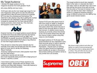
A typical member of my target audience would attempt
to imitate there favourite artists look from the hip/hop
r&b genre by wearing brands such as OBEY and
SUPREME as popular rap group OFWGKTA are heavily
sponsored by these labels which plays a big influence
on how their target audience dress.
They all seem to share the same interests also for
example most males and females who like this certain
genre of music tend to all like the following;
-Music Festivals
-Enjoying underground music ( less popular music that
isnt very well known)
-Listening to records and old vinyls
And most importantly being social with a large group of
friends in real life or online.
I have tried to portray some of these aspects to my
magazine design esspecially with the design of the
supreme and obey label designs. I have also featured a
music festival subheading aswell.
Typical 16-25 year olds spend most of
their time online on twitter or facebook
or out in real life spending time with
their peers where they would discuss or
listen to their favourite album or track at
that moment. In addition some may be
studying at university where there tends
to be a lot of partys where they also get
the chance to play a certain song they
enjoy to a lot of people.
This target audience would also regularly
listen to the radio on channels like radio 1
and radio1 extra so will often hear new music
they will like the sound of but will not know
who the artist is.This level of interest in new
music can also be seen when reading an
article in a magazine therefore putting a
range of different artists from the r&B/hip hop
genre would interest readers.
My target audience of 16-25 year olds
would therefore be very interested in who
there favourite group or artist is wearing
and would try and imitate that onto
themselves . Popular items of clothing
within this genre would be snapbacks
jeans hoodies etc as seen in the picture
above there clothing and fashion sense is
very similar from one another.
My chosen target audience will often use
twitter as a way of communicating with
their favourite artist or talking about them
to others. They will often be very social
about they like and what they dislike.
2. How did you attract this Audience?
To attract this particular audience I
researched into what clothing lines they
wore the most and what about that design
seemed to stand out to me.
One piece of clothing that seemed to very
popular with fans of the HIP-HOP R&B
genre are the OBEY and SUPREME
hoodies and hats. So I thought it would be
a good idea to try and portray that onto my
logo.
The use of red also seemed a popular
choice with existing magazines of this
genre for example SOURCE XXL, FADER
and VIBE all use the colour red for their
main masthead text.
I wanted my main person to be a female
but I chose to dress her in neutral clothing
by colour and design in this case a black t-
shirt and a beanie I have done this to
create a level of accessibility to both
genres and to different ages. The
simplicity with the overall photo as well
matches well with the overall style of the
magazine. I wanted to have only one
image on the front cover as well instead of
having a whole load of different plugs,
plugs and images that would clash
together which creates a childish
unprofessional look for the magazine
instead the reader can feel as if he is
reading a higher end magazine like GQ or
FADER while still reading about what
he/she likes in this case rnb/hiphop/rap
music.
I tried to create subheadings that still caught the attention of the reader but kept the simple style of the
front cover I also wanted it to feature relevant artists at the moment that are popular in the particular genre
of this magazine as this may create more of an interest in wanting to read more inside. I also refrained
from putting any quotes (besides one) on the cover like other magazines as I wanted the reader to be
interested more on what's on the inside rather than reading most of it on the front. The simpicity of the
design makes the subheadings the only thing to read besides the feature of the artist on the front.
I also added a list called “top 20
artists of the year” these list stories
seem to be very popular in most
magazines that are out at the
moment and readers would want to
look inside if there favourite artist has
been featured. I tried to do the same
with the Isle of Wight Festival
subheading as I believe readers will
want to find out if any of their
favourite acts are going.
The use of black and white on the image
is to make everything else stand out in
front. Even if the main artists name is big
bold and in capital letters its still white to
contrast with the black because I still
wanted the masthead to stand out the
most . The way the female is dressed is
also very important in creating that
dynamic which is why I chose to dress her
also in black and white.
I chose to put a female on the front cover rather than a male because I also thought this
would catch the attention of potential readers of both male and female. Which a lot of
magazines of the same genre try and do but end up making the women look like sex symbols
to make the appeal for male readers even greater.