SlideShare una empresa de Scribd logo
1 de 20
colour combination
Color Basics
Color is the perceptual characteristic of light described by a color name. Specifically, color is light, and light is
composed of many colors—those we see are the colors of the visual spectrum: red, orange, yellow, green,
blue, and violet. Objects absorb certain wavelengths and reflect others back to the viewer. We perceive
these wavelengths as color.
A color is described in three ways: by its name, how pure or desaturated it is, and its value or lightness.
Although pink, crimson, and brick are all variations of the color red, each hue is distinct and differentiated by
its chroma, saturation, intensity, and value.
Chroma, intensity, saturation and luminance/value are inter-related terms and have to do with the
description of a color.
(The chroma or saturation of a color is a measure of how intense it is. Think of it as “pure, bright color”,
compared to a color diluted with white, darkened by black or grey, or thinned by being a glaze. Variations in
chroma can be achieved by adding different amounts of a neutral gray of the same value as the color you're
wanting to alter.)
Chroma: How pure a hue is in relation to gray
Saturation: The degree of purity of a hue.
Intensity: The brightness or dullness of a hue. One may lower the intensity by adding white or black.
Luminance / Value: A measure of the amount of light reflected from a hue. Those hues with a high content
of white have a higher luminance or value.
Shade and tint are terms that refer to a variation of a hue.
Shade: A hue produced by the addition of black.
Tint: A hue produced by the addition of white.
COLOUR/VALUE
Value and Colour are closely related.
Value is simply the artistic term for light and dark.
an area’s value is its relative lightness or darkness in a given context
Only through changes of light and dark can we perceive anything.
Light reveals Form
several values of mid tones are termed as achromatic(greys) as they are blends of white and black but no chromas
the term Value Contrast refers to the relationship between the areas of dark and light. Because the scale is arranged in sequential
order, the contrast between any two adjoining areas is rather slight and termed Low Value Contrast
(a value scale of gray. The center gray circles are identical in value)
the centre grey circles, which are a contrast middle value, show higher value contrast at the top and bottom of the scale than
towards the middle
Colour, based on the wave lengths of light, offers a much broader field of visual differences and contrasts. But chromatic greys can
also be produced by mixing certain colours, which result in different tones than those in the previous case.
A further relationship of value and colour is that every colour is, in itself also simultaneously a certain value.
(Victor Vasarely, Untitled, Plate 2 from portfolio Planetary folklore, 1964)
Pure Yellow is a light (high value) colour corresponding to a very light grey in terms of light reflection. Purple is basically a dark, low
value colour that would match a very dark grey.
After Images
Color is light and colored objects absorb and reflect different wavelengths. Light & color are seen by the human eye because
of the two types of photo-receptor cells - rods and cones - located in the retina of the eye. Rods are sensitive to light and
dark; cones are sensitive to red, green & blue light and responsible for color vision. These photoreceptors convey the color
of light to our brain.
When our eyes are exposed to a hue for a prolonged period, the rods & cones become fatigued. You might notice this if you
are reading something on colored paper, and then look away—you often see the inverse, or complement, of the image. This
occurrence can be advantageous if you are seeking the opposite, or contrast, of a colour. This may be dismaying to a viewer
if presented with prolonged exposure to coloured screens or reading materials.
Every color has an opposite, and although individual's perceptions do vary, the range of after images seen is consistent.
Color Combinations
Color combinations may pass unnoticed when pleasing, yet offend dramatically when compositions seem to clash. One outcome we seek in the final form or
composition, is a successful use of color.
We determine whether or not we are successful by critically assessing the visual balance and harmony of the final composition—balance and harmony are
achieved by the visual contrast that exists between color combinations. Planning a successful color combination begins with the investigation, and
understanding, of color relationships.
Using a color wheel and a template, the relationships between colors are easy to identify.
Monochromatic Relationship Colors that are shade or tint variations of the same hue. Complementary Relationship Those colors across from each other on a color wheel.
Split-Complementary Relationship One hue plus two others equally spaced from its complement. Double-Complementary Relationship Two complementary color sets; the distance between selected
complementary pairs will effect the overall contrast of the final composition.
Analogous Relationship Those colors located adjacent to each other on a color wheel. Triad Relationship Three hues equally positioned on a color wheel.
Colour Unity
is defined by another term. We often speak of tonality of a design or painting.
Tonality refers to the dominance of a single colour or the visual importance of a hue that seems to pervade the
whole colour structure despite the presence of other colours.
Monochromatic patterns (as value studies in one colour) give a uniform tonality, since only one hue is present.
Analogous colour schemes can also produce a dominant tonality.
When colours are chosen from one part of the colour wheel, they will share one hue in common. Yellow-
green, blue-green, blue and blue-purple all derive from the primary blue, so they yield a blue tonality.
COLOUR DISCORD
Colour discord is the opposite of colour harmony.
A combination of discordant colours is visually disturbing for the colours have no basic affinity for each other.
They seem to clash to pull away in opposing directions rather than to relate harmoniously to one another.
The term “discord” conveys an immediate negative impression.
Mild discord results in exciting eye-catching colour combinations
The world of fashion has exploited the idea to the point that mildly discordant combinations are almost
commonplace. A combination of Pink and Orange is unexpected, but can be experimented.
Colours widely separated on he colour wheel (but not complements) are generally seen as discordant
combinations.
Examples – primary and a tertiary beyond an adjacent secondary: red and blue purple
Secondary and tertiary beyond an adjacent primary: orange and yellow green
Two tertiary’s on either side of a primary: blue green and blue purple
(Note: The three primary colours are Red, Yellow and Blue.
The three secondary colours are mixtures of the two primaries; Orange, green and purple.
The six tertiary colours are mixtures of a primary and a neighbouring secondary; blue and green make blue-
green, red and purple make red-purple and so on)
In producing Discord, Value is an important consideration. The impression of discord is much greater when the values of the
two colours are similar.
(Franz Marc, The Yellow Cow, 1911)
Franz Marc was born on February 8, 1880, in Munich, Germany. He studied at the Munich Art Academy and traveled to Paris several times where he saw the
work of Gauguin, Van Gogh, and the Impressionists. With Kandinsky, he founded the almanac "Der Blaue Reiter" in 1911 and organized exhibitions with this
name. He was a principal member of the First German Salon d'Automne in 1913. At the beginning of World War I, he volunteered for military service and he
died near Verdun, France, on March 4, 1916.
Franz Marc was a pioneer in the birth of abstract art at the beginning of the twentieth-century The Blaue Reiter group put forth a new program for art based
on exuberant color and on profoundly felt emotional and spiritual states. It was Marc's particular contribution to introduce paradisiacal imagery that had as its
dramatis personae a collection of animals, most notably a group of heroic horses.
Tragically, Marc was killed in World War I at the age of thirty-six, but not before he had created some of the most exciting and touching paintings of the
Expressionist movement.
COLOUR USES
3 basic ways – Local, Optical, Arbitrary.
Local Colour- The term refers to the identifying colour of an object under ordinary
daylight. Local colour is the objective colour that we know objects are: grass is green,
bananas are yellow, and apples are red.
Shades are controlled mainly by the mental identification of the colours in the subject
matter.
When an atmospheric effect visually changes the local colour radically – a faraway
mountain looks blue.
Light changes colour – are examples of optical colours.
(Georges de la Tour, The Repentant Magdalen, 1640)
In Arbitrary colours – colour choices are subjective, rather than based on the colours
seen in nature.
(Frantisek Kupka. Planes by Color, Large Nude 1909)
Non-objective art forms have no apparent reference to natural objects, so that the
colour is also non-objective. Purely aesthetic considerations determine the colour
choices.
COLOUR Vs VALUE
Do colour and value work together or at cross purposes?
Leonardo da Vinci called colour the greatest enemy of art.
Titian supposedly said that an artist needs only three colours.
Van Gogh’s statement “Colouring is what makes a painter a painter” had been a source
of inspiration for the 20th century Fauves.
We customarily think of an artist as working with colour. But consider the vast area of
drawing, woodcuts etching and lithographs produced successfully using pure value and
no colour.
In the field of sculpture and architecture, here while colour is present, the main design
consideration has often been value because of the usual monotone of the materials
involved.
Texture is essentially a variation in light and dark visual patterns.
An Artist in almost any field or specialization should be skilful in manipulating both
colours and value.
Exercises
Draw a color wheel
Primary-3
Secondary-3
Tertiary-6
Hue – colour
Saturation – purity of a hue. When a hue is muted by the addition of its complement it becomes less saturated.
Value – how light or dark colours appear relatively black and white
Primary + Secondary combination
Primary + Secondary + Tertiary combination
Quick colour combos
Monochromatic – original hue that is combined with more or less saturated versions of itself or with lighter or darker versions of itself.
Analogous – made of neighbouring hues,
Orange + yellow-green + yellow
Or
Alternative neighbours
Yellow-orange + red-purple + orange
Split complements – find a colour’s complement, and then chose the neighbours on either side of the complement. These are original hues
split complement.
Triad – three hues that are equally spaced around the colour wheel.
Optical Mixing or Retinal Fusion
Mixing various colours of paint to produce other colours (additive process) can often result in neutral, even ‘muddy’ colours.
Mosaic tapestries – working with limited colour, from a distance, merges them and creates an impression of many hues and values.
Colour and Space
Colour’s spatial properties can be used to create either an illusion of depth or a flat one dimensional pattern.
Colour values are also important in spatial illusion, whatever the colours used; high contrast comes forward visually while areas of lesser contrast
generally recede.
Vincent Van Gogh, Café Terrace on the Place du Forum, Arles, 1888.
Complementary colours
Two colours, placed side by side, will appear differently
depending on which colours are used and what they are placed
next to.
The effect of this interaction is called simultaneous contrast.
Simultaneous contrast is most intense when two complementary
colours are juxtaposed directly next to each other.
For example, red placed directly next to green, if you
concentrate on the edge you will see a slight vibration.
Your eye doesn’t like resting on the edge. The two
complementary colour in their purest, most saturated form don’t
sit well together, however, if you want to try and focus your
viewer gaze on a particular part of the painting a knowledge of
the ‘attraction to the eye’ can be used to great effect…
Van Gogh’s painting technique
Orange and blue accentuate each other in Van Gogh’s Café
Terrace on the Place du Forum, Arles, 1888 above.
In Van Gogh’s painting he has a very bold use of colour. If we
start to analyze the piece we can see how he has used the power
of complementary colours and the colour wheel to heighten the
visual effect of simultaneous contrast.
He wanted to move our eyes around the painting, not just by the
composition, but by his use of complementary colour:
The rear windows – have a very strong saturated orange sitting
right next to a pure french ultramarine, this causes the
shimmering effect to give the evening window light a ‘glow’.
The front of the cobbles - He has used this effect on a more
subtle level where the small arches of orange and blue add
movement, reflecting the movement and life within a cafe.
Warm and cool colours – add a visual depth to it due to the fact
that cool colour recede into the background and warm colours
come forward.
In this example Van Gogh has used complementary colours to his
advantage and often went out of his way to create contrast and
tension in his paintings.
Vincent Van Gogh, The Night Café, Arles, 1888.
When describing the painting below he commented to his brother Theo:
“I have tried to express the terrible passions of humanity by means of red and green. The room is blood red and dark yellow with a green billiard table in the middle; there are
four citron yellow lamps with a glow of orange and green. Everywhere there is a clash and contrast of the most disparate reds and greens….’
Vermeer, The Milkmaid, 1658 – 60
In this Vermeer painting, The Milkmaid, we can also see the effect of
complementary colours, albeit on a more subtle level.
Here he uses an approach using split complements which in general
will create a subtler effect.
Split Complements
This is where you use one colour, for example, blue and instead of
using its direct complement (orange) we split the colour wheel and
use the next colour along. For this example that would be a yellow
orange. This creates a nice visual balance, but also interest for our
eye.
The main point of focus of this painting is the milk jug. Vermeer has
the milkmaid’s gaze looking directly at it so we naturally follow her
gaze to the object.
However, he still uses this visual effect by making the focus of the
painting ,the jug, a warm bright orange placed next to a bright blue
of her dress to create a visual balance.
So how can this help me in my choice of colours when painting?
If you place a strong cadmium yellow next to a grey it will appear (to
our eye) different than if it was placed directly next to its
complementary colour, purple.(I’m using grey as an example
because its a neutral colour)
If you place a grey next to another stronger highly saturated colour,
the grey will appear to have a slight tint of the surrounding or
adjoining colour.
Creating a warm glow to your landscape painting
So if you want to create the illusion of a warm sunset, the first area of land nearest to the
horizon line can be left a muted cool colour (blue, green) so the effects of simultaneous
contrast can be used to create the illusion ‘glow’ of the horizon. The more muted the
horizon line the more natural it will appear. (see: Titian’s use of warm and cool colours)
In Turner’s painting below you can see how he has used a muted blue background to
emphasis the bright orange sunset.
J.M.W Turner, Slave ship, 1840
Why does this happen?
The actual paint colours are of course not altered; only our perception of them changes.
The grey on the left will appear to have a slight tint of the surrounding or adjoining colour.
Whereas the edges of the yellow square on the right have a ‘shimmer’ to them.
A brief history of simultaneous contrast
Michel Eugene Chevereaul, a French Scientist, was working as the director of the dye works at the Gobelins Manufactory in Paris. Whilst he was working there he
received many complaints about the colours of the dyes, Specifically how the blacks appeared differently when used next to blues.
Researching this further he realised that the yarn’s ‘perceived’ colour was being effected by the surrounding colours. This led to the idea of simultaneous contrast.
Why does this happen?
Our perceived ‘memory’ of an object can be very strong.
If a beginner learning how to paint places a banana under a red light it would cause our logical left brain memory some problems because we have such a strong
memory of bananas being yellow.
Even if we see them as red your brain tells you, this doesn’t feel right, so you change the colour to something you feel more comfortable with, and then the painting
looks ‘wrong’.
Colours can be tricky.
To try and counteract this effect artists often use isolated swatches of paint, or viewfinders to try and perceive a colour on its own, in isolation, rather than trying to
judge it next to another colour.
So the next time you are creating a painting withhold judgement on your colour mixing prowess until you have all the adjoining colours next to each other.
I often paint thin, more muted colours to start with and try and build up the whole picture at once. It then becomes easier for the eye to judge the correct balance
of a hue. I leave the strongest, thickest paint for last, so I can choose exactly the tone and colour of the paint to pull the picture together.
One of the biggest mistakes you can do is working on one small section to completion before addressing the picture as a whole.
http://willkempartschool.com/complementary-colours/,

Más contenido relacionado

Similar a ColourART106.pptx (20)

Element of art or desgin
Element of art or desginElement of art or desgin
Element of art or desgin
 
Colour theory II
Colour theory IIColour theory II
Colour theory II
 
Color theory
Color theoryColor theory
Color theory
 
Color Study
Color Study Color Study
Color Study
 
Presentación1 ingles
Presentación1 inglesPresentación1 ingles
Presentación1 ingles
 
Design Element 4 - Color
Design Element 4 - ColorDesign Element 4 - Color
Design Element 4 - Color
 
COLOR PRESENTATION
COLOR PRESENTATIONCOLOR PRESENTATION
COLOR PRESENTATION
 
Colour
Colour Colour
Colour
 
Color theory
Color theoryColor theory
Color theory
 
Color theory
Color theoryColor theory
Color theory
 
color scheme
color schemecolor scheme
color scheme
 
Colours - Design Principles
Colours - Design PrinciplesColours - Design Principles
Colours - Design Principles
 
Pile Chapter 9 Colors Ym
Pile Chapter 9   Colors   YmPile Chapter 9   Colors   Ym
Pile Chapter 9 Colors Ym
 
pp4-PP3.pptx
pp4-PP3.pptxpp4-PP3.pptx
pp4-PP3.pptx
 
Principals and elements of design.
Principals and elements of design.Principals and elements of design.
Principals and elements of design.
 
Color interaction
Color interactionColor interaction
Color interaction
 
Color theory
Color theoryColor theory
Color theory
 
Color Theory
Color TheoryColor Theory
Color Theory
 
slidesho3
slidesho3slidesho3
slidesho3
 
Teaching Arts in Elementary Grades Element of Visual Arts Color
Teaching Arts in Elementary Grades Element of Visual Arts ColorTeaching Arts in Elementary Grades Element of Visual Arts Color
Teaching Arts in Elementary Grades Element of Visual Arts Color
 

Más de abhishekbansal238453 (7)

PRAKRITI.pptx
PRAKRITI.pptxPRAKRITI.pptx
PRAKRITI.pptx
 
threeplaneviewing.ppt
threeplaneviewing.pptthreeplaneviewing.ppt
threeplaneviewing.ppt
 
Gods_Egypt_Sreerup_RC.pdf
Gods_Egypt_Sreerup_RC.pdfGods_Egypt_Sreerup_RC.pdf
Gods_Egypt_Sreerup_RC.pdf
 
unity.ppt
unity.pptunity.ppt
unity.ppt
 
rhythm.ppt
rhythm.pptrhythm.ppt
rhythm.ppt
 
Line.ppt
Line.pptLine.ppt
Line.ppt
 
FeldmanChap15.pptx
FeldmanChap15.pptxFeldmanChap15.pptx
FeldmanChap15.pptx
 

Último

The basics of sentences session 2pptx copy.pptx
The basics of sentences session 2pptx copy.pptxThe basics of sentences session 2pptx copy.pptx
The basics of sentences session 2pptx copy.pptxheathfieldcps1
 
microwave assisted reaction. General introduction
microwave assisted reaction. General introductionmicrowave assisted reaction. General introduction
microwave assisted reaction. General introductionMaksud Ahmed
 
Crayon Activity Handout For the Crayon A
Crayon Activity Handout For the Crayon ACrayon Activity Handout For the Crayon A
Crayon Activity Handout For the Crayon AUnboundStockton
 
Accessible design: Minimum effort, maximum impact
Accessible design: Minimum effort, maximum impactAccessible design: Minimum effort, maximum impact
Accessible design: Minimum effort, maximum impactdawncurless
 
Introduction to ArtificiaI Intelligence in Higher Education
Introduction to ArtificiaI Intelligence in Higher EducationIntroduction to ArtificiaI Intelligence in Higher Education
Introduction to ArtificiaI Intelligence in Higher Educationpboyjonauth
 
MENTAL STATUS EXAMINATION format.docx
MENTAL     STATUS EXAMINATION format.docxMENTAL     STATUS EXAMINATION format.docx
MENTAL STATUS EXAMINATION format.docxPoojaSen20
 
PSYCHIATRIC History collection FORMAT.pptx
PSYCHIATRIC   History collection FORMAT.pptxPSYCHIATRIC   History collection FORMAT.pptx
PSYCHIATRIC History collection FORMAT.pptxPoojaSen20
 
Science 7 - LAND and SEA BREEZE and its Characteristics
Science 7 - LAND and SEA BREEZE and its CharacteristicsScience 7 - LAND and SEA BREEZE and its Characteristics
Science 7 - LAND and SEA BREEZE and its CharacteristicsKarinaGenton
 
The Most Excellent Way | 1 Corinthians 13
The Most Excellent Way | 1 Corinthians 13The Most Excellent Way | 1 Corinthians 13
The Most Excellent Way | 1 Corinthians 13Steve Thomason
 
Concept of Vouching. B.Com(Hons) /B.Compdf
Concept of Vouching. B.Com(Hons) /B.CompdfConcept of Vouching. B.Com(Hons) /B.Compdf
Concept of Vouching. B.Com(Hons) /B.CompdfUmakantAnnand
 
Industrial Policy - 1948, 1956, 1973, 1977, 1980, 1991
Industrial Policy - 1948, 1956, 1973, 1977, 1980, 1991Industrial Policy - 1948, 1956, 1973, 1977, 1980, 1991
Industrial Policy - 1948, 1956, 1973, 1977, 1980, 1991RKavithamani
 
Q4-W6-Restating Informational Text Grade 3
Q4-W6-Restating Informational Text Grade 3Q4-W6-Restating Informational Text Grade 3
Q4-W6-Restating Informational Text Grade 3JemimahLaneBuaron
 
Alper Gobel In Media Res Media Component
Alper Gobel In Media Res Media ComponentAlper Gobel In Media Res Media Component
Alper Gobel In Media Res Media ComponentInMediaRes1
 
“Oh GOSH! Reflecting on Hackteria's Collaborative Practices in a Global Do-It...
“Oh GOSH! Reflecting on Hackteria's Collaborative Practices in a Global Do-It...“Oh GOSH! Reflecting on Hackteria's Collaborative Practices in a Global Do-It...
“Oh GOSH! Reflecting on Hackteria's Collaborative Practices in a Global Do-It...Marc Dusseiller Dusjagr
 
Kisan Call Centre - To harness potential of ICT in Agriculture by answer farm...
Kisan Call Centre - To harness potential of ICT in Agriculture by answer farm...Kisan Call Centre - To harness potential of ICT in Agriculture by answer farm...
Kisan Call Centre - To harness potential of ICT in Agriculture by answer farm...Krashi Coaching
 
Micromeritics - Fundamental and Derived Properties of Powders
Micromeritics - Fundamental and Derived Properties of PowdersMicromeritics - Fundamental and Derived Properties of Powders
Micromeritics - Fundamental and Derived Properties of PowdersChitralekhaTherkar
 
18-04-UA_REPORT_MEDIALITERAСY_INDEX-DM_23-1-final-eng.pdf
18-04-UA_REPORT_MEDIALITERAСY_INDEX-DM_23-1-final-eng.pdf18-04-UA_REPORT_MEDIALITERAСY_INDEX-DM_23-1-final-eng.pdf
18-04-UA_REPORT_MEDIALITERAСY_INDEX-DM_23-1-final-eng.pdfssuser54595a
 
Paris 2024 Olympic Geographies - an activity
Paris 2024 Olympic Geographies - an activityParis 2024 Olympic Geographies - an activity
Paris 2024 Olympic Geographies - an activityGeoBlogs
 

Último (20)

The basics of sentences session 2pptx copy.pptx
The basics of sentences session 2pptx copy.pptxThe basics of sentences session 2pptx copy.pptx
The basics of sentences session 2pptx copy.pptx
 
microwave assisted reaction. General introduction
microwave assisted reaction. General introductionmicrowave assisted reaction. General introduction
microwave assisted reaction. General introduction
 
Crayon Activity Handout For the Crayon A
Crayon Activity Handout For the Crayon ACrayon Activity Handout For the Crayon A
Crayon Activity Handout For the Crayon A
 
Accessible design: Minimum effort, maximum impact
Accessible design: Minimum effort, maximum impactAccessible design: Minimum effort, maximum impact
Accessible design: Minimum effort, maximum impact
 
Introduction to ArtificiaI Intelligence in Higher Education
Introduction to ArtificiaI Intelligence in Higher EducationIntroduction to ArtificiaI Intelligence in Higher Education
Introduction to ArtificiaI Intelligence in Higher Education
 
MENTAL STATUS EXAMINATION format.docx
MENTAL     STATUS EXAMINATION format.docxMENTAL     STATUS EXAMINATION format.docx
MENTAL STATUS EXAMINATION format.docx
 
PSYCHIATRIC History collection FORMAT.pptx
PSYCHIATRIC   History collection FORMAT.pptxPSYCHIATRIC   History collection FORMAT.pptx
PSYCHIATRIC History collection FORMAT.pptx
 
Science 7 - LAND and SEA BREEZE and its Characteristics
Science 7 - LAND and SEA BREEZE and its CharacteristicsScience 7 - LAND and SEA BREEZE and its Characteristics
Science 7 - LAND and SEA BREEZE and its Characteristics
 
Model Call Girl in Bikash Puri Delhi reach out to us at 🔝9953056974🔝
Model Call Girl in Bikash Puri  Delhi reach out to us at 🔝9953056974🔝Model Call Girl in Bikash Puri  Delhi reach out to us at 🔝9953056974🔝
Model Call Girl in Bikash Puri Delhi reach out to us at 🔝9953056974🔝
 
The Most Excellent Way | 1 Corinthians 13
The Most Excellent Way | 1 Corinthians 13The Most Excellent Way | 1 Corinthians 13
The Most Excellent Way | 1 Corinthians 13
 
Concept of Vouching. B.Com(Hons) /B.Compdf
Concept of Vouching. B.Com(Hons) /B.CompdfConcept of Vouching. B.Com(Hons) /B.Compdf
Concept of Vouching. B.Com(Hons) /B.Compdf
 
Industrial Policy - 1948, 1956, 1973, 1977, 1980, 1991
Industrial Policy - 1948, 1956, 1973, 1977, 1980, 1991Industrial Policy - 1948, 1956, 1973, 1977, 1980, 1991
Industrial Policy - 1948, 1956, 1973, 1977, 1980, 1991
 
Q4-W6-Restating Informational Text Grade 3
Q4-W6-Restating Informational Text Grade 3Q4-W6-Restating Informational Text Grade 3
Q4-W6-Restating Informational Text Grade 3
 
Model Call Girl in Tilak Nagar Delhi reach out to us at 🔝9953056974🔝
Model Call Girl in Tilak Nagar Delhi reach out to us at 🔝9953056974🔝Model Call Girl in Tilak Nagar Delhi reach out to us at 🔝9953056974🔝
Model Call Girl in Tilak Nagar Delhi reach out to us at 🔝9953056974🔝
 
Alper Gobel In Media Res Media Component
Alper Gobel In Media Res Media ComponentAlper Gobel In Media Res Media Component
Alper Gobel In Media Res Media Component
 
“Oh GOSH! Reflecting on Hackteria's Collaborative Practices in a Global Do-It...
“Oh GOSH! Reflecting on Hackteria's Collaborative Practices in a Global Do-It...“Oh GOSH! Reflecting on Hackteria's Collaborative Practices in a Global Do-It...
“Oh GOSH! Reflecting on Hackteria's Collaborative Practices in a Global Do-It...
 
Kisan Call Centre - To harness potential of ICT in Agriculture by answer farm...
Kisan Call Centre - To harness potential of ICT in Agriculture by answer farm...Kisan Call Centre - To harness potential of ICT in Agriculture by answer farm...
Kisan Call Centre - To harness potential of ICT in Agriculture by answer farm...
 
Micromeritics - Fundamental and Derived Properties of Powders
Micromeritics - Fundamental and Derived Properties of PowdersMicromeritics - Fundamental and Derived Properties of Powders
Micromeritics - Fundamental and Derived Properties of Powders
 
18-04-UA_REPORT_MEDIALITERAСY_INDEX-DM_23-1-final-eng.pdf
18-04-UA_REPORT_MEDIALITERAСY_INDEX-DM_23-1-final-eng.pdf18-04-UA_REPORT_MEDIALITERAСY_INDEX-DM_23-1-final-eng.pdf
18-04-UA_REPORT_MEDIALITERAСY_INDEX-DM_23-1-final-eng.pdf
 
Paris 2024 Olympic Geographies - an activity
Paris 2024 Olympic Geographies - an activityParis 2024 Olympic Geographies - an activity
Paris 2024 Olympic Geographies - an activity
 

ColourART106.pptx

  • 2. Color Basics Color is the perceptual characteristic of light described by a color name. Specifically, color is light, and light is composed of many colors—those we see are the colors of the visual spectrum: red, orange, yellow, green, blue, and violet. Objects absorb certain wavelengths and reflect others back to the viewer. We perceive these wavelengths as color. A color is described in three ways: by its name, how pure or desaturated it is, and its value or lightness. Although pink, crimson, and brick are all variations of the color red, each hue is distinct and differentiated by its chroma, saturation, intensity, and value. Chroma, intensity, saturation and luminance/value are inter-related terms and have to do with the description of a color. (The chroma or saturation of a color is a measure of how intense it is. Think of it as “pure, bright color”, compared to a color diluted with white, darkened by black or grey, or thinned by being a glaze. Variations in chroma can be achieved by adding different amounts of a neutral gray of the same value as the color you're wanting to alter.)
  • 3. Chroma: How pure a hue is in relation to gray Saturation: The degree of purity of a hue. Intensity: The brightness or dullness of a hue. One may lower the intensity by adding white or black. Luminance / Value: A measure of the amount of light reflected from a hue. Those hues with a high content of white have a higher luminance or value. Shade and tint are terms that refer to a variation of a hue. Shade: A hue produced by the addition of black. Tint: A hue produced by the addition of white.
  • 4. COLOUR/VALUE Value and Colour are closely related. Value is simply the artistic term for light and dark. an area’s value is its relative lightness or darkness in a given context Only through changes of light and dark can we perceive anything. Light reveals Form several values of mid tones are termed as achromatic(greys) as they are blends of white and black but no chromas the term Value Contrast refers to the relationship between the areas of dark and light. Because the scale is arranged in sequential order, the contrast between any two adjoining areas is rather slight and termed Low Value Contrast (a value scale of gray. The center gray circles are identical in value) the centre grey circles, which are a contrast middle value, show higher value contrast at the top and bottom of the scale than towards the middle Colour, based on the wave lengths of light, offers a much broader field of visual differences and contrasts. But chromatic greys can also be produced by mixing certain colours, which result in different tones than those in the previous case. A further relationship of value and colour is that every colour is, in itself also simultaneously a certain value. (Victor Vasarely, Untitled, Plate 2 from portfolio Planetary folklore, 1964) Pure Yellow is a light (high value) colour corresponding to a very light grey in terms of light reflection. Purple is basically a dark, low value colour that would match a very dark grey.
  • 5. After Images Color is light and colored objects absorb and reflect different wavelengths. Light & color are seen by the human eye because of the two types of photo-receptor cells - rods and cones - located in the retina of the eye. Rods are sensitive to light and dark; cones are sensitive to red, green & blue light and responsible for color vision. These photoreceptors convey the color of light to our brain. When our eyes are exposed to a hue for a prolonged period, the rods & cones become fatigued. You might notice this if you are reading something on colored paper, and then look away—you often see the inverse, or complement, of the image. This occurrence can be advantageous if you are seeking the opposite, or contrast, of a colour. This may be dismaying to a viewer if presented with prolonged exposure to coloured screens or reading materials. Every color has an opposite, and although individual's perceptions do vary, the range of after images seen is consistent.
  • 6.
  • 7.
  • 8.
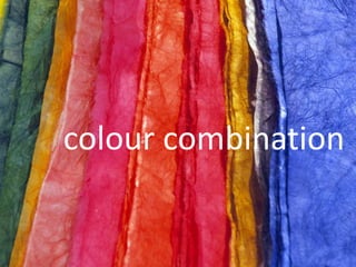
  • 9. Color Combinations Color combinations may pass unnoticed when pleasing, yet offend dramatically when compositions seem to clash. One outcome we seek in the final form or composition, is a successful use of color. We determine whether or not we are successful by critically assessing the visual balance and harmony of the final composition—balance and harmony are achieved by the visual contrast that exists between color combinations. Planning a successful color combination begins with the investigation, and understanding, of color relationships. Using a color wheel and a template, the relationships between colors are easy to identify. Monochromatic Relationship Colors that are shade or tint variations of the same hue. Complementary Relationship Those colors across from each other on a color wheel. Split-Complementary Relationship One hue plus two others equally spaced from its complement. Double-Complementary Relationship Two complementary color sets; the distance between selected complementary pairs will effect the overall contrast of the final composition. Analogous Relationship Those colors located adjacent to each other on a color wheel. Triad Relationship Three hues equally positioned on a color wheel.
  • 10. Colour Unity is defined by another term. We often speak of tonality of a design or painting. Tonality refers to the dominance of a single colour or the visual importance of a hue that seems to pervade the whole colour structure despite the presence of other colours. Monochromatic patterns (as value studies in one colour) give a uniform tonality, since only one hue is present.
  • 11. Analogous colour schemes can also produce a dominant tonality. When colours are chosen from one part of the colour wheel, they will share one hue in common. Yellow- green, blue-green, blue and blue-purple all derive from the primary blue, so they yield a blue tonality.
  • 12. COLOUR DISCORD Colour discord is the opposite of colour harmony. A combination of discordant colours is visually disturbing for the colours have no basic affinity for each other. They seem to clash to pull away in opposing directions rather than to relate harmoniously to one another. The term “discord” conveys an immediate negative impression. Mild discord results in exciting eye-catching colour combinations The world of fashion has exploited the idea to the point that mildly discordant combinations are almost commonplace. A combination of Pink and Orange is unexpected, but can be experimented. Colours widely separated on he colour wheel (but not complements) are generally seen as discordant combinations. Examples – primary and a tertiary beyond an adjacent secondary: red and blue purple Secondary and tertiary beyond an adjacent primary: orange and yellow green Two tertiary’s on either side of a primary: blue green and blue purple (Note: The three primary colours are Red, Yellow and Blue. The three secondary colours are mixtures of the two primaries; Orange, green and purple. The six tertiary colours are mixtures of a primary and a neighbouring secondary; blue and green make blue- green, red and purple make red-purple and so on)
  • 13. In producing Discord, Value is an important consideration. The impression of discord is much greater when the values of the two colours are similar. (Franz Marc, The Yellow Cow, 1911) Franz Marc was born on February 8, 1880, in Munich, Germany. He studied at the Munich Art Academy and traveled to Paris several times where he saw the work of Gauguin, Van Gogh, and the Impressionists. With Kandinsky, he founded the almanac "Der Blaue Reiter" in 1911 and organized exhibitions with this name. He was a principal member of the First German Salon d'Automne in 1913. At the beginning of World War I, he volunteered for military service and he died near Verdun, France, on March 4, 1916. Franz Marc was a pioneer in the birth of abstract art at the beginning of the twentieth-century The Blaue Reiter group put forth a new program for art based on exuberant color and on profoundly felt emotional and spiritual states. It was Marc's particular contribution to introduce paradisiacal imagery that had as its dramatis personae a collection of animals, most notably a group of heroic horses. Tragically, Marc was killed in World War I at the age of thirty-six, but not before he had created some of the most exciting and touching paintings of the Expressionist movement.
  • 14. COLOUR USES 3 basic ways – Local, Optical, Arbitrary. Local Colour- The term refers to the identifying colour of an object under ordinary daylight. Local colour is the objective colour that we know objects are: grass is green, bananas are yellow, and apples are red. Shades are controlled mainly by the mental identification of the colours in the subject matter. When an atmospheric effect visually changes the local colour radically – a faraway mountain looks blue. Light changes colour – are examples of optical colours. (Georges de la Tour, The Repentant Magdalen, 1640) In Arbitrary colours – colour choices are subjective, rather than based on the colours seen in nature. (Frantisek Kupka. Planes by Color, Large Nude 1909) Non-objective art forms have no apparent reference to natural objects, so that the colour is also non-objective. Purely aesthetic considerations determine the colour choices.
  • 15. COLOUR Vs VALUE Do colour and value work together or at cross purposes? Leonardo da Vinci called colour the greatest enemy of art. Titian supposedly said that an artist needs only three colours. Van Gogh’s statement “Colouring is what makes a painter a painter” had been a source of inspiration for the 20th century Fauves. We customarily think of an artist as working with colour. But consider the vast area of drawing, woodcuts etching and lithographs produced successfully using pure value and no colour. In the field of sculpture and architecture, here while colour is present, the main design consideration has often been value because of the usual monotone of the materials involved. Texture is essentially a variation in light and dark visual patterns. An Artist in almost any field or specialization should be skilful in manipulating both colours and value.
  • 16. Exercises Draw a color wheel Primary-3 Secondary-3 Tertiary-6 Hue – colour Saturation – purity of a hue. When a hue is muted by the addition of its complement it becomes less saturated. Value – how light or dark colours appear relatively black and white Primary + Secondary combination Primary + Secondary + Tertiary combination Quick colour combos Monochromatic – original hue that is combined with more or less saturated versions of itself or with lighter or darker versions of itself. Analogous – made of neighbouring hues, Orange + yellow-green + yellow Or Alternative neighbours Yellow-orange + red-purple + orange Split complements – find a colour’s complement, and then chose the neighbours on either side of the complement. These are original hues split complement. Triad – three hues that are equally spaced around the colour wheel. Optical Mixing or Retinal Fusion Mixing various colours of paint to produce other colours (additive process) can often result in neutral, even ‘muddy’ colours. Mosaic tapestries – working with limited colour, from a distance, merges them and creates an impression of many hues and values. Colour and Space Colour’s spatial properties can be used to create either an illusion of depth or a flat one dimensional pattern. Colour values are also important in spatial illusion, whatever the colours used; high contrast comes forward visually while areas of lesser contrast generally recede.
  • 17. Vincent Van Gogh, Café Terrace on the Place du Forum, Arles, 1888. Complementary colours Two colours, placed side by side, will appear differently depending on which colours are used and what they are placed next to. The effect of this interaction is called simultaneous contrast. Simultaneous contrast is most intense when two complementary colours are juxtaposed directly next to each other. For example, red placed directly next to green, if you concentrate on the edge you will see a slight vibration. Your eye doesn’t like resting on the edge. The two complementary colour in their purest, most saturated form don’t sit well together, however, if you want to try and focus your viewer gaze on a particular part of the painting a knowledge of the ‘attraction to the eye’ can be used to great effect… Van Gogh’s painting technique Orange and blue accentuate each other in Van Gogh’s Café Terrace on the Place du Forum, Arles, 1888 above. In Van Gogh’s painting he has a very bold use of colour. If we start to analyze the piece we can see how he has used the power of complementary colours and the colour wheel to heighten the visual effect of simultaneous contrast. He wanted to move our eyes around the painting, not just by the composition, but by his use of complementary colour: The rear windows – have a very strong saturated orange sitting right next to a pure french ultramarine, this causes the shimmering effect to give the evening window light a ‘glow’. The front of the cobbles - He has used this effect on a more subtle level where the small arches of orange and blue add movement, reflecting the movement and life within a cafe. Warm and cool colours – add a visual depth to it due to the fact that cool colour recede into the background and warm colours come forward. In this example Van Gogh has used complementary colours to his advantage and often went out of his way to create contrast and tension in his paintings.
  • 18. Vincent Van Gogh, The Night Café, Arles, 1888. When describing the painting below he commented to his brother Theo: “I have tried to express the terrible passions of humanity by means of red and green. The room is blood red and dark yellow with a green billiard table in the middle; there are four citron yellow lamps with a glow of orange and green. Everywhere there is a clash and contrast of the most disparate reds and greens….’
  • 19. Vermeer, The Milkmaid, 1658 – 60 In this Vermeer painting, The Milkmaid, we can also see the effect of complementary colours, albeit on a more subtle level. Here he uses an approach using split complements which in general will create a subtler effect. Split Complements This is where you use one colour, for example, blue and instead of using its direct complement (orange) we split the colour wheel and use the next colour along. For this example that would be a yellow orange. This creates a nice visual balance, but also interest for our eye. The main point of focus of this painting is the milk jug. Vermeer has the milkmaid’s gaze looking directly at it so we naturally follow her gaze to the object. However, he still uses this visual effect by making the focus of the painting ,the jug, a warm bright orange placed next to a bright blue of her dress to create a visual balance. So how can this help me in my choice of colours when painting? If you place a strong cadmium yellow next to a grey it will appear (to our eye) different than if it was placed directly next to its complementary colour, purple.(I’m using grey as an example because its a neutral colour) If you place a grey next to another stronger highly saturated colour, the grey will appear to have a slight tint of the surrounding or adjoining colour.
  • 20. Creating a warm glow to your landscape painting So if you want to create the illusion of a warm sunset, the first area of land nearest to the horizon line can be left a muted cool colour (blue, green) so the effects of simultaneous contrast can be used to create the illusion ‘glow’ of the horizon. The more muted the horizon line the more natural it will appear. (see: Titian’s use of warm and cool colours) In Turner’s painting below you can see how he has used a muted blue background to emphasis the bright orange sunset. J.M.W Turner, Slave ship, 1840 Why does this happen? The actual paint colours are of course not altered; only our perception of them changes. The grey on the left will appear to have a slight tint of the surrounding or adjoining colour. Whereas the edges of the yellow square on the right have a ‘shimmer’ to them. A brief history of simultaneous contrast Michel Eugene Chevereaul, a French Scientist, was working as the director of the dye works at the Gobelins Manufactory in Paris. Whilst he was working there he received many complaints about the colours of the dyes, Specifically how the blacks appeared differently when used next to blues. Researching this further he realised that the yarn’s ‘perceived’ colour was being effected by the surrounding colours. This led to the idea of simultaneous contrast. Why does this happen? Our perceived ‘memory’ of an object can be very strong. If a beginner learning how to paint places a banana under a red light it would cause our logical left brain memory some problems because we have such a strong memory of bananas being yellow. Even if we see them as red your brain tells you, this doesn’t feel right, so you change the colour to something you feel more comfortable with, and then the painting looks ‘wrong’. Colours can be tricky. To try and counteract this effect artists often use isolated swatches of paint, or viewfinders to try and perceive a colour on its own, in isolation, rather than trying to judge it next to another colour. So the next time you are creating a painting withhold judgement on your colour mixing prowess until you have all the adjoining colours next to each other. I often paint thin, more muted colours to start with and try and build up the whole picture at once. It then becomes easier for the eye to judge the correct balance of a hue. I leave the strongest, thickest paint for last, so I can choose exactly the tone and colour of the paint to pull the picture together. One of the biggest mistakes you can do is working on one small section to completion before addressing the picture as a whole. http://willkempartschool.com/complementary-colours/,