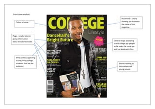
1. Front cover analysis
Masthead – clearly
Colour scheme showing the audience
the name of the
magazine.
Plugs - smaller stories
giving information
about the stories inside. Central image appealing
to the college age people
as he looks the same age
and has books with him.
Web address appealing
to the young college
students that are the Stories relating to
audience. the audience of
young people.
2. Contents page analysis
Simply set out for college students to follow and find out where
the stories that interest them are. The contents page title says
“what’s inside?” not contents page like other magazines, makes
it interesting and different to other magazines. Regulars are in
their own section in the bottom left corner; this allows young
students to see what their college magazine offers every issue.
A welcome message to students making them feel a part of the
college magazine and like it’s made for them. Graphic features
of stories inside the magazine, making students more
interested and are able to see pictures of how good their
college is. Page numbers are a standard way to work out what’s
where and how to find it. Information about the stories help
the students to see what they want to read. Logos of
companies that the college is connected with allowing the
students to see who the college is involved with and what they
do. Overall this contents page would really apply to the target
audience of young college students and would make them want
to read their college magazine.
3. Cover cover analysis
This cover page has a main image of a girl who is probably a
student at a college, she looks relaxed and happy in her
surroundings which looks like a college appealing to the target
audience as she looks like she enjoys college. The masthead is
the colleges name, a simple masthead for the magazine again
allowing students to identify with the college and for other
people to see how good the college magazine is. Plugs all over
the cover allowing students to see what is on offer in the issue
and seeing what they are going to read and what’s included in
their colleges magazine. The main story has a large font in two
different colours making it clear to be seen and read by all
students. Sort of buzz words such as “inside!” inviting students
to continue with the read to the inside and see what they want
to read. It leads them into the magazine. Feature in the bottom
left hand corner showing a small graphic feature of what’s
included on page 34 this would appeal to the audience as they
can again see what’s inside the magazine and looks interesting.
Overall again a good college front cover but could do with a few
more stories on the front cover allowing students to see more
of what’s inside.