

Recomendados
Más contenido relacionado
La actualidad más candente
La actualidad más candente (20)
Similar a Layout absolute poz
Similar a Layout absolute poz (20)
Layout absolute poz
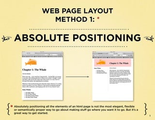
- 1. Web Page Layout MethoD 1: * Absolute Positioning * Absolutely positioning all the elements of an html page is not the most elegant, flexible or semantically proper way to go about making stuff go where you want it to go. But it’s a great way to get started. 1
- 2. Overview ➸➸Start with an html page that has all the content marked up, but not yet styled with CSS. ➸➸Make a div with the id wrapper (<div id=”wrapper”>) and put all your content (everything inside the body element ) in it. ➸➸In the CSS, style the wrapper div like so: #wrapper { margin:0 auto; position:relative; width:(some # of pixels); height:(some # of pixels); } ➸➸Put each chunk of content inside a new div. Give each div an id that describes the content. ➸➸In the CSS, create a style selector for each div. Give each: position:absolute; height:_________; Top and left values tell the div where width: _________; to be inside the wrapper div, and your top: ___________; page is now beautifully arranged! left: ___________; 2
- 3. Absolute Positioning step-by-step 1 Start with an html page that has all the content marked up, but not yet styled with CSS. The markup: In the Browser: <!DOCTYPE html> <head> <title>Moby HTML</title> <meta charset=”UTF-8”> <style type=”text/css”> </style> </head> <body> <img src=”orange_sp.gif” alt=”orange sperm whale”> <h1> Chapter 1: The Whale</h1> <p>Call me Ishmael. </p> <p> Some years ago -- never mind how long precisely -- having little or no money in my purse, and nothing particular to interest me on shore, I thought I would sail about a little and see the watery part of the world. It is a way I have of driving off the spleen, and regulating the circulation. </p> <p>Whenever I find myself growing grim about the mouth; whenever it is a damp, drizzly November in my soul; whenever I find myself involuntarily pausing before coffin warehouses, and bringing up the rear of every funeral I meet...</p> <h3>Some Whales</h3> <ul> <li>The Right Whale</li> <li>The Fin Back Whale</li> <li>The Hump-backed Whale</li> <li>The Razor Back Whale</li> </ul> </body> </html> 3
- 4. Absolute Positioning step-by-step 2 Make a div with the id wrapper and put all your content (everything inside the body element ) in it. The markup: <!DOCTYPE html> <head> <title>Moby HTML</title> <meta charset=”UTF-8”> <style type=”text/css”> </style> </head> <body> <div id=”wrapper”> <img src=”orange_sp.gif” alt=”orange sperm whale”> Now everything <h1> Chapter 1: The Whale</h1> is tucked in a div <p>Call me Ishmael. </p> <p> Some years ago -- never mind how long precisely -- called wrapper having little or no money in my purse, and nothing particular to interest me on shore, I thought I would sail about a little and see the watery part of the world. It is a way I have of driving off the spleen, and regulating the circulation. </p> <p>Whenever I find myself growing grim about the mouth; whenever it is a damp, drizzly November in my soul; whenever I find myself involuntarily pausing before coffin warehouses, and bringing up the rear of every funeral I meet...</p> <h3>Some Whales</h3> <ul> <li>The Right Whale</li> <li>The Fin Back Whale</li> <li>The Hump-backed Whale</li> <li>The Razor Back Whale</li> </ul> </div><!--end wrapper--> </body> </html> 4
- 5. Absolute Positioning step-by-step 3 How does it look in the browser? Exactly the same. You haven’t styled div id wrapper. In the Browser: 5
- 6. Absolute Positioning step-by-step 4 So make a CSS style for div id wrapper: <!DOCTYPE html> <head> <title>Moby HTML</title> Position:relative; will Height and width give make the layout magic <meta charset=”UTF-8”> your web page a fixed happen later width and height <style type=”text/css”> #wrapper { position:relative; Margin: 0 auto; makes the width:600px; content – all the stuff inside height:1000px; the div with the id “wrapper” margin:0 auto; – center inside the browser } window, no matter how wide the window. </style> </head> <body> <div id=”wrapper”> <img src=”orange_sp.gif” alt=”orange sperm whale”> <h1> Chapter 1: The Whale</h1> 6 <p>Call me Ishmael. </p>
- 7. Absolute Positioning step-by-step 5 Now how does your web page look? Centered, and 600px wide. W00T! In the Browser: 7
- 8. Absolute Positioning step-by-step <!DOCTYPE html> <head> <title>Moby HTML</title> <meta charset=”UTF-8”> <style type=”text/css”> Next step: put each chunk of content you want to position 6 #wrapper { position:relative; inside a new div. Give each div an id that describes width:600px; height:1000px; the content. } margin:0 auto; </style> The markup: </head> This div is empty. I <body> created it to make the <div id=”wrapper”> pink header box. I’ll <div id=”header”> </div><!-- end header --> use a background-im- <div id=”littlewhale”> age declaration in CSS Div for image <img src=”orange_sp.gif” alt=”orange sperm whale”> </div><!-- end little whale --> to create the color. <div id=”chapter1”> Div for headline <h1> Chapter 1: The Whale</h1> </div><!-- end chapter1 --> <div id=”maincontent”> <p>Call me Ishmael. </p> <p> Some years ago -- never mind how long precisely -- having little or no money in my purse, and nothing particular to interest me on shore, I thought I would sail about a little and see the watery part of the world. It is a way I have of driving off the spleen, and regulating the circulation. </p> Div for paragraphs <p>Whenever I find myself growing grim about the mouth; whenever it is a damp, drizzly November in my soul; whenever I find myself involuntarily pausing before coffin warehouses, and bringing up the rear of every funeral I meet...</p> </div><!-- end maincontent --> <div id=”sidebar”> Div for sidebar list <h3>Some Whales</h3> <ul> <li>The Right Whale</li> <li>The Fin Back Whale</li> <li>The Hump-backed Whale</li> </ul> </div><!-- end sidebar --> </div><!--end wrapper--> </body> </html> 8
- 9. Absolute Positioning step-by-step 7 How does it look in the browser? Exactly the same. You haven’t created any CSS styles. So let’s do it! In the Browser: 9
- 10. Absolute Positioning step-by-step 8 It helps to start with a sketch in which you decide where you want to put stuff: 10
- 11. Absolute Positioning step-by-step Use CSS selectors to style the divs you made so that they go where 9 you want them to go within div id wrapper. If you recall, #wrapper centers everything in it. And its position:relative delcaration makes it possible to <!DOCTYPE html> position the divs within it. <head> <title>Moby HTML</title> <meta charset=”UTF-8”> <style type=”text/css”> The “wrapper” selector has this declaration: #wrapper { position: relative; position:relative; which enables all the divs inside of it to be positioned width:600px; absolutely in relation to the wrapper div. height:1000px; margin:0 auto; } #header { position:absolute; width:600px; height:125px; background-color:#FFCCCC; top:0; left:0; } #littlewhale { position:absolute; top:0; left:0; } 11
- 12. <head> <title>Moby HTML</title> Absolute Positioning step-by-step <meta charset=”UTF-8”> <style type=”text/css”> #wrapper { q } position:relative; To create a pink header width:600px; create height:1000px; CSS: #header margin:0 auto; box and place it at the top of the page, #header { position:absolute; width:600px; The #header CSS selector does the following: height:125px; background-color:#FFCCCC; • makes div id header into a top:0; 600px by 125px box; left:0; } • gives it a lovely pink background color; #littlewhale { position:absolute; • positions it absolutely (i.e., sticks it) top:0; 0px from the top of the wrapper div and left:0; 0px from the left of the wrapper div. } #chapter1 { position:absolute; top:33px; left:250px; } #maincontent { position:absolute; width: 350px; height: 400px; top:125px; left:250px; } #sidebar { position:absolute; 12 top:125px;
- 13. position:relative; width:600px; height:1000px; Absolute Positioning step-by-step } margin:0 auto; #header { position:absolute; w width:600px; To make the little whale image height:125px; stick up at the top and left, create background-color:#FFCCCC; #littlewhale CSS: top:0; left:0; } The #littlewhale CSS selector does the #littlewhale { following: position:absolute; top:0; • makes div id littlewhale into a box that left:0; takes its dimensions from the contents - } i.e., the image. #chapter1 { position:absolute; • positions the box absolutely (i.e., sticks it) top:33px; 0px from the top of the wrapper div and left:250px; 0px from the left of the wrapper div. } #maincontent { position:absolute; width: 350px; height: 400px; top:125px; left:250px; } #sidebar { position:absolute; top:125px; left: 0; width:225px; height:400px; border-right: 1px solid #FFCCCC; } </style> 13 </head>
- 14. width:600px; height:125px; Absolute Positioning step-by-step background-color:#FFCCCC; top:0; left:0; } #littlewhale { e To } position:absolute; make the title go to its top:0; left:0; #chapter1 { place, create #chapter1 CSS: position:absolute; top:33px; The #chapter1 CSS selector does the left:250px; following: } • makes div id chapter1 into a box that takes its #maincontent { size from its contents - i.e., the h1 element. position:absolute; width: 350px; • positions the box it absolutely (i.e., sticks height: 400px; it) 33px from the top of the wrapper div and top:125px; 250px from the left of the wrapper div. left:250px; } #sidebar { position:absolute; top:125px; left: 0; width:225px; height:400px; border-right: 1px solid #FFCCCC; } </style> </head> <body> <div id=”wrapper”> <div id=”header”> 14 </div><!-- end header -->
- 15. left:0; } #littlewhale { Absolute Positioning step-by-step position:absolute; top:0; left:0; } #chapter1 { r To put position:absolute; } the paragraphs in a top:33px; create left:250px; #maincontent CSS: #maincontent { main content section, The #maincontent CSS selector makes position:absolute; div id maincontent do the following: width: 350px; height: 400px; top:125px; • make an invisible 350x400px box around left:250px; the paragraph elements inside it. } • positions the box it absolutely (i.e., sticks #sidebar { position:absolute; it) 125px from the top of the wrapper div top:125px; and 250px from the left of the wrapper div. left: 0; • note that the sidebar div just scoots up width:225px; into place like a sidebar. At this point, you height:400px; border-right: 1px solid #FFCCCC; wouldn’t have to make a CSS selector for it } to style it any further </style> </head> <body> <div id=”wrapper”> <div id=”header”> </div><!-- end header --> <div id=”littlewhale”> <img src=”orange_sp.gif” alt=”orange sperm whale”> 15 </div><!-- end little whale -->
- 16. } #chapter1 { position:absolute; Absolute Positioning step-by-step top:33px; left:250px; } #maincontent { t position:absolute; If you want350px;change the width: to layout of div id sidebar, create height: 400px; #sidebar CSS top:125px; left:250px; } The #sidebar CSS selector makes #sidebar { div id sidebar do the following: position:absolute; top:125px; left: 0; • make an invisible 225x400px box around width:225px; the list elements inside it. height:400px; • positions the box it absolutely (i.e., sticks border-right: 1px solid #FFCCCC; it) 125px from the top of the wrapper div } </style> and 0px from the left of the wrapper div. </head> • Creates a 1 pixel border on the right side of the div. <body> <div id=”wrapper”> <div id=”header”> </div><!-- end header --> <div id=”littlewhale”> <img src=”orange_sp.gif” alt=”orange sperm whale”> </div><!-- end little whale --> <div id=”chapter1”> <h1> Chapter 1: The Whale</h1> </div><!-- end chapter1 --> 16 <div id=”maincontent”>
- 17. Absolute Positioning step-by-step � FIN � 17